i love these. soft, sensual figures with vivid and bold brushstrokes from french artist fanny nushka moreaux.
i love the angles, the play on perspective, how blurry yet specific the figures are. also, they're so GLAM.


via creative boom
i love these. soft, sensual figures with vivid and bold brushstrokes from french artist fanny nushka moreaux.
i love the angles, the play on perspective, how blurry yet specific the figures are. also, they're so GLAM.
via creative boom
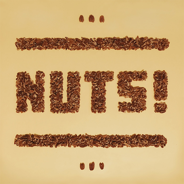
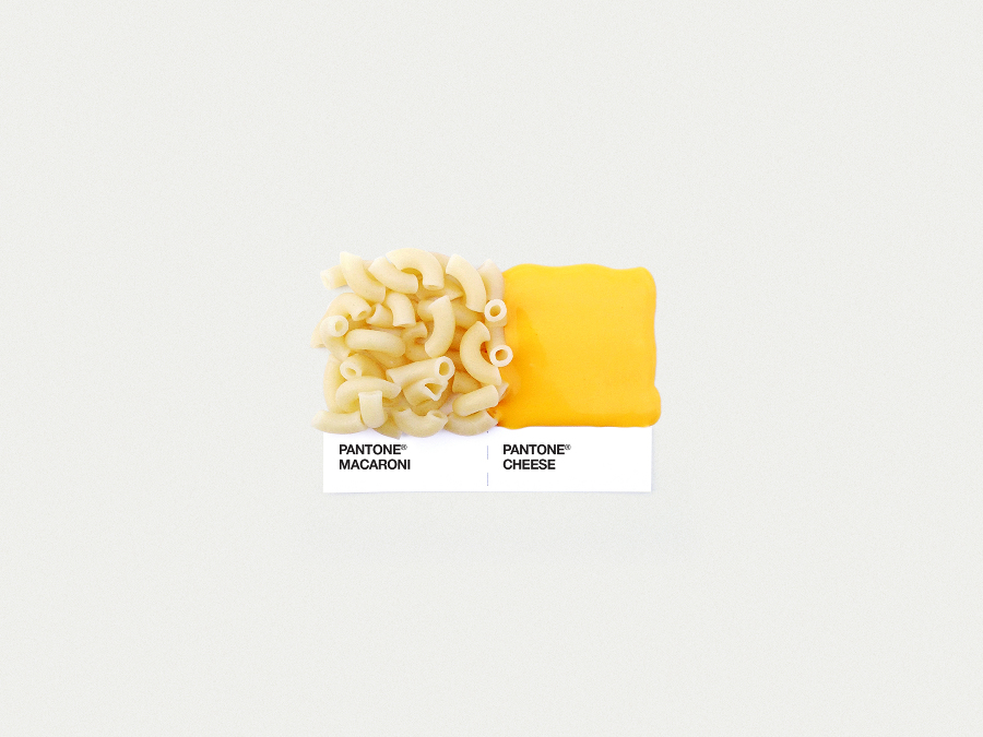
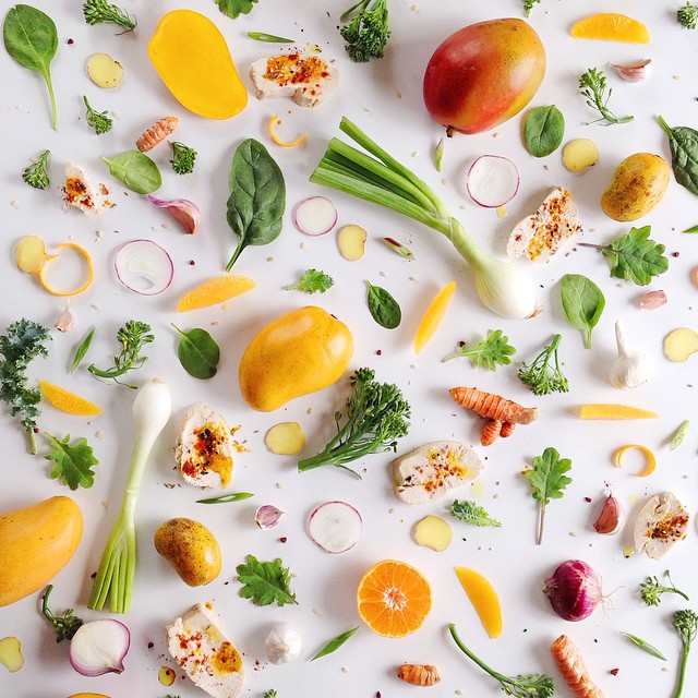
another fun reminder to play with your food. this series is from julia malanuk and features beautiful food typography. the different letters and numbers are made up of items that have a lot of whatever vitamin they're representing. and they are seriously pretty.
quick story: when my nephew was about five we went to the beach and were talking about how he was going to get to try seafood for the first time. he turns around and says, "what do you mean?! i LOVE seafood. i love cookies and cake and candy!" C-FOOD! love that story so much. and with that we'll start with the letter C.
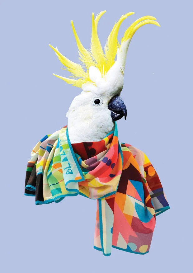
i have this thing with birds. see here and here. so, it's no surprise that i am really loving scarf company blazon and their use of birds as models. always fun to see a company mix things up - gives their pieces a sense of whimsy and displays the products in a unique way, while still being really beautiful.
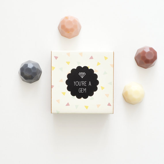
loving these beautifully designed and packaged jewel soaps from australian brand vice and velvet. they have tons of beautiful products but these are especially special.
seen any beautifully designed or packaged products lately? por favor send them my way!
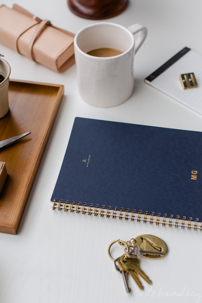
i wanted to share a project that kind of combines all the things i love: design, small business, female entrepreneurship, the dc creative community, and well, just pretty things in general.
appointed is an american-made brand of beautifully designed desktop goods.
from them: "we believe a beautiful work environment fosters creativity, productivity and overall well-being. and we believe that each new notebook represents untapped potential and endless possibility. our goal is to add beauty to the workday and to outfit workspaces everywhere with tools that energize and inspire."
i've written here before about how important i think it is to bring design and beauty into everyday spaces that are typically beige and boring. so, i love the idea of having polished, thoughtfully designed office products that can go in and out of all the spaces of life - from the 9-5 stuff to the creative stuff to the to-do lists and the big dream brainstorming. if it's something you're interacting with multiple times a day it should be beautifully designed!
pretty right?
added bonus? appointed was started by dc-based graphic designer and creative powerhouse suann song. i've been following suann for years and she's consistently made beautiful things and supported dc small business.
they launched on kickstarter a couple of days ago so go and get em!
as they say on their kickstarter, "beautiful tools to inspire beautiful work." indeed!
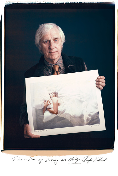
wanted to share this lovely project from tim mantoani, called "behind photographs: archiving photographic legends." mantoani showcases great photographers with their most famous image. a little bit of history, a little bit of photojournalism and a little bit of beauty.
this project also made me think about how these photographers must feel about their most famous images. from a personal and from a creative point of view. it must be hard to have your most famous work be from 20, 30, 40 years ago, no? or maybe not. lots to unpack in these beautiful images.
also, marilyn. can you imagine being behind the lens in that moment?
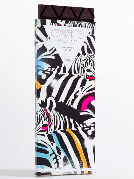
in preparation for valentine's day: the prettiest chocolates ever. compartes has the most beautiful packaging design. here are a few of my favorites, (obviously) starting with with the one inspired by venezuela.
how fun are these minimalist animal designs?
these guys are the centerpiece of a brand called animodul, a clothing and toy company for kids. this beautiful brand design was created by spanish design studio atipo.
cool shapes above and an AWESOME video below. amazing to see how much they accomplish with just a few shapes. and fun to see in the second half of the video how these designs are applied beyond branding, onto the product.
via logodesignlove
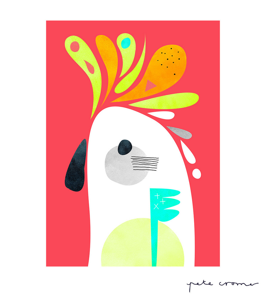
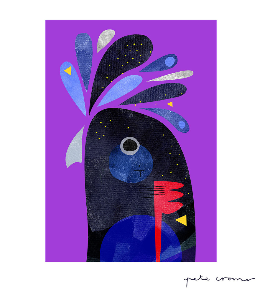
i saw these awesome birds by australian designer and artist pete cromer and had to share. hope they bring a little color and charm to your friday!
more from pete here. and if you're looking to add a little color and charm to your space take a look at my collection of art and design prints on pinterest for ideas.
lately, i am finding a lot of inspiration - and discovering so many exciting designers - on instagram. i thought i would share a few in case you are looking to diversify your instagram feed from sunsets and selfies. the thing i love the most about instagram is that it gives you a window into how a creative person sees the world in the ordinary moments of their day. it allows you to see beauty and design and interest where you might not on your own.
i also appreciate that instagram is a space where artists can explore in a more casual way. i’ve mentioned two artists i follow (justina blakenly in this post and dschwen in this post) who started side projects for fun on instagram that became incredibly successful and took them to new, unexpected opportunities.
take a look at some of my favorite sources of inspiration on instagram below and don’t forget to follow @thebossaesthetic for a window into where i see design.
(note: hover over the images for info and see below for links!)


@happymundane, because color, line.
@kitato, because he showcases people is such pretty ways.
@julieskitchen, because she plays with food (but not in the “here’s a delicious pie i ate” kinda way) and makes the prettiest patterns.
@littlecoal, because his photos always make me pause. and on instagram (scrollscrollscroll) that means a lot.
@macroe, a study in landscape and simplicity.
@huxsterized, because COLOR.
@maxwanger, a study in proportion and scale. definitely a favorite.
@paperfashion, because she sees her art (#shadowdancers) everywhere.
@palomaparrot, because her images have such a consistent point of view: thoughtful, clean, bright.
am i missing any of your favorites? email me or leave a comment below!
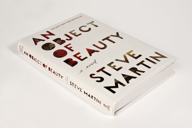
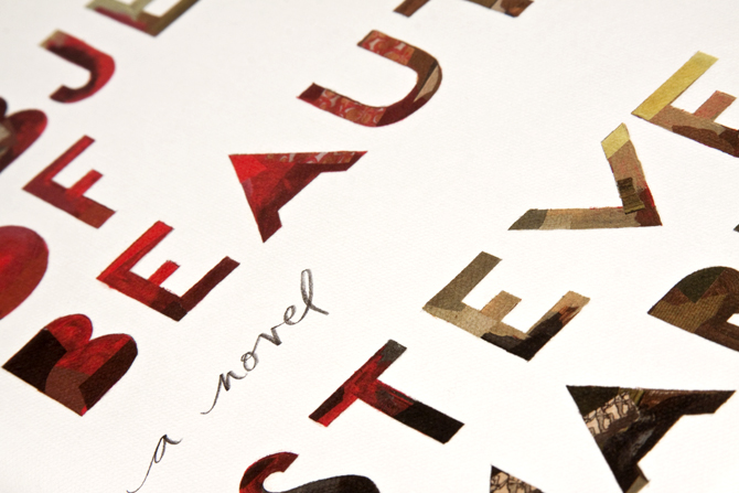
i always enjoy getting a glimpse into a creative process, especially for a piece of art or design i love. the cover art for steve martin’s an object of beauty is one of my favorites so i wanted to share some highlights from this interview with the illustrator/designer darren booth on his creative process.
the challenge: art director anne twomey explains that an object of beauty is about “an ambitious young woman set in manhattan's high powered art world during it's heady days of the early 1990's till now. it is also a history of modern art.” she explains that they needed to get a cover done and approved in about a month (eesh), but that the real challenge was to make the cover itself a piece of art.
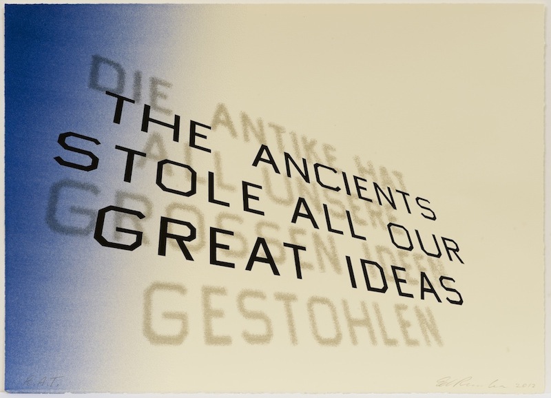
the illustrator's influences: booth was told steve martin was a fan of ed ruscha’s work and you can really see the way that influenced booth by looking at ruscha's font treatment below.
ed ruscha, mark twain quote, 2012
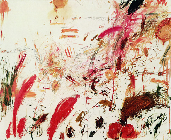
booth says he was also influenced by robert rauschenberg and cy twombly's work because they both often have a lot going in a small area. you can see how they both influenced his use of texture.
robert rauschenberg, untitled, ca. 1954,
cy twombly, ferragosto, 1961
the creative director's influences: twomey explains that “with a strong title and beloved author, a text driven solution, seemed obvious.” i thought that was interesting - i hadn't thought about how a famous name shifts the direction of a piece of design. she also mentions ed ruscha's textual, flat paintings as well as several other pop artists. she explains that her vision was to create a unique cover that referenced the text driven work of these artists, but was not based on a single influence.
the message: when asked about the message behind the design booth responded “there's beauty in imperfections. the fact that the lettering is done by hand allows for that feeling of a human element to come across.” i love that.
influence vs inspiration: one last thing booth said that struck me was that on this project he learned how to balance the difference between inspiration and influence. i think a lot of creative people struggle with the balance between influence and inspiration, given that most people need a combination of both. you really see the successful balance here when you see booth's work in the context of its influences. he was able to find the right balance, pulling from influences but ultimately creating an original "object of beauty" that feels all his own.
read the full interview here.
completely blown away by these photos by russian photographer and street artist alexey menschikov. they are somehow both incredibly complex and beautifully minimalistic. the texture of the shadows in the first one, the angle of the cigarette and the pieces on the wall in the second to last one, the use of scale in the fifth one, the way the lines all come from the bottom left corner in the last one. such rich images.
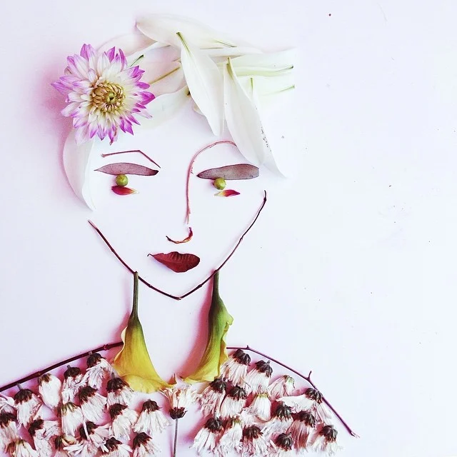
i love this project, called #facethefolliage, by justina blakeney. it started out as just a personal project on instagram but evolved into kind of a movement with her followers. eventually, recently, it led to a partnership with vogue. i love watching projects of bloggers/designers i follow evolve into something much, much bigger. she also sometimes has little stories with each image (in the captions below) - such a perfect, creative use of instagram.
more on justina's blog. and instagram.
and here's the vogue partnership (which is gorgeous).
She was all anyone could talk about at fashion week. No one could believe her whole collection...even the glasses...we're made entirely of leaves and flowers! #facethefoliage
Regal #facethefoliage
First she made the wish, then she made it happen. #happybirthday #facethefoliage
She wasn't thrilled that the party's theme was purple. Purple was not her color. #facethefoliage
#facethefoliage
In her 20's she learned to talk, and in her 30's she learned to listen. #facethefoliage #jbfacethefoliage
i love the simplicity, playfulness and creativity of this series by dschwen, a creative studio based in minneapolis led by david schwen. like the #facethefolliage project by justina blakeney, i love seeing how creative personal side projects (that often start on instagram) take on a life of their own.