MASTER MAEDA

if you have fifteen minutes i highly suggest you spend some time today with design master john maeda. insightful and funny, his ted talk reflects on the relationship between content and design. he has spent his (exceptional) career at the intersection of art, design and technology and has fascinating insights on how creativity and technology intertwine.

maeda spent about a decade at MIT's media lab before becoming president of the rhode island school of design. last year he headed west to silicon valley and has since become - in addition to an established design icon - an important teacher on the power of design in business.
ON FEAR AND CREATIVITY

a little mid-week inspiration for you! here’s a short film featuring successful creatives sharing their perspectives on fear and creativity. as one of them says, “no longer can you follow a road map to success… we’re defining our own paths and we’re making it up as we go along.” and as we define our own paths, fear and uncertainty will inevitably accompany us. it's a matter of letting the fear and uncertainty sit with the drive and creativity and helping move you forward.

i like this piece a lot because i think on some level we all know everyone else (no matter how successful) is also just figuring it out as they go along, but a reminder is always nice. take a look below.

more here.

via design taxi

CREATING AN OBJECT OF BEAUTY

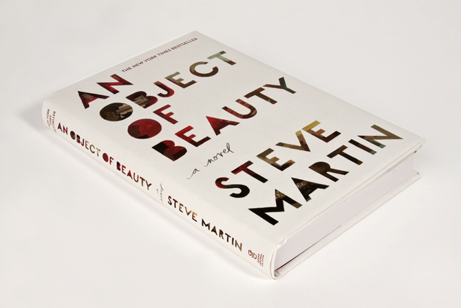
i always enjoy getting a glimpse into a creative process, especially for a piece of art or design i love. the cover art for steve martin’s an object of beauty is one of my favorites so i wanted to share some highlights from this interview with the illustrator/designer darren booth on his creative process.

the challenge: art director anne twomey explains that an object of beauty is about “an ambitious young woman set in manhattan's high powered art world during it's heady days of the early 1990's till now. it is also a history of modern art.” she explains that they needed to get a cover done and approved in about a month (eesh), but that the real challenge was to make the cover itself a piece of art.

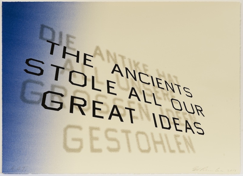
the illustrator's influences: booth was told steve martin was a fan of ed ruscha’s work and you can really see the way that influenced booth by looking at ruscha's font treatment below. 

ed ruscha, mark twain quote, 2012

ed ruscha, mark twain quote, 2012

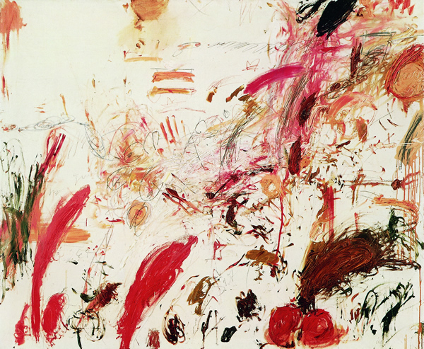
booth says he was also influenced by robert rauschenberg and cy twombly's work because they both often have a lot going in a small area. you can see how they both influenced his use of texture.

robert rauschenberg, untitled, ca. 1954,

robert rauschenberg, untitled, ca. 1954,

cy twombly, ferragosto, 1961

cy twombly, ferragosto, 1961

the creative director's influences: twomey explains that “with a strong title and beloved author, a text driven solution, seemed obvious.” i thought that was interesting - i hadn't thought about how a famous name shifts the direction of a piece of design. she also mentions ed ruscha's textual, flat paintings as well as several other pop artists. she explains that her vision was to create a unique cover that referenced the text driven work of these artists, but was not based on a single influence.

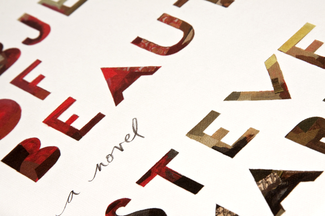
the message: when asked about the message behind the design booth responded “there's beauty in imperfections. the fact that the lettering is done by hand allows for that feeling of a human element to come across.” i love that.

influence vs inspiration: one last thing booth said that struck me was that on this project he learned how to balance the difference between inspiration and influence. i think a lot of creative people struggle with the balance between influence and inspiration, given that most people need a combination of both. you really see the successful balance here when you see booth's work in the context of its influences. he was able to find the right balance, pulling from influences but ultimately creating an original "object of beauty" that feels all his own.

read the full interview here.