NYC GIFATHON

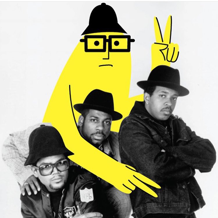
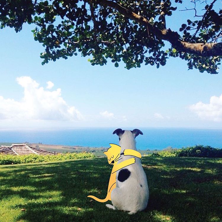
this is awesome. london-based animator, james curran, spent a month in nyc last year and created a gif for each day's (mis)adventures. through the thirty gifs he captures places and people and things we all know and love about new york. he strung all of the gifs together and it reads like a video journal slash extensive instagram travel post slash love/hate letter to a new york. i love the use of color, the consistency, and the fun. and i love that it really feels like a story. check it out.

more here.

via ad week

CUTE DO

illustrator daniel frost has always had a fascination with the interesting people and situations of east london. so, he decided to create a book that "illustrated east london" and captured something about the people and their trends. take a look at a few pages from "haircuts of hackney," his illustrated collection of the hairstyles of east london. the colors feel retro, the design feels modern and the overall vibe is just clean and cool. 

Haircuts of Hackney
Haircuts of Hackney
Haircuts of Hackney
Haircuts of Hackney
Haircuts of Hackney

more here.

and here.

via creative boom

PLAY WITH YOUR FOOD: VITAMINAS EDITION

another fun reminder to play with your food. this series is from julia malanuk and features beautiful food typography. the different letters and numbers are made up of items that have a lot of whatever vitamin they're representing. and they are seriously pretty.

quick story: when my nephew was about five we went to the beach and were talking about how he was going to get to try seafood for the first time. he turns around and says, "what do you mean?! i LOVE seafood. i love cookies and cake and candy!" C-FOOD! love that story so much. and with that we'll start with the letter C.

vitamintype
vitamintype
vitamintype
vitamintype
vitamintype
vitamintype

APRIL FOOLS A PLUS

and the winner of april fools' day goes to... my friends at fundrise. take a look at their email from last week's april fools' day below. and then do yourself a favor and click through to the full page.

creative brands that have a sense of a humor, a passion for the details and a distinct personality always get an A+ in my branding book. and the level of detail here is truly phenomenal. and it is the perfect play on their product. AND i am sure that while everyone can appreciate this, no one found it funnier than their customer. like i said, A+.

and if you don't know about the awesome work fundrise is doing in the crowdfunding and real estate space you should probably get on that.

more here.

PLAY WITH YOUR FOOD!

you know even thanksgiving has to get a little design love on THE BOSS AESTHETIC. here is artist hannah rothstein's interpretation of how some of our most famous artists would serve thanksgiving.

hope you enjoy these on this pumpkin-pie-baking, stretchy-pants-wearing kinda day. and thank you! for stopping by, for sharing the blog and for your wonderful comments and support.

now, time to play with some food.

georges seurat:

how georges seurat would serve thanksgiving

jackson pollock:

mark rothko:

pablo picasso:

piet mondrian:

rené magritte:

vincent van gogh: