such cool and chic branding. i really love the use of gold, the versatility of the icon in the logo and that gorgeous white font.


I BANKING GETS COOL
a very cool re-brand from swedish creative agency snask for investment bank nordea markets. take a look at the accompanying film below - using all handmade and handpainted products.
don't see it reflected on their website! but cool in theory.
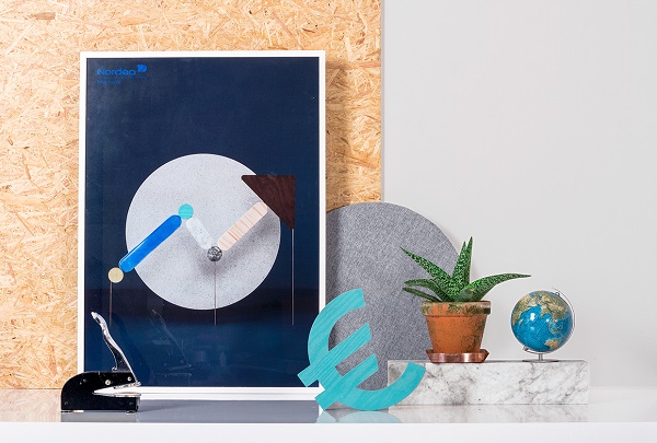
via design taxi
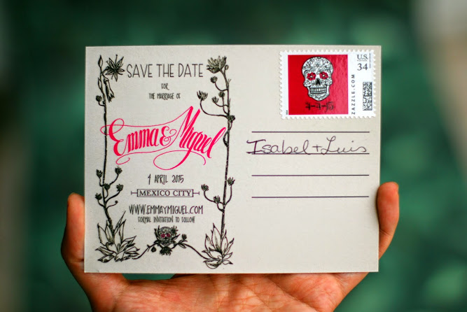
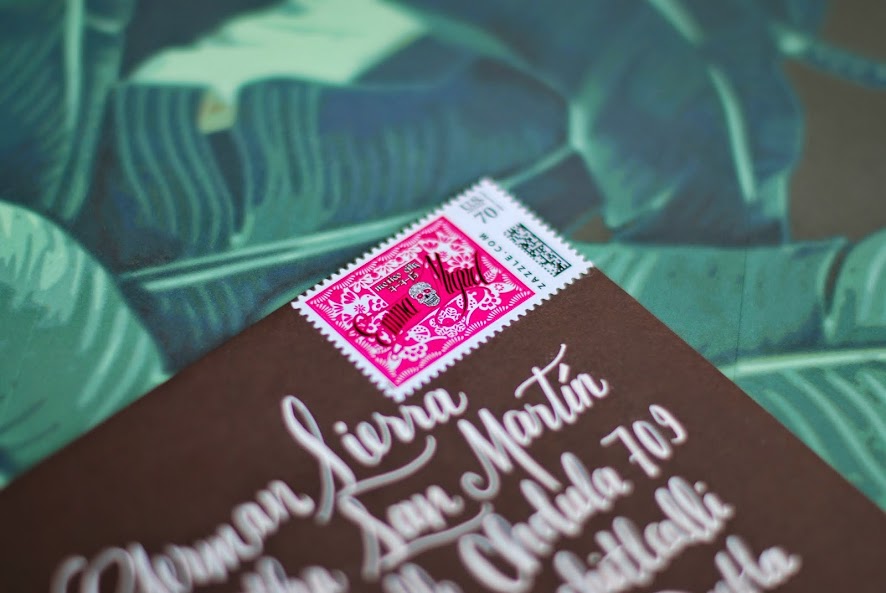
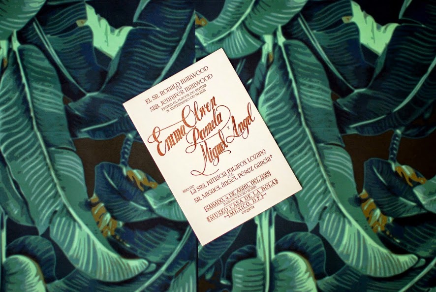
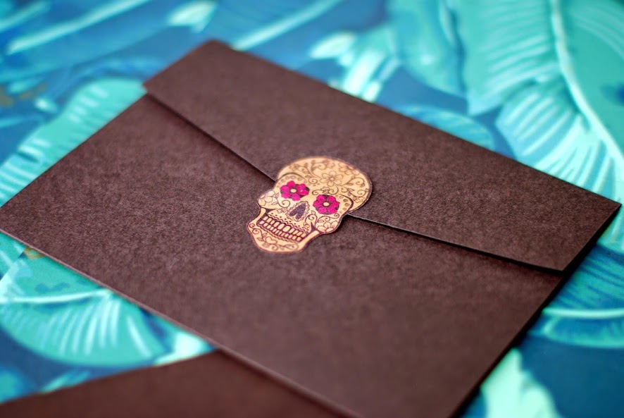
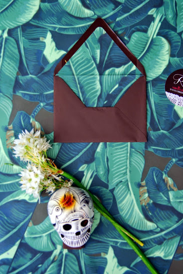
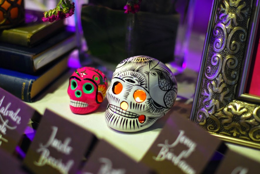
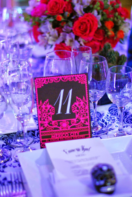
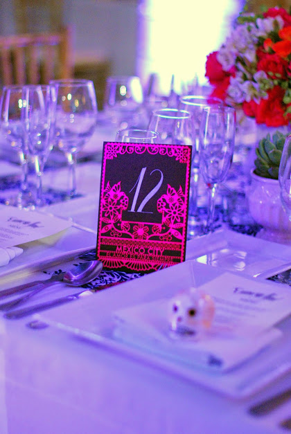
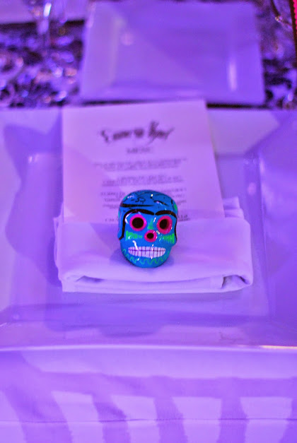
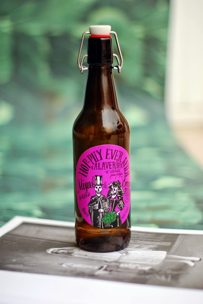
SUGAR SKULLS AND MEXICAN ROSES
ready for my favorite branding of 2015? good! so...
it's a wedding.
a couple of months ago my friends emma and miguel got married in mexico city, and with the help of the insanely talented isabel from tinta y calamar they created a wedding suite that made this design-lover's heart skip a beat.
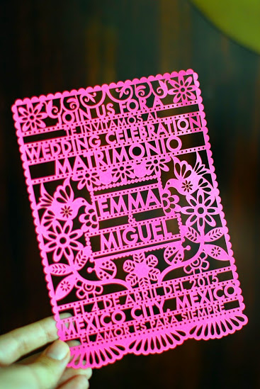
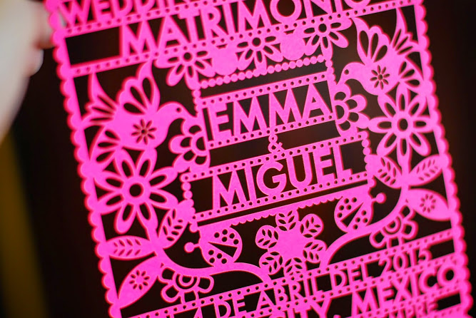
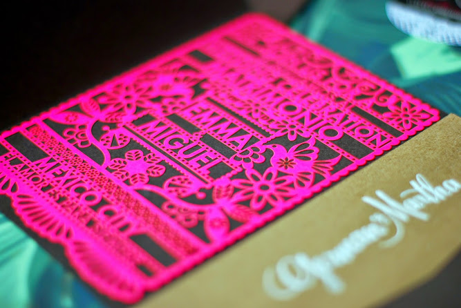
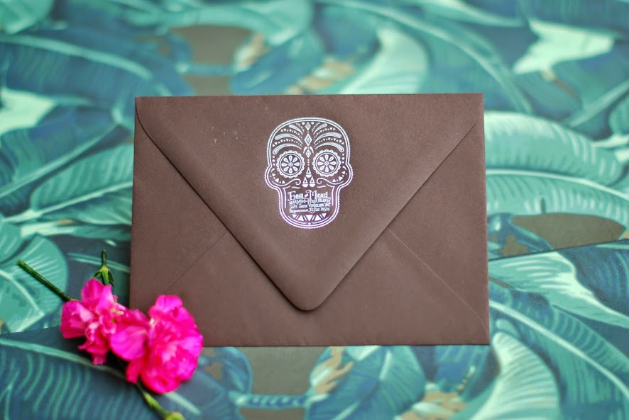
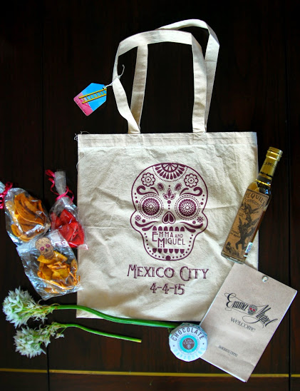
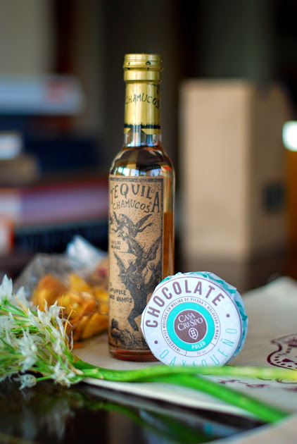
from the save the date to the table numbers and the skulls on the place settings, the design was consistent and unique. it was very mexican but the theme never translated as cheesy, just as a consistent thread. and THE DETAILS. to have this level of detail and this amount of color in anything and still make it feel clean is incredibly difficult. isabel incorporated laser cutting, hand painting, skulls, the couple's names, tons of color, the list goes on. but the overall look was consistent and so cool. as you'll see, the main elements of the wedding (and the paper suite) were a mexican sugar skull, papel picado (the laser cut paper) and rosa mexicano, a specific shade of hot pink.
i am so excited to share isabel's work - as well as emma and miguel's vision - with you. it's a beautiful example of how much love and work goes into weddings. it's a lesson in design. and it's branding at it's best, from an unexpected source. the fact that it was for emma, who i've been friends with since we were 15, is just the (mexican) cherry on top.
ok! let's start at the top.
first / the save the date postcards:
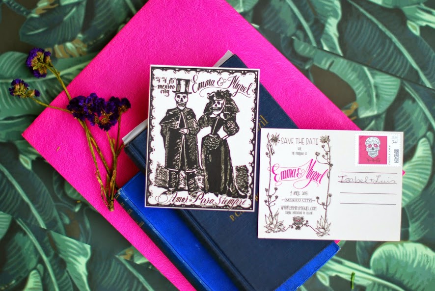
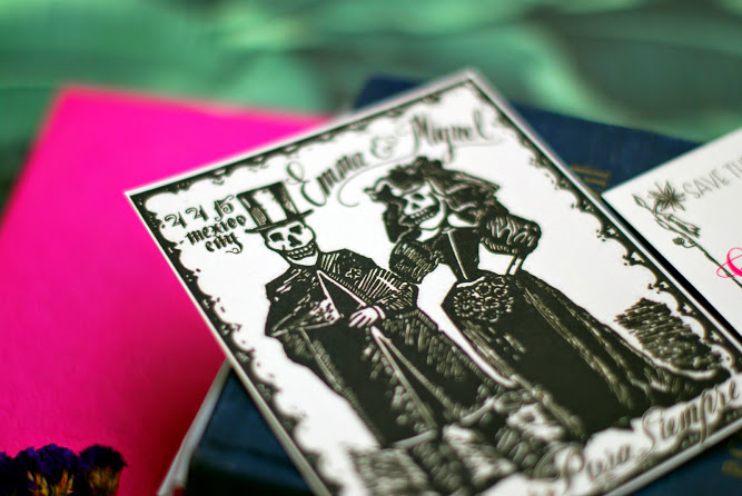
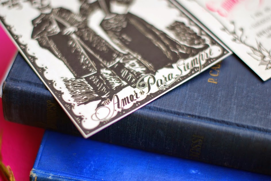
next / the full invitation suite:
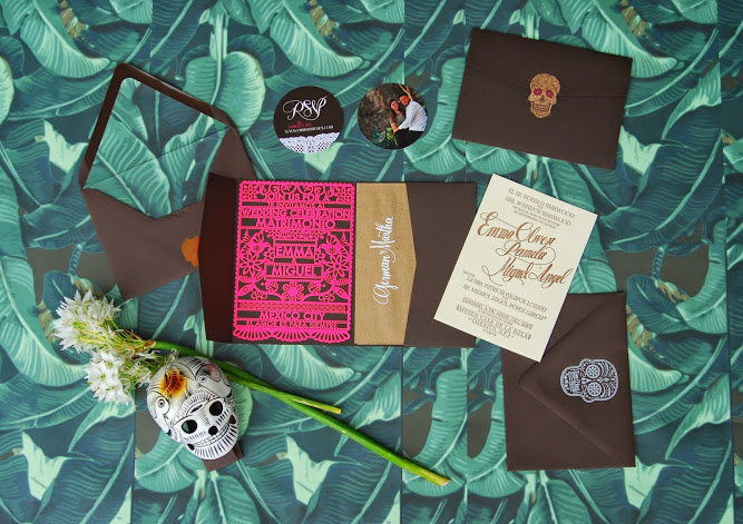
and / the welcome bag!
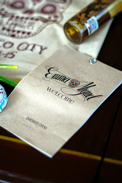
finally / at the wedding:

beautiful, right? thank you, isabel, for your beautiful work. y que vivan los novios!
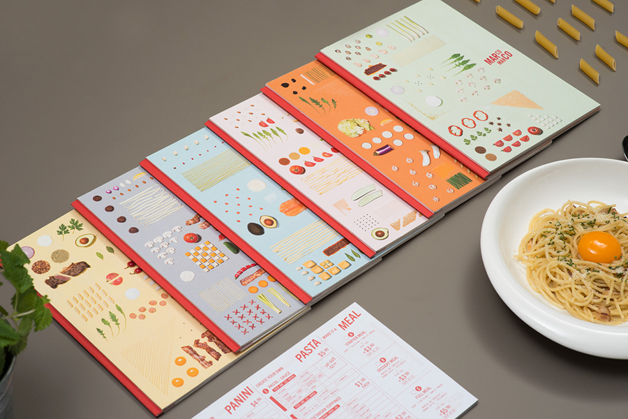
COOKING UP DESIGN
italian food plus minimalist design plus cool branding plus ocd levels of organization? yes please.
take a look at the gorgeous brand identity of marco marco, an italian restaurant chain based in singapore.
created by arce, the design work focuses on simple type, stunning photography and different deconstructed dishes.


MAKE IT POP
gotta love a good creative collaboration. jonathan quintin and matt wilson got together to create a combination of graphic and motion design work, and the combo of their two strengths led to some pretty great branding. the font is playful but still so clean and beautiful. i also love the play on proportion and the way the use of the logo varies throughout the different pieces. cool and clean.

via creative boom
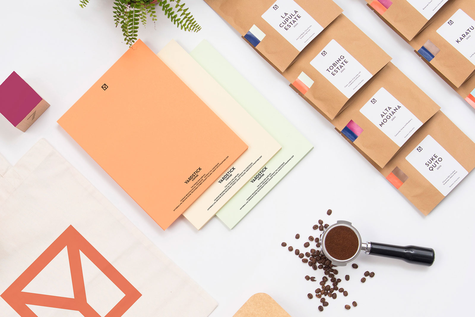
COFFEE CUP COOL
i wanted to share the lovely branding for yardstick, a coffee company in the philippines. part of their mission is to increase the knowledge of specialty coffee in the philippines, so they used the national flag (flipped on it's side and broken down to its basic elements) as the inspiration for the branding. i also kind of love that they don't have a brand color but rather a palette of colors that they mix and match. clean and lovely.


WHAT IT'S ALL ABOUT
i have never been compelled to copy a whole article over here on the boss aesthetic but this one is worth it. the article below, titled "what artisanal brands can teach us about using technology to humanize business," is from entrepreneur this past january but a friend recently re-sent it to me with the subject line "totes you." to which i say, yup! this article really encompasses SO MUCH of what i think needs to happen in how brands connect with consumers today. it also connects to a lot of what i share here - from my favorite products to the branding and marketing examples i share. my favorite passage and then the whole article below. take a look! and i'd love to hear what you think in the comments below.
"Consumers are embracing the idea of having more personal and direct connections to the products that inhabit their lives. The great irony of these back-to-basic principles? Technology is playing a critical role as an enabler of a more personalized way of doing business -- one that lets consumers connect with products as their father’s father once did at the local country store. The trend underscores one of the great paradoxes of the digital age: In an increasingly automated world of interconnected everything, consumers are craving new products that they can have an emotional connection with -- items that are customized to their personalities and tastes."

What Artisanal Brands Can Teach Us About Using Technology to Humanize Business
By Randy Komisar, Partner at Kleiner Perkins Caufield & Byers
Bayard Winthrop made a big bet with a small idea a few years ago. When the San Francisco-based entrepreneur set out to design, make and sell a high-quality sweatshirt at a low-end price ($70), he didn’t go the simple route.
Winthrop didn’t hop a plane to Mumbai or Bangalore to outsource production and open a storefront in a trendy shopping district. Instead, he contracted with a small factory in San Francisco and put up a website. (Disclosure: I serve as an informal advisor to Winthrop.)
More important, he focused on absolute product excellence, not promotional externalities. He claims that 80 cents of every dollar invested in retail is unrelated to the product itself. This paid off months later when Slate's Farhad Manjoo declared his product “the greatest hoodie ever made.” Within 36 hours, Winthrop’s direct-to-consumer business, American Giant, was humming. Within months, he had sold thousands of sweatshirts and was swamped with back orders.
Winthrop’s idea, of course, isn’t a small one any longer. It’s tightly linked to the same dynamic driving the farm-to-table movement and the boom in artisanal manufacturing. In each of these new models, consumers are embracing the idea of having more personal and direct connections to the products that inhabit their lives.
The great irony of these back-to-basic principles? Technology is playing a critical role as an enabler of a more personalized way of doing business -- one that lets consumers connect with products as their father’s father once did at the local country store.
The trend underscores one of the great paradoxes of the digital age: In an increasingly automated world of interconnected everything, consumers are craving new products that they can have an emotional connection with -- items that are customized to their personalities and tastes. And consumers are beginning to look beyond markets driven by mass production and low cost for everything from clothes to cars.
Across dozens of industries, Winthrop and other entrepreneurs are creating new “made-to-order” personalization platforms, cutting out as many middlemen as possible and relying heavily on social and mobile technologies to forge lasting relationships with new customers.
Three core principles are driving success for companies like American Giant and many others. Here’s my take on what those principles are and why they matter:
1. Embracing extreme authenticity.
When it comes to consumer products, a complex web of manufacturers, wholesalers, retailers, advertisers and marketers factor heavily into the ultimate price of a good. All these third parties add layers of complexity and cost between when the product is made and then when it's sold.
Manufacturers might produce higher-quality products, but in the retail sector they typically sell them at higher prices (as much as 13 percent higher, in some cases) to account for distribution and marketing.
How can companies remove these costs -- and also spark new connections with consumers? First, they can source the manufacturing of their goods locally and use the Internet as a primary storefront.
By contracting with a San Francisco factory ( later adding three more plants in North Carolina) and sourcing his cotton and other supplies in the United States, Winthrop has eliminated the high cost of producing sweatshirts overseas. And he keeps real estate costs low by selling his apparel only online and he spends little on marketing.
With the extra capital freed up by lower distribution and marketing costs, Winthrop can afford to buy quality cotton and pay workers a relatively generous wage -- $17 per hour.
Zappos and Amazon may have built massive online stores, but they remain product curators -- not makers -- at their core.
Companies like Warby Parker took this model a step further by not only delivering items purchased online, but also creating them in-house. By offering to deliver its own product (eyeglass frames) to customers with the added bonus of no obligation to buy them, Warby put choice in the hands of the customer while saving on the real estate costs of an in-store experience.
2. Letting customers be the voice of a brand.
Artisanal manufacturers are providing consumers amazing new products that they can love and share with their vast online networks. And through social media, they serve as authentic cheerleaders to drive sales. By relying on customers to become the collective voice of their brands, companies free up capital that would otherwise be spent on expensive marketing and distribution processes.
Dozens of companies are tapping into this concept to build and grow promising new businesses. Brewers and distillers like New Belgium Brewing and Woodinville Whiskey have taken big strides in advancing the quality of craft-made beverages while relying on consumers to spread the word.
Crowdsourced creation has also enlisted technology and online platforms to create great products. Take Arizona-based Local Motors. The company provides an online space for customers to design, build and sell custom-made vehicles and parts.
Such companies perhaps owe a portion of their success to the farm-to-table innovators of the last decade, who showed how the quality of home-grown produce wasn’t just better but connected to consumers’ core values in ways that supermarkets simply did not. Hundreds of other industries and sub-industries in the U.S. economy are next in line to undergo the same transformation.
3. Practicing extreme honesty.
Transparency is integral to the companies' building lasting relationships with customers today -- and allows for a focus on creating great products. Successful companies can’t hide mistakes or internal goings-on like they once could.
Extreme honesty is the new policy of successful business in the 21st century. The days of coverups and pushing issues under the rug are gone. Humans are fallible and so are companies. Admitting this will take a company a long way with its advocates.
At American Giant, Winthrop has been very open about the company’s inability to meet demand. Some customers have waited months for a hoodie. This level of transparency guarantees that quality products will receive the recognition they deserve from the customers who love them.
The artisanal movement certainly won’t fill the hole left by the decline in U.S. manufacturing in the last 30 years, but it’s helping to forge a new model that lets some companies marry the best that technology can offer with the human values and sense of individuality that consumers increasingly crave. In the end, the melding of these elements really will put the greatest products ever made just one click away.
This article is adapted from The Technology of Us, an ebook hosted by TeleTech that explores the intersection of technology and humanity.
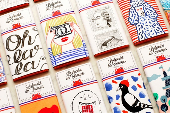
UN PETITE PEAU
i love the gorgeous and playful illustrated packaging of french chocolate company le chocolat des francais. the company worked with french illustrators and artists to showcase french heritage and give the products a proud and playful and tres francais feel.
also love the use of red, white and blue throughout the branding (to further convey the french pride at the core of the product) and the use of that amazing frog logo. so good.


via creative boom
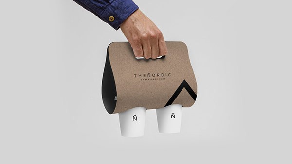
CHIC ON WHEELS
who said food trucks can't be chic?
take a look at the beautiful branding of swiss design student alexandre pietra. she created a full brand identity for a food truck called "the nordic." and no detail went un-noticed.
pietra has a beautifully minimalistic (and classically scandinavian) design influence here to reflect the scandinavian food truck's simple menu.
she also uses the logo in an interesting way, blowing it up and using it at scale throughout the materials. definitely makes everything feel cohesive while still having certain elements feel unique.


via designtaxi
THE BIBLE GETS BRANDED
a very cool project from two graphic design students at john brown university. as part of a semester-long project nick eshnaur and jarod hamm got together and designed a logo a day for the entire new testament in the bible. interesting to think about branding in this context. definitely got me thinking!


SO FRESH AND SO CLEAN
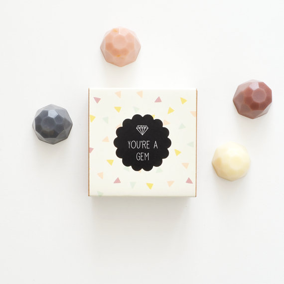
loving these beautifully designed and packaged jewel soaps from australian brand vice and velvet. they have tons of beautiful products but these are especially special.


seen any beautifully designed or packaged products lately? por favor send them my way!
SO, WHAT'S A LOGO ANYWAYS?
i was talking to a friend who is thinking of starting a business the other day. we were brainstorming about what she should think about as she builds her brand, logo, identity design, website design, instagram profile, brand tone, etc. i found it helpful to go back to the basics of what all of these things mean so i thought i’d share those with you. this piece from just creative is a great summary of this stuff so i've condensed it, (tweeked it a little) and copied for you the pieces i think are most important when building or re-building a brand.
ok! let's talk brand, identity and logo.

A BRAND IS the perceived emotional corporate image as a whole. it is an organization, service or product with a ‘personality’ that is shaped by the perceptions of the audience.
many people believe a brand only consists of a few elements – colors, fonts, a logo, a slogan and maybe music. in reality, it is much more complicated than that. you might say that a brand is a ‘corporate image’.
the fundamental idea and core concept behind having a ‘corporate image’ is that everything a company does, everything it owns and everything it produces should reflect the values and aims of the business as a whole.
it is the consistency of this core idea that makes up the company, driving it, showing what it stands for, what it believes in and why they exist. it is not purely some colors, some typefaces, a logo and a slogan.
THE IDENTITY IS MADE UP OF the visual aspects that form part of the overall brand.
in most cases, identity design is based around the visual devices used within a company, usually assembled within a set of guidelines. these guidelines that make up an identity usually administer how the identity is applied throughout a variety of mediums, using approved color palettes, fonts, layouts, measurements and so forth. these guidelines ensure that the identity of the company is kept coherent, which in turn, allows the brand as a whole, to be recognizable.
the identity can be made up of many visual devices:
- a logo (the symbol of the entire identity & brand)
- stationery (letterhead + business card + envelopes, etc.)
- marketing collateral (flyers, brochures, books, websites, etc.)
- products & packaging (products sold and the packaging in which they come in)
- apparel design (tangible clothing items that are worn by employees)
- signage (interior & exterior design)
- messages & actions (messages conveyed via indirect or direct modes of communication)
- other communication (audio, smell, touch, etc.)
- anything visual that represents the business
all of these things make up an identity and should support the brand as a whole.
THE LOGO identifies a business in its simplest form via the use of a mark or icon. it is the corporate identity and brand all wrapped up into one identifiable mark. this mark is the symbol of the business as a whole.
a logo identifies a company or product via the use of a mark, flag, symbol or signature. a logo does not sell the company directly nor rarely does it describe a business. logo’s derive their meaning from the quality of the thing it symbolizes, not the other way around – logos are there to identity, not to explain. in a nutshell, what a logo means is more important than what it looks like.
so, in summary:
brand: the perceived emotional corporate image as a whole.
identity: the visual aspects that form part of the overall brand.
logo: identifies a business in its simplest form via the use of a mark or icon.
and, as always, if you want to chat branding, identity design, or logos, feel free to shoot me an email!
UN POQUITO DE LEARNING WITH YOUR GUAC?
very cool initiative from chipotle i wanted to share. the fast food mega-chain is partnering was writers and illustrators to do more with their packaging through a new series called “cultivating thought.” authors provide mini essays and illustrators provide accompanying illustrations. and voila! your burrito stimulates your belly and your mind.

the idea actually came from jonathan safran foer, the new york times best-selling author of extremely loud and incredibly close and everything is illuminated. apparently, he was eating chipotle one day, found himself with nothing to read and had an aha moment. he approached chipotle with his idea to expose customers to creative people and kudos to chipotle for taking an idea from an outsider and running with it.
the contributers are pretty amazing: toni morrison wrote a piece called “two-minute seduction." sarah silverman has a funny piece called “two-minute index.” steven pinker presents “a two-minute case for optimism.”
i love the idea of stretching your product to do more. i appreciate the creativity and thought behind it. i think the biggest win of this initiative is that it comes from a customer. it comes from putting yourself in your customer’s shoes and saying, when our customers are engaging with our product what are they missing? how can we enrich the process of engaging with our product?
i do think that not featuring mexican or hispanic authors right off the bat was a missed opportunity. not just because there are so many great hispanic authors, but because it’s an opportunity to connect the campaign back to the brand - which is what branded content is all about. but chipotle got that feedback after it launched this initiative and (again) kudos to them for correcting the mistake quickly!
all in all, a great example of smart, thoughtful branded content.
ON BRANDING
great commentary on branding from ije nwokorie of design indaba. nice insights on the importance of authenticity and transparency in branding. and it's just 5 minutes! take a look.
via david airey
NUMERO UNO
oh man. i'm in love.

this is the identity design and branding for 1 hotels, a new eco-conscious chain (from starwood) launching properties in manhattan, brooklyn and miami.
the branding is consistent but flexible, clean but not boring, and says a lot with a little. it's just so good.

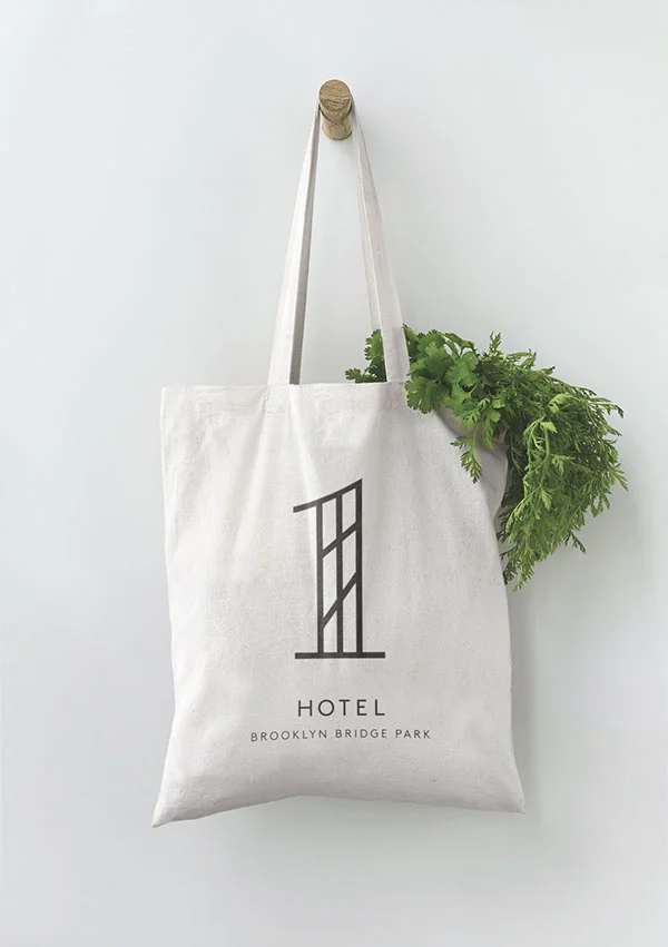
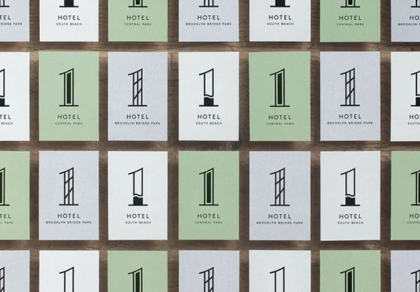
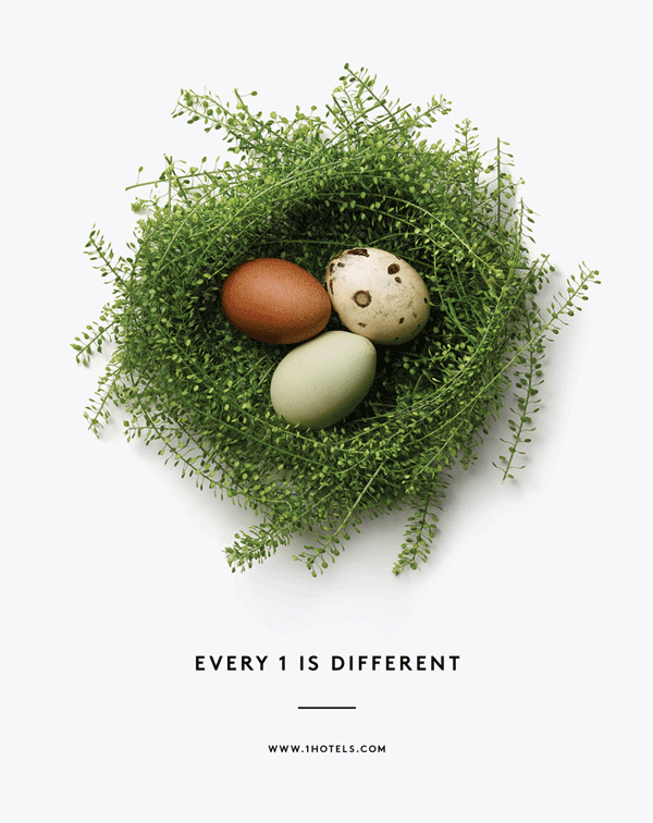
creative direction is from michael ian kaye and christian cervantes. design is from chris rogers and jules tardy.
BIG WINS FOR BRANDS IN 2014
here's a great infographic on the brands that got digital marketing right in 2014.

via unmetric
FOURSQUARE: A LESSON IN (BAD) LOGO DESIGN
i wanted to share some of graham smith's excellent analysis of foursquare's new logo. i was going to write my own take on this but felt his analysis was such a smart lesson in how to think about branding and logo design i decided to just share it as is. the point at the end about incorporating references into a logo (or not) is especially interesting. i cut some of his language for brevity but everything below is directly from him! you can read the full post here.

from graham:
"Foursquare's New Logo Redesign Goes Superhero
Direct from the folks at Foursquare: “…if you build a totally new app, you need a totally new logo. Our logo is changing from the check-in checkmark to something representing the new Foursquare. We designed it to be a mix of map pin and superhero emblem. We’ve always thought of Foursquare as giving you superpowers to explore your city, and our new logo reflects that vision. It’s coming soon to a homescreen near you.”
The good.
The logotype/wordmark/brand name yada yada, is pretty nice: it has presence, it’s pretty damn solid, has a nice rich almost Ultra Violet style to the colouring.
I also like the two colours, but they also remind me a little too much of the Flickr colour palette.
The bad
What is meant to be super is really really bad.
That ‘F’, that is a map-pin, and a superhero emblem just looks awful. The pinky outer keyline is far too kludgy, the outer corner radius look far too large compared to the inner radius. Which then leads to the corner radius of the ‘F’ which looks like an afterthought, BUT don’t come close to matching the far softer corner radius on the Foursquare wording.
Why oh why could they not have at least kept some consistency with the corner radius from the superhero ‘F’ emblem to that in the main wording? That would have at least made up for one of the most awkward looking logomark and logotype miss-matches I have seen in a long time.
There is nothing in this combination logo that looks like it should be one of a nice and cohesive whole. It’s super disjointed at best.
Conclusion:
The typography for the main Foursquare brand name is really good, has a strong presence to it, and has style. What I simply cannot get my head around is how completely unsymbiotic the relationship between this and that God awful superhero ‘F’ emblem really is.
I’m not even sure a map-pin, as a visual reference, was ever needed, especially how long Foursquare has been around. It’s not like Foursquare is a new brand having something to prove about it’s mission and purpose, and almost feels ever so slightly patronising.
The map-pin reference is way too over dramatic, and unnecessary. Almost sure a classy icon could have been crafted from that really strong logotype without force serving up well used, and tired visual cliches.
The new Foursquare logotype is all grown-up, yet the icon feels it’s taken a huge backwards step in this established brand’s maturity. "
BRAND PLAY: HONEST SLOGANS
clean design, smart brand analysis, a simple, playful concept and perfect execution. so many good things here and so hard to pick a favorite (or ten!) of clif dickens' honest slogans series. i love that by being so on point with these insights, dickens is able to create a sense of camaraderie and connection with his audience and make us feel like we're all in on the joke. he created dozens of these awesome pieces so click on over to his site to see the full series.


MEET HARRY! AND A NOTE ON BRANDED CONTENT
meet harry. harry’s is a very cool shaving company that breaks from the traditional model and brings you a “great shave at a fair price.” it’s a brand i really like: the main man in my life loves the product, they have a really clean design, they have a very consistent brand voice, and i love their website.

what i really wanted to share was their magazine, five o' clock, and talk a little bit about brands creating editorial content. harry's says the magazine is about “undiscovered moments, advice, and generally useful information for a well-lived life.” generally, i think the voice of the content works, it’s thoughtful content for the modern guy, and it’s on brand. i also give them credit for not throwing up random images and text: they have real photographers, illustrators, editors, etc. they’re doing a lot right but I think there are some small things they could do better that would make a big difference.
- focus your content. it’s too broad! narrow the content so your customer knows what he’s coming to the site for. also, “making today better than yesterday” doesn’t really mean anything.
- always tie it back to the product. if the post can’t be tied to shaving, grooming, getting ready habits, then it doesn’t work. there’s a post on apologizing, you guys. it’s too random.
- brand it. they have great posts about men they admire and their morning routines. this is great content! but there’s a missed opportunity here. they should be telling us what harry’s products these guys use, how often they shave, their favorite products to use alongside harry’s, and so on. the line between effective branded content and annoying product placement is thin, but it can be done. and when it’s done right, your content will work harder for your brand and your customer will get more out of your content.

HERMES BRAND VIDEO
this is a beautifully branded one minute video by vallee duhamel for parisian luxury brand hermes. throughout the video scenes and objects transform in and out of hermes products. hermes is known for their luxe and subtle branding so this video feels like a playful, creative extension of that style.