LIBRO-TECA

i have mentioned my love of wes anderson (and symmetry and color) before. i've also mentioned my love of beautiful books. so, let's pull it all together now. take a look at this awesome five minute video of the books displayed in wes anderson movies, created by luis azevedo. the film also has a really interesting essay on the influence and symbolism of books in wes andersen films. here's a little peak:

"In the work of Wes Anderson, books and art in general have a strong connection with memory. The Royal Tenenbaums (2001) begins with a homonymous book, as does Fantastic Mr. Fox (2009). The Grand Budapest Hotel (2014) begins and ends with a book. Moonrise Kingdom (2012) ends with a painting of a place which no longer exists. These movies have a clear message: books preserve stories, for they exist within them and live on through them."

more here.

via swissmiss

CUTE DO

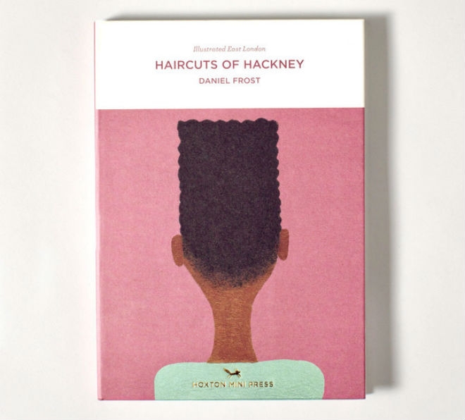
illustrator daniel frost has always had a fascination with the interesting people and situations of east london. so, he decided to create a book that "illustrated east london" and captured something about the people and their trends. take a look at a few pages from "haircuts of hackney," his illustrated collection of the hairstyles of east london. the colors feel retro, the design feels modern and the overall vibe is just clean and cool. 

Haircuts of Hackney
Haircuts of Hackney
Haircuts of Hackney
Haircuts of Hackney
Haircuts of Hackney

more here.

and here.

via creative boom

BIRDS OF A FEATHER

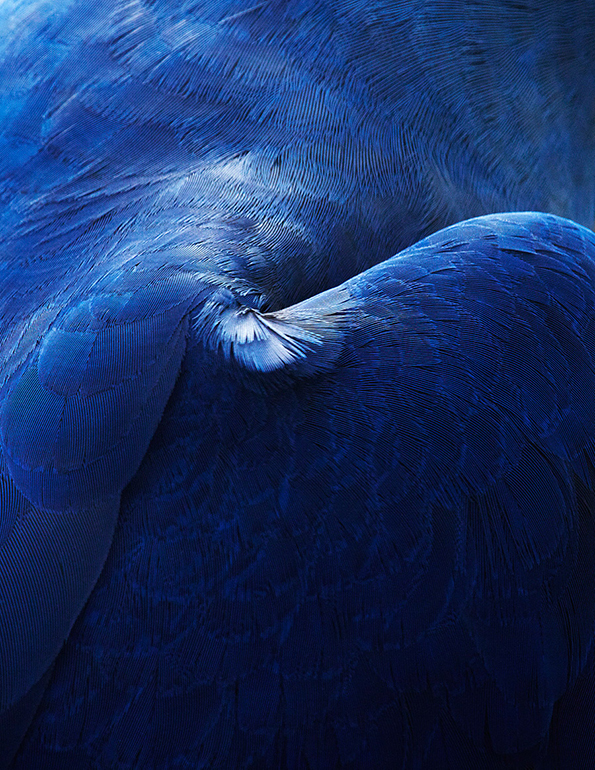
i wanted to share studio baer’s gorgeously designed book featuring thomas lohr’s abstract photographs of birds.

the photos are beautiful and the design of the book really takes them to another level. as i've said before, context is everything and layout can truly make or break how you engage with and feel about an image.

Abstract plumage by Studio Baer

more here.

via it's nice that

ABOUT TIME

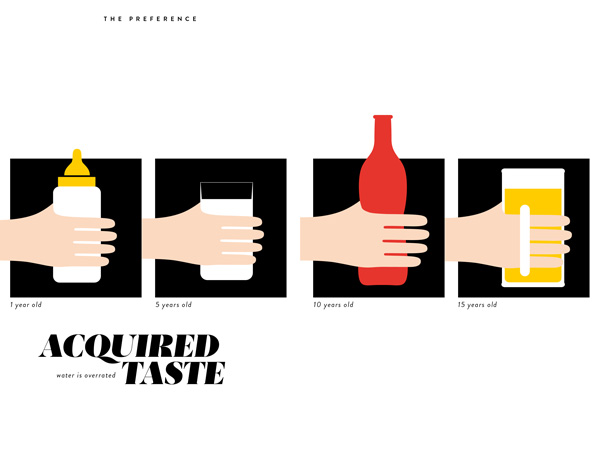
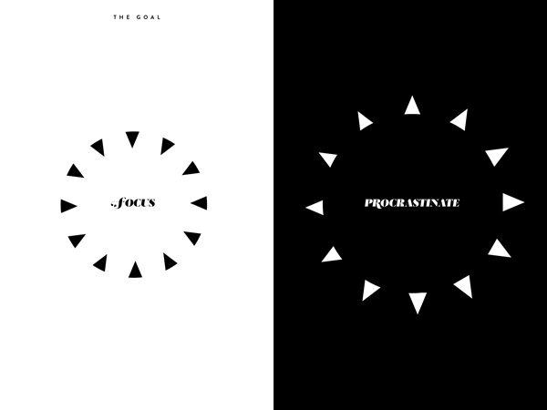
i wanted to share some images from about time: a visual memoir around the clock, a beautiful book by french-armenian graphic designer vahram muratyan.

you might recognize the style from the famous paris vs. new york images he did a couple of years ago.

the book is graphic and beautiful but also really thoughtful and insightful and clever.

muratyan presents minimalist visualizations of routines and cycles and patterns that make up the flow of time in our lives. given how obsessed we all are with time – how little we have, how we spend it, how we take it from others, how we track it – it’s interesting to look at these with a little bit of a sense of humor.

i also kind of love that the style is both modern and a little retro. it feels like even the style is a comment on time!

about time
about time
about time
about time

LOST IN TRANSLATION

and not the scarlett johansson and bill murray kind.

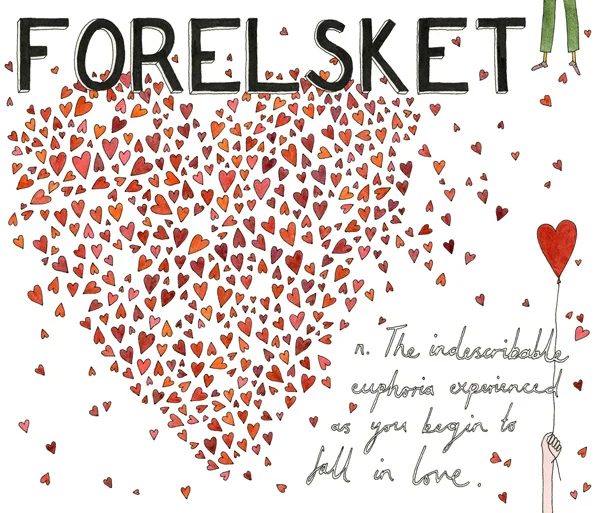
as a native spanglish speaker the struggle to find the right translation, the right word, the right phrase, is REAL. how we communicate is such an integral part of who we are that lost in translation moments can carry a lot of weight in our lives. writer and illustrator ella frances sangers explores this in her book lost in translation: an illustrated compendium of untranslatable words from around the world. try and translate that mouthful!

i really loved and wanted to share these illustrations. and it's fun to think about the cultural context for some of the words she shares. definitely need to incorporate wabi-sabi into my vocabulary.

Lost in Translation Illustration

A LITTLE GIVE AND A LITTLE TAKE

Hands by Saskia Pomeroy

are you a giver or a taker? maybe you’re a benefit-of-the-doubt kinda guy. or perhaps an-eye-for-an-eye kinda lady? what role do you think that plays in how you work? or in your success?

these are the questions organizational psychologist adam grant asks in his book, give and take. it’s a fascinating book and i think these questions give huge insight into how we operate, at work and in life.

“according to conventional wisdom, highly successful people have three things in common: motivation, ability, and opportunity. if we want to succeed, we need a combination of hard work, talent, and luck. [but there is] a fourth ingredient, one that’s critical but often neglected: success depends heavily on how we approach our interactions with other people. every time we interact with another person at work, we have a choice to make: do we try to claim as much value as we can, or contribute value without worrying about what we receive in return?”

he breaks the theory down into three chunks: givers give more than they receive. takers do the opposite and put their interests first. and matchers do neither. matchers are more focused on making sure the scales of giving and getting are evenly balanced. i’m a matcher. an eye-for-an-eye kinda lady. and when i heard grant speak it really gave me a lot of insight into myself. and since then i have been better able to understand and manage my thoughts and feelings because of this context.

so, long story short, which of the three types is most likely to succeed?

“research demonstrates that givers sink to the bottom of the success ladder. across a wide range of important occupations, givers are at a disadvantage: they make others better off but sacrifice their own success in the process.”

but here’s the interesting part: while givers were the worst performers, they were also the best. with takers and matchers landing in the middle.

“there’s something distinctive that happens when givers succeed: it spreads and cascades. when takers win, there’s usually someone else who loses. research shows that people tend to envy successful takers and look for ways to knock them down a notch. in contrast, when [givers] win, people are rooting for them and supporting them, rather than gunning for them. givers succeed in a way that creates a ripple effect, enhancing the success of people around them. you’ll see that the difference lies in how giver success creates value, instead of just claiming it.”

so interesting!

more here.

image above by saskia pomeroy
CREATING AN OBJECT OF BEAUTY

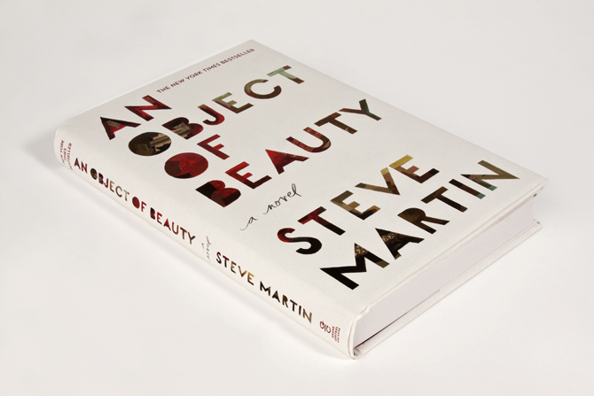
i always enjoy getting a glimpse into a creative process, especially for a piece of art or design i love. the cover art for steve martin’s an object of beauty is one of my favorites so i wanted to share some highlights from this interview with the illustrator/designer darren booth on his creative process.

the challenge: art director anne twomey explains that an object of beauty is about “an ambitious young woman set in manhattan's high powered art world during it's heady days of the early 1990's till now. it is also a history of modern art.” she explains that they needed to get a cover done and approved in about a month (eesh), but that the real challenge was to make the cover itself a piece of art.

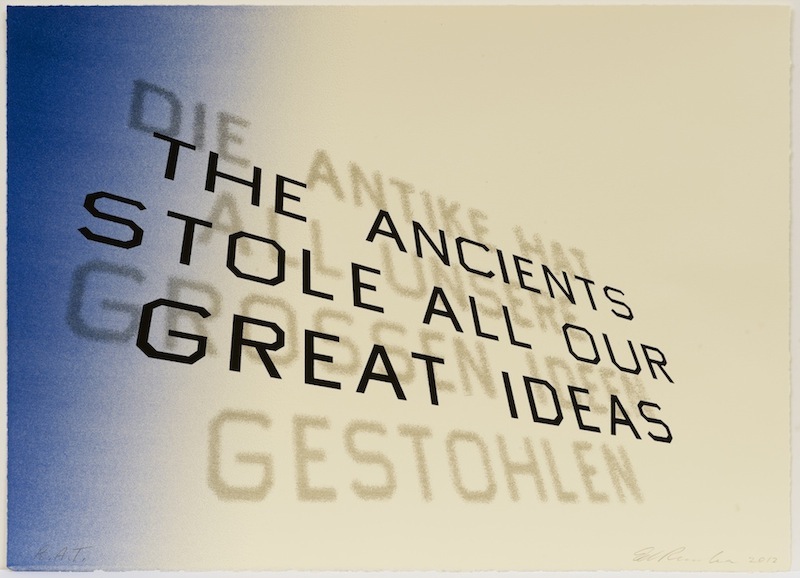
the illustrator's influences: booth was told steve martin was a fan of ed ruscha’s work and you can really see the way that influenced booth by looking at ruscha's font treatment below. 

ed ruscha, mark twain quote, 2012

ed ruscha, mark twain quote, 2012

booth says he was also influenced by robert rauschenberg and cy twombly's work because they both often have a lot going in a small area. you can see how they both influenced his use of texture.

robert rauschenberg, untitled, ca. 1954,

robert rauschenberg, untitled, ca. 1954,

cy twombly, ferragosto, 1961

cy twombly, ferragosto, 1961

the creative director's influences: twomey explains that “with a strong title and beloved author, a text driven solution, seemed obvious.” i thought that was interesting - i hadn't thought about how a famous name shifts the direction of a piece of design. she also mentions ed ruscha's textual, flat paintings as well as several other pop artists. she explains that her vision was to create a unique cover that referenced the text driven work of these artists, but was not based on a single influence.

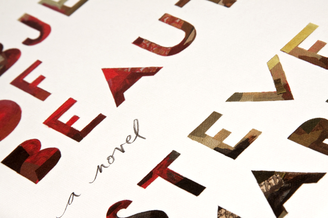
the message: when asked about the message behind the design booth responded “there's beauty in imperfections. the fact that the lettering is done by hand allows for that feeling of a human element to come across.” i love that.

influence vs inspiration: one last thing booth said that struck me was that on this project he learned how to balance the difference between inspiration and influence. i think a lot of creative people struggle with the balance between influence and inspiration, given that most people need a combination of both. you really see the successful balance here when you see booth's work in the context of its influences. he was able to find the right balance, pulling from influences but ultimately creating an original "object of beauty" that feels all his own.

read the full interview here.