these are phenomenal. you guys have to go check out "hipstory" by amit shimoni immediately. that is all.
oh, and the top one is my fave. cuz obvs.

hillary clinton

charles de gaulle

queen elizabeth

dalai lama
jfk

angela merkel
these are phenomenal. you guys have to go check out "hipstory" by amit shimoni immediately. that is all.
oh, and the top one is my fave. cuz obvs.
hillary clinton
charles de gaulle
queen elizabeth
dalai lama
jfk
angela merkel
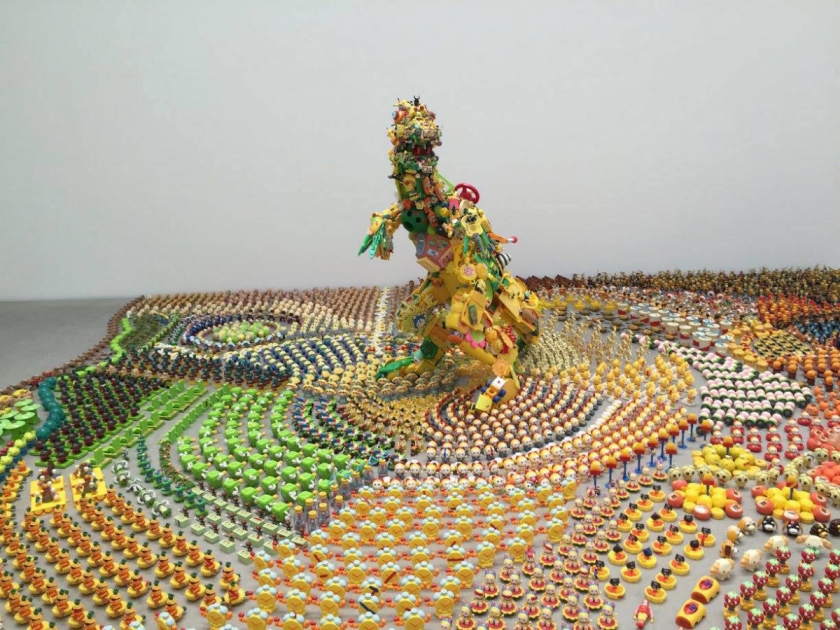
crazy cool installation from japanese artist hiroshi fuji featuring over 50,000 recycled toys.
love the rainbow of colors. so much detail in this - from the organization by color to the organization by shape and style. the more you look at these images the more impressive (and insane!) the installation feels.
via creative boom
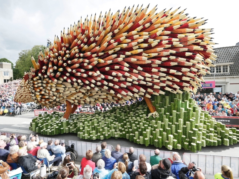
so, this is how the netherlands celebrates van gogh.
it's called corso zundert, and it's a legendary parade with massive floats designed and decorated with millions of dahlias. every year there is a new theme and this year, the theme is the celebration of vincent van gogh, who was born in zundert.
the town launched the parade in 1936 as a way to celebrate their role as a global supplier of dahlias.
so cool.
via creative boom
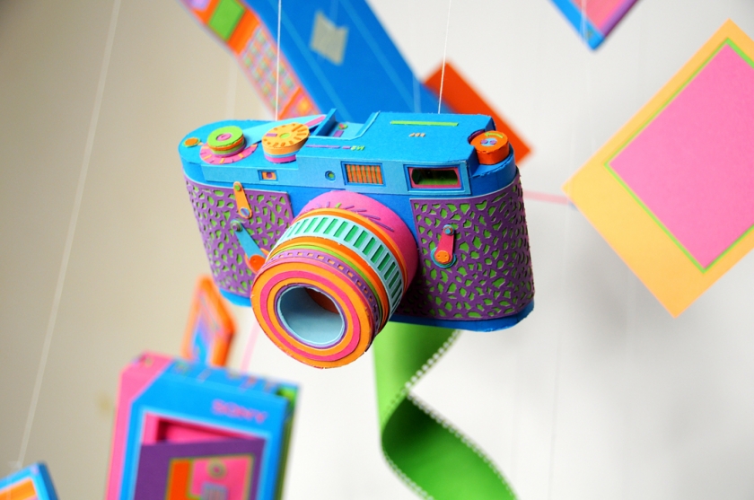
more awesome work from french paper artists zim&zou.
lucie thomas and thibault zimmerman are both based in paris, trained as graphic designers and just generally crazy talented. they create all of the elements of their installations completely by hand - from paper cutting to molding and sculpture. i love seeing someone work in paper in a more crafted way and relying on more delicate techniques than the digital tools most people are moving to.
they have a ton of beautiful work but this series is one of my favorites.
via creative boom
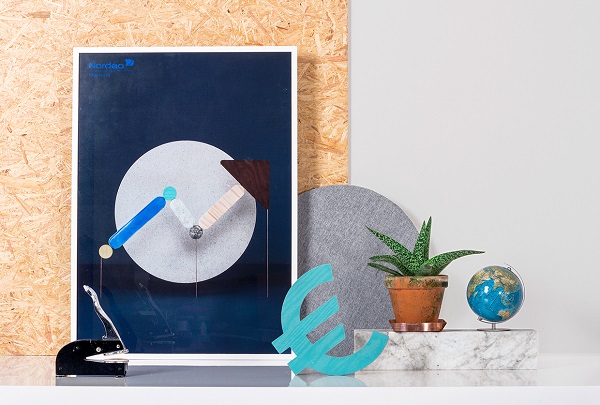
a very cool re-brand from swedish creative agency snask for investment bank nordea markets. take a look at the accompanying film below - using all handmade and handpainted products.
don't see it reflected on their website! but cool in theory.
via design taxi
hey you urban gardeners.
take a look at this beautifully designed, origami-inspired planter from london-based studio ayaskan. it's designed to expand as the plan grows, allowing you to avoid the process of repotting. it's called "growth" and while it's still just a concept, they are working on beginning production soon. pretty cool!
from the studio: "the life cycle of a plant is a transformation, from an early seed to its full grown size; the blooming of a flower, the unfolding of a leaf, the branching of the roots... this process is what growth aims to capture within a plant pot."
via huh magazine
take a look at this cool typography project from marianne beck. the danish-born, paris-based designer creates a typeface out of very neatly cut and placed pieces of scrap paper. scrap paper!
it's a very simple, but beautifully cohesive and clever series of letters. from trash to treasure indeed.
the letter A
the letter B
the letter C
via it's nice that
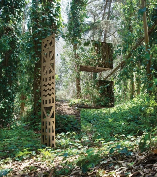
today i'm sharing a very cool project from american design studio character, titled "look closer." the project consists of sculptures made of wood and mirrors and reflects (literally!) the idea that a simple shape and an interesting material can make any setting an inspiration for design. the project was created for san francisco design week so it used the initials of the event as the core of the pieces. i love that the wood showcases the industrial design of the pieces while the mirrors reflect back to you the beauty of nature.
via creative boom
remember these paper birds? well, now i've got some equally cool paper cityscapes for you. these pieces by artist hattie newman are seriously amazing. clever, complex, colorful and kinda stylish, right?
via creative boom
meet my new minimalist hero, mr. andrew b. myers. take a look at these photos. yes, people. these are photographs. myers, a canadian photographer based in new york, carefully composes different objects and shoots them in perfectly designed, minimalistic patterns. he shoots these in flat light so that they appear illustrated. so cool.
via people of print
love these images of pablo picasso. these are part of a collaboration that took place between picasso and gjon mili in 1949. mili pioneered the use of stroboscopic light in photography. pretty amazing to see the master "draw with light."
via honestlywtf
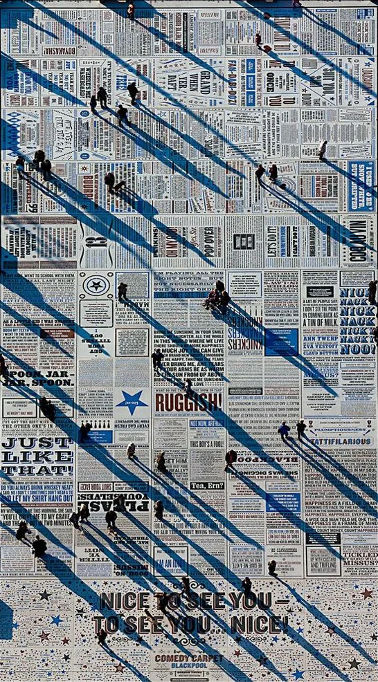
created by artist gordon young, this amazing piece of art covers a massive area of blackpool, england. it's called the comedy carpet and was commissioned to celebrate the history of comedy in the city. it features punchlines, monologues and phrases from comedians who have performed in blackpool. so cool.
three minutes to leave you inspired for the day. the piece below, by mourad merzouki, features 11 dancers interacting with technology in crazy/cool/beautiful ways.
one of the beautiful things about twitter is that every now and then as you *scrollscrollscroll* something will make you pause and think or smile. even if it's fleeting, every now and then a tweet creates an opportunity for insight or connection or levity in your day. but it's fleeting!
enter onehundredforty. this is an awesome "art experiment" that merges art and design and technology. the way it works is that you select a tweet and they design and print a poster based on your tweet. "designs are made up of several different components, and a set of rules determines how these components are to be combined, including a grid system which adapts to the length of any tweet. if you’re not pleased with the result, you can simply click refresh and see a new design for your tweet." there are 50 original artworks to chose from.
i love this line from their description of the project "we saw twitter as an interesting way to bridge the digital world with the analog. to preserve something that at the moment is just being lost among the 500,000,000 new tweets produced each day."
one of the things that really resonated with me about this project is the idea of bringing the online offline. i've talk about this before, but with the massive amount of content and sharing that happens online i think we need more people and more brands thinking about how to bridge the online and offline, how to connect online sharing with physical experiences.
cool, right? get yourself over to their kickstarter.
via miss moss
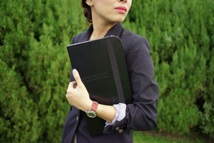
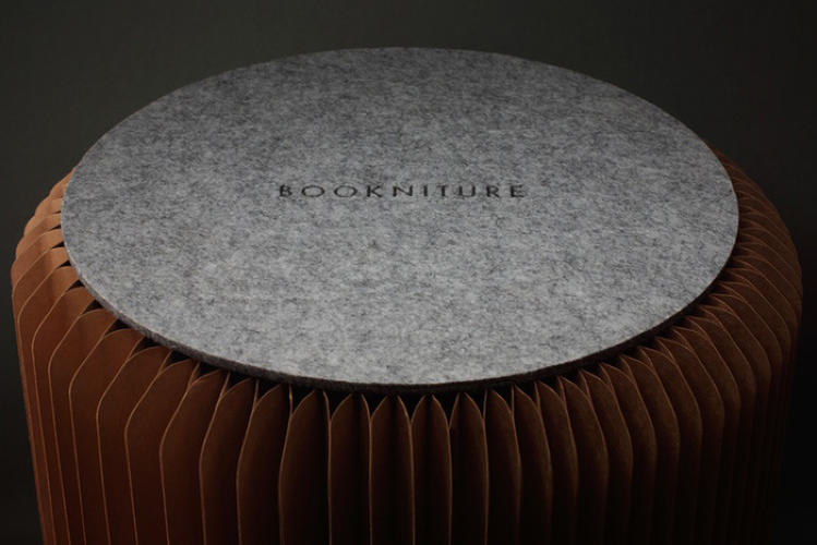
talk about design that does a lot with a little. these moleskine-like books unfold into tables and stools!
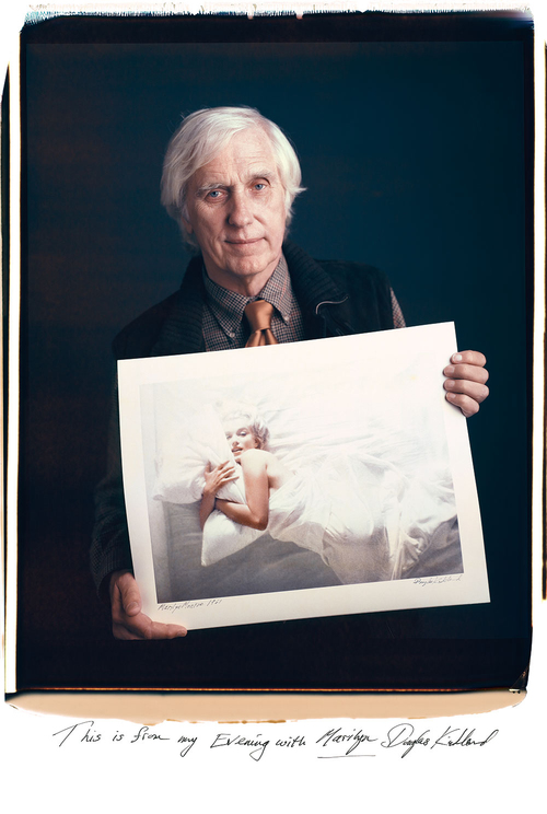
wanted to share this lovely project from tim mantoani, called "behind photographs: archiving photographic legends." mantoani showcases great photographers with their most famous image. a little bit of history, a little bit of photojournalism and a little bit of beauty.
this project also made me think about how these photographers must feel about their most famous images. from a personal and from a creative point of view. it must be hard to have your most famous work be from 20, 30, 40 years ago, no? or maybe not. lots to unpack in these beautiful images.
also, marilyn. can you imagine being behind the lens in that moment?
how cool is this animated type?
this animated typeface is part of a pretty cool project led by animography that had designers all over the world working together. the typeface is called franchise and was made by one type designer and 110 animators. each animator was asked to pick a piece and animate it using no more than 4 colors and 25 frames. they could use whatever technique or style to bring their character to life.
such a beautiful result and such a cool design process!
more from animography here.
via 8faces
i wanted to share a recent article from the atlantic on why new ideas fail and how experts reject innovation. the essence of the article is that new ideas often fail because people have a bias against the new. because "the brain is hardwired to distrust creativity."
and experts specifically/especially resist change precisely because they are experts, because they know too much and are blinded by that knowledge. so, instead of knowledge turning us into critical thinkers, it may turn us into "over-critical thinkers."
what i thought was most interesting was that the article asks whether this is not just a dilemma for innovators, but for creators (and hence creatives) as well.
so, what's a creative/creator/innovator to do? the article says it might be all about disguising new ideas as *kindanew* ideas: "if people are attracted to the familiar, it’s crucial for creative people to frame their ideas in ways that seem recognizable, predictable, and safe...there is an "optimal newness" for ideas that live somewhere between the fresh and the familiar."
and the article ends with an amazing argument for marketing and design, thankyouverymuch.
"creative people often bristle at the suggestion that they have to stoop to marketing their ideas. it's more pleasant to think that one's brilliance is self-evident and doesn't require the gloss of sales or the theater of marketing. but whether you're an academic, screenwriter, or entrepreneur, the difference between a brilliant new idea with bad marketing and a mediocre idea with excellent marketing can be the difference between success and bankruptcy."
i could not have said it better myself!
beautiful scramble above by artist jen wink.
this is so cool. designer joe harrison was thinking about how the nature of logos will change as our screens get smaller and we get more and more mobile, so he created "responsive logos." this project made me pause and think about how branding needs to evolve for the multi-screen, interactive, ADD, always abbreviated world. if you click through and reduce your screen (it’s actually even cooler on your phone) you’ll see the logo evolve into it’s simplest form. the idea is that logos must be "responsive" to the device they're being displayed on.
i am obsessed with the simplicity-driven nature of this project. simplicity forces so much thought and intelligence into design and when it’s done right - and captures a lot with a little - it’s perfection. brands are going to have to do more with less as our interactions with them evolve so click through and see how harrison sees that happening. he plays with coca-cola, chanel, nike, bang & olufsen (shown below), disney and levi's.