such cool and chic branding. i really love the use of gold, the versatility of the icon in the logo and that gorgeous white font.


COOKING UP DESIGN
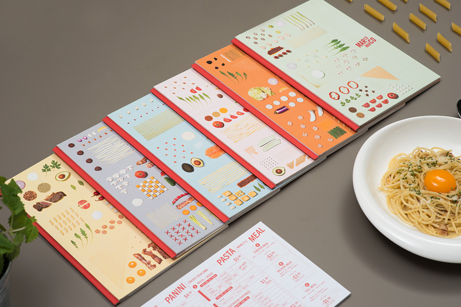
italian food plus minimalist design plus cool branding plus ocd levels of organization? yes please.
take a look at the gorgeous brand identity of marco marco, an italian restaurant chain based in singapore.
created by arce, the design work focuses on simple type, stunning photography and different deconstructed dishes.


MAKE IT POP
gotta love a good creative collaboration. jonathan quintin and matt wilson got together to create a combination of graphic and motion design work, and the combo of their two strengths led to some pretty great branding. the font is playful but still so clean and beautiful. i also love the play on proportion and the way the use of the logo varies throughout the different pieces. cool and clean.

via creative boom
ON YOUR MARKS
great branding often comes from unexpected places. in fact, the best branding i've seen this year was at a wedding! more on that soon.
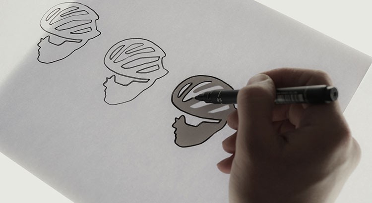
today i wanted to share a beautiful branding project from an unexpected source: a cyclist.
this spring mark beaumont will be riding from cairo to capetown in the hopes of setting a cycling world record - a 100,000 kilometer-long ride. the proceeds from this ride, which he is calling africa solo, will go to orkidstudio, an organization that works to benefit kids and communities through innovative design and construction.
beaumont asked design studio o street to design a logo that could capture the spirit of this amazing undertaking. take a look at the process and sketches below and the inspired idea to combine mark's profile and the continent of africa into the branding of this amazing adventure.


CHIC ON WHEELS
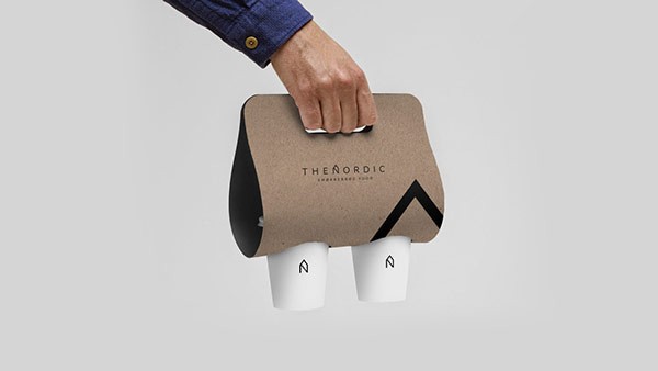
who said food trucks can't be chic?
take a look at the beautiful branding of swiss design student alexandre pietra. she created a full brand identity for a food truck called "the nordic." and no detail went un-noticed.
pietra has a beautifully minimalistic (and classically scandinavian) design influence here to reflect the scandinavian food truck's simple menu.
she also uses the logo in an interesting way, blowing it up and using it at scale throughout the materials. definitely makes everything feel cohesive while still having certain elements feel unique.


via designtaxi
SO, WHAT'S A LOGO ANYWAYS?
i was talking to a friend who is thinking of starting a business the other day. we were brainstorming about what she should think about as she builds her brand, logo, identity design, website design, instagram profile, brand tone, etc. i found it helpful to go back to the basics of what all of these things mean so i thought i’d share those with you. this piece from just creative is a great summary of this stuff so i've condensed it, (tweeked it a little) and copied for you the pieces i think are most important when building or re-building a brand.
ok! let's talk brand, identity and logo.

A BRAND IS the perceived emotional corporate image as a whole. it is an organization, service or product with a ‘personality’ that is shaped by the perceptions of the audience.
many people believe a brand only consists of a few elements – colors, fonts, a logo, a slogan and maybe music. in reality, it is much more complicated than that. you might say that a brand is a ‘corporate image’.
the fundamental idea and core concept behind having a ‘corporate image’ is that everything a company does, everything it owns and everything it produces should reflect the values and aims of the business as a whole.
it is the consistency of this core idea that makes up the company, driving it, showing what it stands for, what it believes in and why they exist. it is not purely some colors, some typefaces, a logo and a slogan.
THE IDENTITY IS MADE UP OF the visual aspects that form part of the overall brand.
in most cases, identity design is based around the visual devices used within a company, usually assembled within a set of guidelines. these guidelines that make up an identity usually administer how the identity is applied throughout a variety of mediums, using approved color palettes, fonts, layouts, measurements and so forth. these guidelines ensure that the identity of the company is kept coherent, which in turn, allows the brand as a whole, to be recognizable.
the identity can be made up of many visual devices:
- a logo (the symbol of the entire identity & brand)
- stationery (letterhead + business card + envelopes, etc.)
- marketing collateral (flyers, brochures, books, websites, etc.)
- products & packaging (products sold and the packaging in which they come in)
- apparel design (tangible clothing items that are worn by employees)
- signage (interior & exterior design)
- messages & actions (messages conveyed via indirect or direct modes of communication)
- other communication (audio, smell, touch, etc.)
- anything visual that represents the business
all of these things make up an identity and should support the brand as a whole.
THE LOGO identifies a business in its simplest form via the use of a mark or icon. it is the corporate identity and brand all wrapped up into one identifiable mark. this mark is the symbol of the business as a whole.
a logo identifies a company or product via the use of a mark, flag, symbol or signature. a logo does not sell the company directly nor rarely does it describe a business. logo’s derive their meaning from the quality of the thing it symbolizes, not the other way around – logos are there to identity, not to explain. in a nutshell, what a logo means is more important than what it looks like.
so, in summary:
brand: the perceived emotional corporate image as a whole.
identity: the visual aspects that form part of the overall brand.
logo: identifies a business in its simplest form via the use of a mark or icon.
and, as always, if you want to chat branding, identity design, or logos, feel free to shoot me an email!
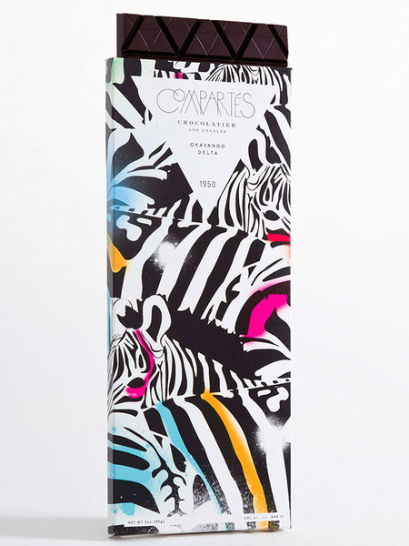
CUZ IT'S PRETTY: CHOCOLATE EDITION
in preparation for valentine's day: the prettiest chocolates ever. compartes has the most beautiful packaging design. here are a few of my favorites, (obviously) starting with with the one inspired by venezuela.


NUMERO UNO
oh man. i'm in love.

this is the identity design and branding for 1 hotels, a new eco-conscious chain (from starwood) launching properties in manhattan, brooklyn and miami.
the branding is consistent but flexible, clean but not boring, and says a lot with a little. it's just so good.

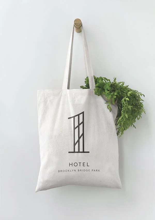
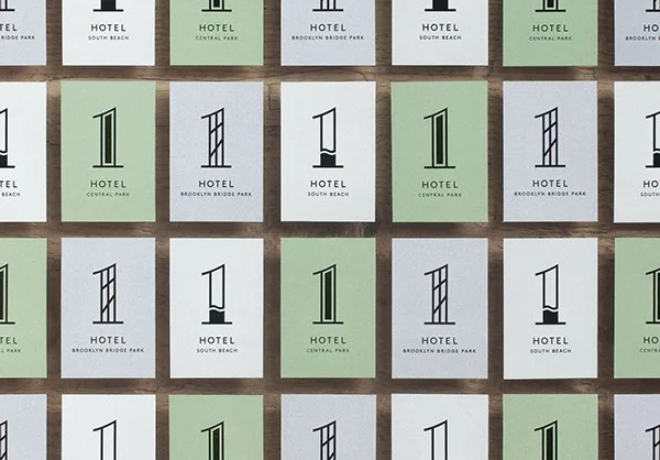
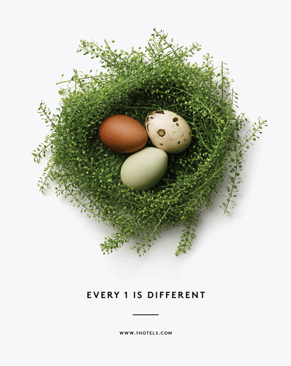
creative direction is from michael ian kaye and christian cervantes. design is from chris rogers and jules tardy.