FACE TO FACE

i really loved going through this collection from viktor & rolf for spring-summer 2016. we have all seen work inspired by cubist picasso a million times, but this one felt kind of different and fresh to me. i love the progression of the pieces and that the starting point is a little white dress. each piece stretches the reference a bit further, making the models less and less visible and increasingly more of a vehicle for these moving sculptures they've created.

the other interesting thing is that cubism is inherently not about "pretty." it's about asymmetry (which the eye often finds confusing AKA ugly) and disrupting the peace by breaking up the pieces and throwing them around. the cool thing about this interpretation, however, is that it feels light and really beautiful.

Viktor & Rolf
Viktor & Rolf
Viktor & Rolf
Viktor & Rolf
Viktor & Rolf
Viktor & Rolf
Viktor & Rolf
Viktor & Rolf
Viktor & Rolf

via wwd
INSTA INSPO

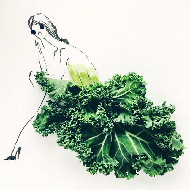
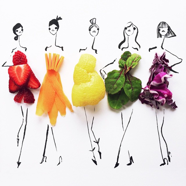
a big part of my job at framebridge is to reach out to content creators and design influencers, share what we do, and make collaborations happen. one of the first people i reached out to when i first got to framebridge was monling lee. she is one of my all time instagram crushes.

and since she's based in dc, we got drinks and ended up talking for nearly three hours about design, the power of instagram and the importance of having a creative point of view. we also talked about the fact that she had been creating beautiful content online for years but had never seen her work in print. 

so, naturally, we fixed that. and this week we shared an interview with her on the framebridge blog so others could find inspiration in her work too.

Monling Lee

FLAT FASHION

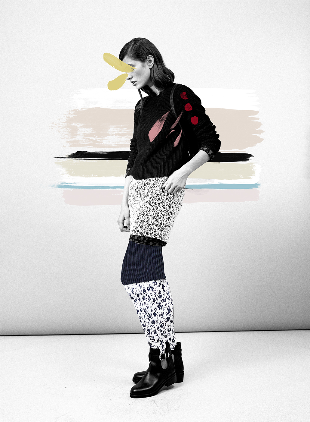
you know i love a creative twist. these, my friends, are PHOTOS not vector art prints. they are shot by erik madigan heck for junta watanabe's fall 2015 collection, and designed to create a flat, graphic feel. super stunning.

Junya Watanabe
Junya Watanabe
Junya Watanabe
Junya Watanabe
Junya Watanabe
Erik Madigan Heck

more here.

via design milk

ONE FINE FRIDA

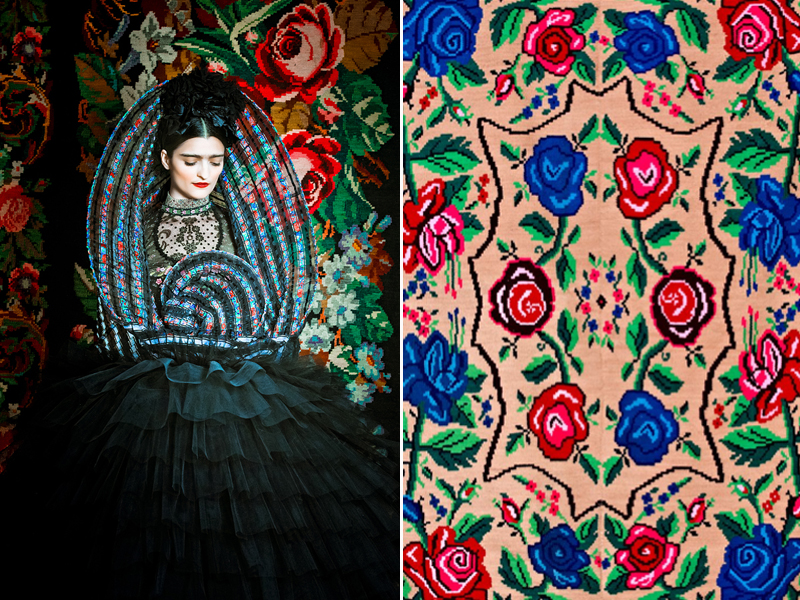
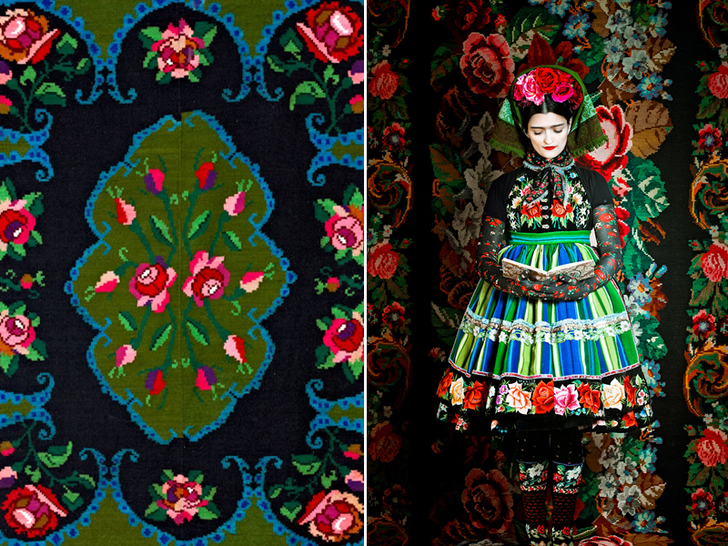
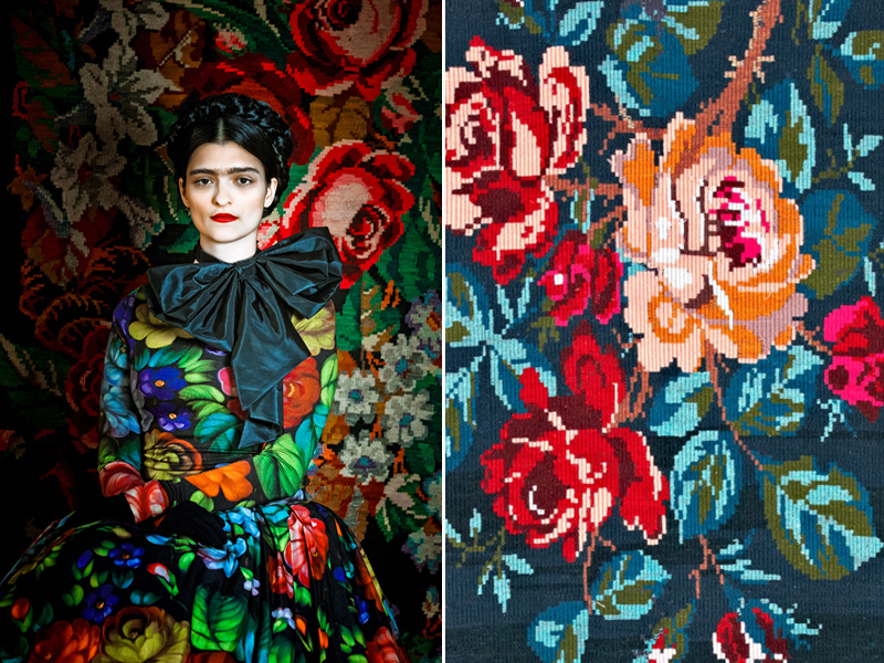
i love when fashion moves into art and design. viennese fashion designer susanne bisovsky does just that, always incorporating art and design into how she constructs and presents her clothes. i especially love how she did it with this collection i stumbled on from a couple of years ago. she combines the rich, colorful details of viennese textile construction with the always inspiring frida kahlo. from a purely visual perspective images of frida always conveyed strength, color, layers of texture and a richness of pattern - both on frida and in the background around her. i love bisovsky's interpretation of that. 

Susanne Bisovsky's Frida Collection

more here.

images via honestlywtf

ONE TO WATCH

interesting new series coming from gap. in preparation for spring, gap has launched a 12 part "microseries" on instagram. the series is called "spring is weird." every week a new (15-second) episode will be rolled out on instagram.

gap says the series will be about "the burgeoning romance between slate and dano, as they navigate chance encounters, first dates and moody spring weather in the hope of finding their perfect fit. as they grapple with what is real and what is social "content," they begin to suspect that their lives may not be theirs alone."

here's the first one:

definitely one to watch! no one has really done this before and as big brands try to figure out how to best leverage instagram it's interesting to watch new creative attempts to leverage instagram's community and format. the instagram community is deeply connected and creative so i'm into the fact that gap is taking a slightly more weird and creative approach on this platform. also, any time a platform or medium forces a brand to be tighter and more deliberate about their branded content i think it does a lot of good (from both a creativity and a content perspective). excited to watch this unfold. who knows? maybe it'll make gap cool again. probably not, but i'm open to the idea!

more here.

IF CONTENT IS KING, CONTEXT IS QUEEN

this one is key for designers but i think it applies to anyone who ever presents an idea. in essence, the lesson is that presentation matters, specifically context. context is key for people to understand your vision, and one step further, be excited about it. they have to visualize it and it's your job to help them do that. (remember the castles?) that might mean convincing a designer at your organization to do you a favor and put some time into an important internal report to ensure you get buy in. it might also mean spending time setting up an idea in a pitch deck, outlining your mission statement a little deeper and with stronger visuals, or using color to better highlight what numbers are going up and what numbers are dropping in a boring data report.

david airey's blog spoke to this recently. see below for an excerpt, and here for the full post.

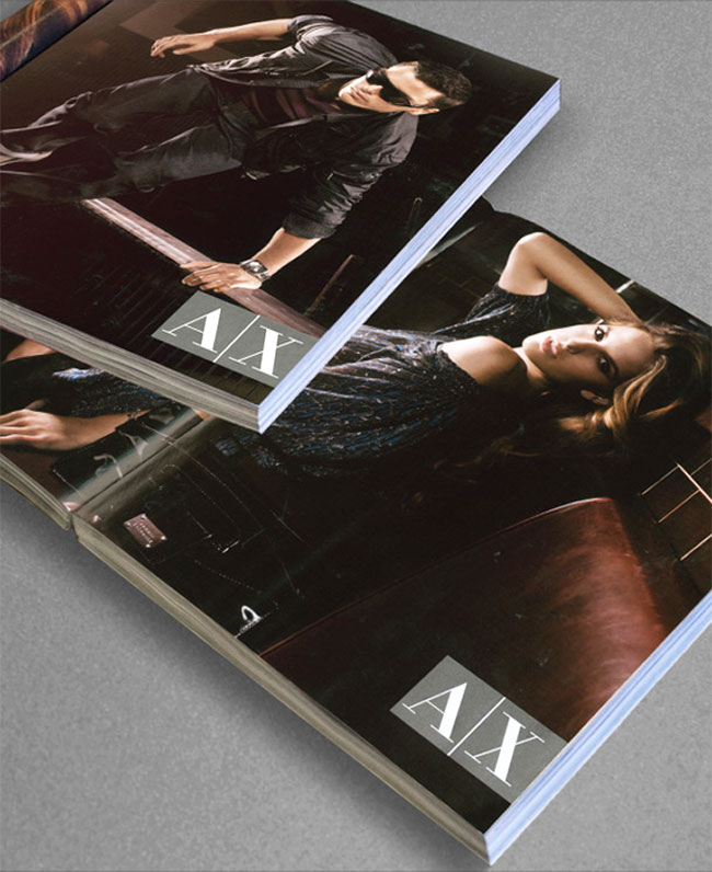
"When Giorgio Armani was first shown Chermayeff & Geismar’s new logo for Armani Exchange (A|X), he rejected it outright. The designers later found out that due to Armani’s infamously busy schedule, the new mark had been presented to him between meetings, on a white piece of paper."

"The A|X directors of advertising and branding, Tom Jarrold and Matthew Scrivens, then suggested approaching Armani a second time (which they almost never do) with the entire Chermayeff & Geismar presentation, which showed the logo in such applications as magazine ads, storefronts, and billboards."

"Once Armani saw the increased visual impact of the new identity in context, he immediately approved it."

so, friends. remember: presentation matters. go the extra mile to help your audience (your boss, your client, your team) visualize what you're selling. and when it comes to presentation, if content is king, context is queen.