back to the basics! i love this beautifully organized (and color coded) piece from brent summers of digital telepathy. they give us the various tools, elements, and disciplines of design, all neatly conveyed in one place.
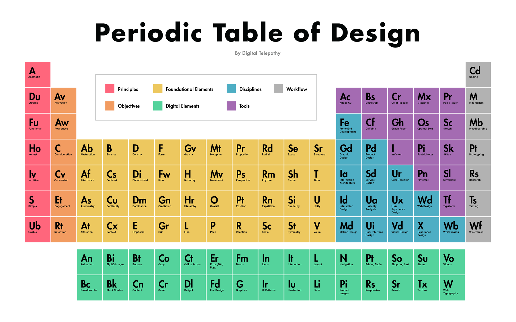
via design taxi
back to the basics! i love this beautifully organized (and color coded) piece from brent summers of digital telepathy. they give us the various tools, elements, and disciplines of design, all neatly conveyed in one place.
via design taxi
a nice little infographic for you today! this overview of the basic elements of design is a good one to bookmark. and if you don't have a design background at all, try looking at some of the things i've posted through the lens of one of these elements.
via design taxi
if you have fifteen minutes i highly suggest you spend some time today with design master john maeda. insightful and funny, his ted talk reflects on the relationship between content and design. he has spent his (exceptional) career at the intersection of art, design and technology and has fascinating insights on how creativity and technology intertwine.
maeda spent about a decade at MIT's media lab before becoming president of the rhode island school of design. last year he headed west to silicon valley and has since become - in addition to an established design icon - an important teacher on the power of design in business.
i have never been compelled to copy a whole article over here on the boss aesthetic but this one is worth it. the article below, titled "what artisanal brands can teach us about using technology to humanize business," is from entrepreneur this past january but a friend recently re-sent it to me with the subject line "totes you." to which i say, yup! this article really encompasses SO MUCH of what i think needs to happen in how brands connect with consumers today. it also connects to a lot of what i share here - from my favorite products to the branding and marketing examples i share. my favorite passage and then the whole article below. take a look! and i'd love to hear what you think in the comments below.
"Consumers are embracing the idea of having more personal and direct connections to the products that inhabit their lives. The great irony of these back-to-basic principles? Technology is playing a critical role as an enabler of a more personalized way of doing business -- one that lets consumers connect with products as their father’s father once did at the local country store. The trend underscores one of the great paradoxes of the digital age: In an increasingly automated world of interconnected everything, consumers are craving new products that they can have an emotional connection with -- items that are customized to their personalities and tastes."
What Artisanal Brands Can Teach Us About Using Technology to Humanize Business
By Randy Komisar, Partner at Kleiner Perkins Caufield & Byers
Bayard Winthrop made a big bet with a small idea a few years ago. When the San Francisco-based entrepreneur set out to design, make and sell a high-quality sweatshirt at a low-end price ($70), he didn’t go the simple route.
Winthrop didn’t hop a plane to Mumbai or Bangalore to outsource production and open a storefront in a trendy shopping district. Instead, he contracted with a small factory in San Francisco and put up a website. (Disclosure: I serve as an informal advisor to Winthrop.)
More important, he focused on absolute product excellence, not promotional externalities. He claims that 80 cents of every dollar invested in retail is unrelated to the product itself. This paid off months later when Slate's Farhad Manjoo declared his product “the greatest hoodie ever made.” Within 36 hours, Winthrop’s direct-to-consumer business, American Giant, was humming. Within months, he had sold thousands of sweatshirts and was swamped with back orders.
Winthrop’s idea, of course, isn’t a small one any longer. It’s tightly linked to the same dynamic driving the farm-to-table movement and the boom in artisanal manufacturing. In each of these new models, consumers are embracing the idea of having more personal and direct connections to the products that inhabit their lives.
The great irony of these back-to-basic principles? Technology is playing a critical role as an enabler of a more personalized way of doing business -- one that lets consumers connect with products as their father’s father once did at the local country store.
The trend underscores one of the great paradoxes of the digital age: In an increasingly automated world of interconnected everything, consumers are craving new products that they can have an emotional connection with -- items that are customized to their personalities and tastes. And consumers are beginning to look beyond markets driven by mass production and low cost for everything from clothes to cars.
Across dozens of industries, Winthrop and other entrepreneurs are creating new “made-to-order” personalization platforms, cutting out as many middlemen as possible and relying heavily on social and mobile technologies to forge lasting relationships with new customers.
Three core principles are driving success for companies like American Giant and many others. Here’s my take on what those principles are and why they matter:
1. Embracing extreme authenticity.
When it comes to consumer products, a complex web of manufacturers, wholesalers, retailers, advertisers and marketers factor heavily into the ultimate price of a good. All these third parties add layers of complexity and cost between when the product is made and then when it's sold.
Manufacturers might produce higher-quality products, but in the retail sector they typically sell them at higher prices (as much as 13 percent higher, in some cases) to account for distribution and marketing.
How can companies remove these costs -- and also spark new connections with consumers? First, they can source the manufacturing of their goods locally and use the Internet as a primary storefront.
By contracting with a San Francisco factory ( later adding three more plants in North Carolina) and sourcing his cotton and other supplies in the United States, Winthrop has eliminated the high cost of producing sweatshirts overseas. And he keeps real estate costs low by selling his apparel only online and he spends little on marketing.
With the extra capital freed up by lower distribution and marketing costs, Winthrop can afford to buy quality cotton and pay workers a relatively generous wage -- $17 per hour.
Zappos and Amazon may have built massive online stores, but they remain product curators -- not makers -- at their core.
Companies like Warby Parker took this model a step further by not only delivering items purchased online, but also creating them in-house. By offering to deliver its own product (eyeglass frames) to customers with the added bonus of no obligation to buy them, Warby put choice in the hands of the customer while saving on the real estate costs of an in-store experience.
2. Letting customers be the voice of a brand.
Artisanal manufacturers are providing consumers amazing new products that they can love and share with their vast online networks. And through social media, they serve as authentic cheerleaders to drive sales. By relying on customers to become the collective voice of their brands, companies free up capital that would otherwise be spent on expensive marketing and distribution processes.
Dozens of companies are tapping into this concept to build and grow promising new businesses. Brewers and distillers like New Belgium Brewing and Woodinville Whiskey have taken big strides in advancing the quality of craft-made beverages while relying on consumers to spread the word.
Crowdsourced creation has also enlisted technology and online platforms to create great products. Take Arizona-based Local Motors. The company provides an online space for customers to design, build and sell custom-made vehicles and parts.
Such companies perhaps owe a portion of their success to the farm-to-table innovators of the last decade, who showed how the quality of home-grown produce wasn’t just better but connected to consumers’ core values in ways that supermarkets simply did not. Hundreds of other industries and sub-industries in the U.S. economy are next in line to undergo the same transformation.
3. Practicing extreme honesty.
Transparency is integral to the companies' building lasting relationships with customers today -- and allows for a focus on creating great products. Successful companies can’t hide mistakes or internal goings-on like they once could.
Extreme honesty is the new policy of successful business in the 21st century. The days of coverups and pushing issues under the rug are gone. Humans are fallible and so are companies. Admitting this will take a company a long way with its advocates.
At American Giant, Winthrop has been very open about the company’s inability to meet demand. Some customers have waited months for a hoodie. This level of transparency guarantees that quality products will receive the recognition they deserve from the customers who love them.
The artisanal movement certainly won’t fill the hole left by the decline in U.S. manufacturing in the last 30 years, but it’s helping to forge a new model that lets some companies marry the best that technology can offer with the human values and sense of individuality that consumers increasingly crave. In the end, the melding of these elements really will put the greatest products ever made just one click away.
This article is adapted from The Technology of Us, an ebook hosted by TeleTech that explores the intersection of technology and humanity.
remember this post about why we are attracted to certain images? well, here is part two: a master class from wes anderson, appropriately called centered, compiled by kogonada. when i am in need of design inspiration, wes anderson is often the answer. wes anderson movies and looking at the costume design of cirque du soleil productions. works every time!
p.s. part three of this master class is just to watch all of the grand budapest hotel.
i was talking to a friend who is thinking of starting a business the other day. we were brainstorming about what she should think about as she builds her brand, logo, identity design, website design, instagram profile, brand tone, etc. i found it helpful to go back to the basics of what all of these things mean so i thought i’d share those with you. this piece from just creative is a great summary of this stuff so i've condensed it, (tweeked it a little) and copied for you the pieces i think are most important when building or re-building a brand.
ok! let's talk brand, identity and logo.
A BRAND IS the perceived emotional corporate image as a whole. it is an organization, service or product with a ‘personality’ that is shaped by the perceptions of the audience.
many people believe a brand only consists of a few elements – colors, fonts, a logo, a slogan and maybe music. in reality, it is much more complicated than that. you might say that a brand is a ‘corporate image’.
the fundamental idea and core concept behind having a ‘corporate image’ is that everything a company does, everything it owns and everything it produces should reflect the values and aims of the business as a whole.
it is the consistency of this core idea that makes up the company, driving it, showing what it stands for, what it believes in and why they exist. it is not purely some colors, some typefaces, a logo and a slogan.
THE IDENTITY IS MADE UP OF the visual aspects that form part of the overall brand.
in most cases, identity design is based around the visual devices used within a company, usually assembled within a set of guidelines. these guidelines that make up an identity usually administer how the identity is applied throughout a variety of mediums, using approved color palettes, fonts, layouts, measurements and so forth. these guidelines ensure that the identity of the company is kept coherent, which in turn, allows the brand as a whole, to be recognizable.
the identity can be made up of many visual devices:
all of these things make up an identity and should support the brand as a whole.
THE LOGO identifies a business in its simplest form via the use of a mark or icon. it is the corporate identity and brand all wrapped up into one identifiable mark. this mark is the symbol of the business as a whole.
a logo identifies a company or product via the use of a mark, flag, symbol or signature. a logo does not sell the company directly nor rarely does it describe a business. logo’s derive their meaning from the quality of the thing it symbolizes, not the other way around – logos are there to identity, not to explain. in a nutshell, what a logo means is more important than what it looks like.
so, in summary:
brand: the perceived emotional corporate image as a whole.
identity: the visual aspects that form part of the overall brand.
logo: identifies a business in its simplest form via the use of a mark or icon.
and, as always, if you want to chat branding, identity design, or logos, feel free to shoot me an email!
great commentary on branding from ije nwokorie of design indaba. nice insights on the importance of authenticity and transparency in branding. and it's just 5 minutes! take a look.
via david airey
google has been collecting some great content over on think with google. i especially liked this piece by rei inamoto, from AKGA, about how marketers need to think about mobile.
he says that while the specific devices and behaviors around mobile will continue to evolve, there are three essential principles or questions to consider when building mobile products: is it portable? is it personal? is it perpetual?
"1. portable: your idea must be able to go where the user goes. if it can’t follow the user through his or her day, it's not mobile.
2. personal: the promise of digital was always and will always be its potential for personalization. your idea must cater to the individual needs and desires of every user—and the experience must be unique to her.
3. perpetual: your idea has to stand the test of time—24 hours a day, 365 days a year—because mobile is always on. the first thing you reach for in the morning is probably a mobile device. at the office. on your lunch break. curled up on your couch at home. even when you're sleeping, your mobile device is with you and on."
we often talk about the 4 P's of marketing: product, price, place and promotion; these 3 P's of mobile seem like a timely addition to that framework.
inamoto also shares five great examples of companies bringing his “3 P’s” to life in everything from textbooks to makeup and backseat driving. my favorite is the one below, txtbks. this is a company that wants to make textbooks more accessible to children in the philippines by making school books accessible via text (!) on old analog mobile phones.
remember this post, from front, that explained responsive web design? love that one.
front created another series of gifs I wanted to share, this one about the history of web design.
it's amazing to see how quickly web design has evolved and kinda fun to learn a little bit more about what all these terms we always hear (java, flash, css) really mean. click through to read the full explanations!
the dark ages of web design (1989)
tables – the beginning (1995)
javascript comes to the rescue (1995)
the golden era of freedom – flash (1996)
CSS (1998)
mobile uprising – grids and frameworks (2007)
responsive web design (2010)
the times of the flat (2010)
the bright future (2014)
read the full history and learn more over here.
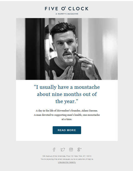
i know you send a lot of emails. and i know some are very important to you. but here's the thing: usually no one reads them. so, here's an example of an email that was well done that i think we can all learn from. these lessons apply to those using e-communications for marketing but they also apply to anyone who wants to get their emails read! generally speaking, if you're writing emails, you can probably be doing a better job at getting your emails read and your messages across. like this awesome email from pandora, this email from harry's is a lesson in simple and effective email design.
from: harry's
subject line: the moustache that changed the world
sent: on a saturday earlier this month at 10am
here's why it's good:
1. timely: the content is seasonal, it ties to what's on people's minds. people are thinking about movember and this email hopes to build on that.
2. simple: self-explanatory subject line, one image, one quote, one block of text, one action, one link. BEAUTIFUL.
3. relevant but different: this isn't usually what readers get from harry's so it stands out. but (this is important) it still ties nicely with what they expect from the brand.
4. thoughtful send time: when are guys likely to spend a couple of minutes reading through an email from harry's? saturday morning sounds about right to me.
click here to learn more about movember (only a couple of hours left!) over at harry's.
and check out my first post on harry's: meet harry! and a note on branded content.
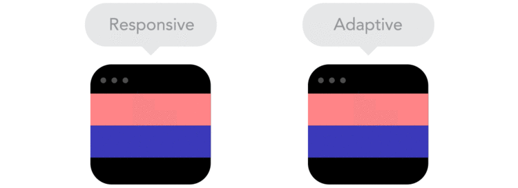
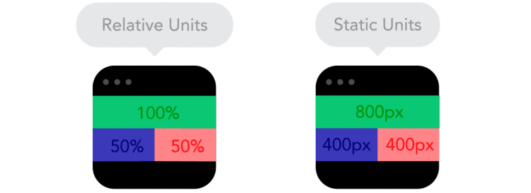
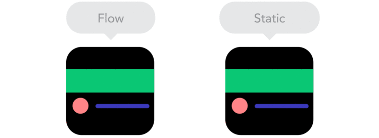
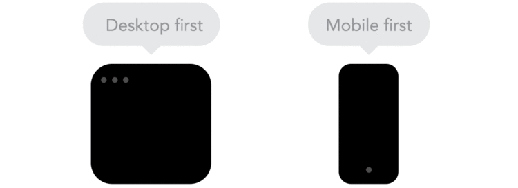
you know when people talk about mobile being *superduperimportant* and then go on and on about responsive design? yeah, usually they don't either. so here you go! a couple of quick and informative gifs that explain the basics of responsive design.
take a look and then play around with some of your favorite sites on your mobile device. you'll start noticing how these differences affect the functionality and design of the sites and brands you engage with via mobile. and hopefully feel like a smarter user and consumer of design.
via fastcompany and froont
"Responsive designs fluidly expand, whereas adaptive designs hitch as you expand a browser or viewport."
"Positioning your designs elements using pixels as X,Y coordinates can cause a site designed for one screen to look weird on another. Use relative units, like percent of the screen, instead of static units like pixels."
"Breakpoints allow the layout to change at predefined points, i.e. having three columns on a desktop, but only one column on a mobile device."
"As screen sizes become smaller, content starts to take up more vertical space and anything below will be pushed down. It's called the flow."
"By using nesting elements, you can make it so collections of onscreen elements adapt to a shrinking or expanding screen as one, instead of individually."
"Sometimes it's great that content takes up the whole width of a screen, like on a mobile device, but having the same content stretching to the whole width of your TV screen often makes less sense."
"Technically there isn't much of a difference if a project is started from a smaller screen to a bigger screen (mobile first) or vice versa (desktop first). Yet it adds extra limitations and helps you make decisions if you start with mobile first."
"Does your icon have lot of details and some fancy effects applied? If yes, use a bitmap. If not, consider using a vector image." A vector image can more properly adapt to different resolutions.
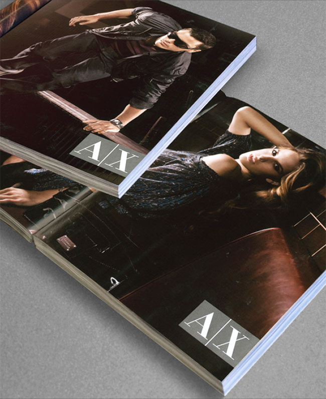
this one is key for designers but i think it applies to anyone who ever presents an idea. in essence, the lesson is that presentation matters, specifically context. context is key for people to understand your vision, and one step further, be excited about it. they have to visualize it and it's your job to help them do that. (remember the castles?) that might mean convincing a designer at your organization to do you a favor and put some time into an important internal report to ensure you get buy in. it might also mean spending time setting up an idea in a pitch deck, outlining your mission statement a little deeper and with stronger visuals, or using color to better highlight what numbers are going up and what numbers are dropping in a boring data report.
david airey's blog spoke to this recently. see below for an excerpt, and here for the full post.
"When Giorgio Armani was first shown Chermayeff & Geismar’s new logo for Armani Exchange (A|X), he rejected it outright. The designers later found out that due to Armani’s infamously busy schedule, the new mark had been presented to him between meetings, on a white piece of paper."
"The A|X directors of advertising and branding, Tom Jarrold and Matthew Scrivens, then suggested approaching Armani a second time (which they almost never do) with the entire Chermayeff & Geismar presentation, which showed the logo in such applications as magazine ads, storefronts, and billboards."
"Once Armani saw the increased visual impact of the new identity in context, he immediately approved it."
so, friends. remember: presentation matters. go the extra mile to help your audience (your boss, your client, your team) visualize what you're selling. and when it comes to presentation, if content is king, context is queen.
wanna get your emails read? bookmark this!
whether you're a marketer thinking about being more effective via email or you're just thinking about how to get your boss to read your emails, i've got some suggestions. here's a useful (and pretty!) list of email marketing best practices. click through to see the full version - which is pretty AND clickable - and read through all of the tips.
it's a lonnggg article but if you work in email marketing it's very valuable. number two worked on me like a charm when i first signed up for squarespace. four is key and an important reminder to make your data work for and with your marketing. number one is my number one digital marketing mantra.
if you DO NOT work in email marketing, do you send emails to people that matter about things that matter to you? then this is relevant to you too! i can't count how many times i've seen a long email from a friend looking for donations/support, a colleague looking for feedback on something, or been cc'ed on a crazy long email to a senior manager that fell flat. you can apply almost all of these tips to those emails: be smart about highlighting what you want them to do (tip 8), be mindful of pulling out the most important points (12), be strategic about subject lines (10) and so on.
whether you're a marketer or not, we can all be doing a better job of getting our messages across.
more here. and for a great example of effective emailing check out this post about pandora from a couple of weeks ago.
“as the story goes, walt disney had a key piece of advice to the executives planning the magic kingdom: build the castle first. disney understood that everyone involved in achieving his vision - from the madison avenue advertisers selling it to the guys hacking their way through the mosquito-infested florida swamp - needed literally to see the beauty of this vision to remind them what they were working toward. so the first thing to rear up out of the swamp was, in fact, cinderella’s castle, which, with its fluttering flats and whimsical turrets, was the very embodiment of the magic he intended to make.”
this is from a post on harvard business review's blog and an extension of a piece of advice i heard a couple of times during business school: build the castle first.
the advice boils down to this: leadership is bringing a vision to a group. with a new idea, people need to see something, have something to hold onto, they need to feel it before they can get on board.
hence, the castle.
in order to lead in a new direction - and break down barriers - you have to provide that *littlesomethingspecial* for people to build from. whether you’re selling friends and family on a new startup idea or building out a new venture within a corporate structure, think about building your castle first - the prototype, the logo, whatever your symbol may be. it shows people you’re for real and gives them just enough of the tangible stuff so that they can dream with you.
castle illustration by amy broadwell.
i wanted to share some of graham smith's excellent analysis of foursquare's new logo. i was going to write my own take on this but felt his analysis was such a smart lesson in how to think about branding and logo design i decided to just share it as is. the point at the end about incorporating references into a logo (or not) is especially interesting. i cut some of his language for brevity but everything below is directly from him! you can read the full post here.
from graham:
"Foursquare's New Logo Redesign Goes Superhero
Direct from the folks at Foursquare: “…if you build a totally new app, you need a totally new logo. Our logo is changing from the check-in checkmark to something representing the new Foursquare. We designed it to be a mix of map pin and superhero emblem. We’ve always thought of Foursquare as giving you superpowers to explore your city, and our new logo reflects that vision. It’s coming soon to a homescreen near you.”
The good.
The logotype/wordmark/brand name yada yada, is pretty nice: it has presence, it’s pretty damn solid, has a nice rich almost Ultra Violet style to the colouring.
I also like the two colours, but they also remind me a little too much of the Flickr colour palette.
The bad
What is meant to be super is really really bad.
That ‘F’, that is a map-pin, and a superhero emblem just looks awful. The pinky outer keyline is far too kludgy, the outer corner radius look far too large compared to the inner radius. Which then leads to the corner radius of the ‘F’ which looks like an afterthought, BUT don’t come close to matching the far softer corner radius on the Foursquare wording.
Why oh why could they not have at least kept some consistency with the corner radius from the superhero ‘F’ emblem to that in the main wording? That would have at least made up for one of the most awkward looking logomark and logotype miss-matches I have seen in a long time.
There is nothing in this combination logo that looks like it should be one of a nice and cohesive whole. It’s super disjointed at best.
Conclusion:
The typography for the main Foursquare brand name is really good, has a strong presence to it, and has style. What I simply cannot get my head around is how completely unsymbiotic the relationship between this and that God awful superhero ‘F’ emblem really is.
I’m not even sure a map-pin, as a visual reference, was ever needed, especially how long Foursquare has been around. It’s not like Foursquare is a new brand having something to prove about it’s mission and purpose, and almost feels ever so slightly patronising.
The map-pin reference is way too over dramatic, and unnecessary. Almost sure a classy icon could have been crafted from that really strong logotype without force serving up well used, and tired visual cliches.
The new Foursquare logotype is all grown-up, yet the icon feels it’s taken a huge backwards step in this established brand’s maturity. "
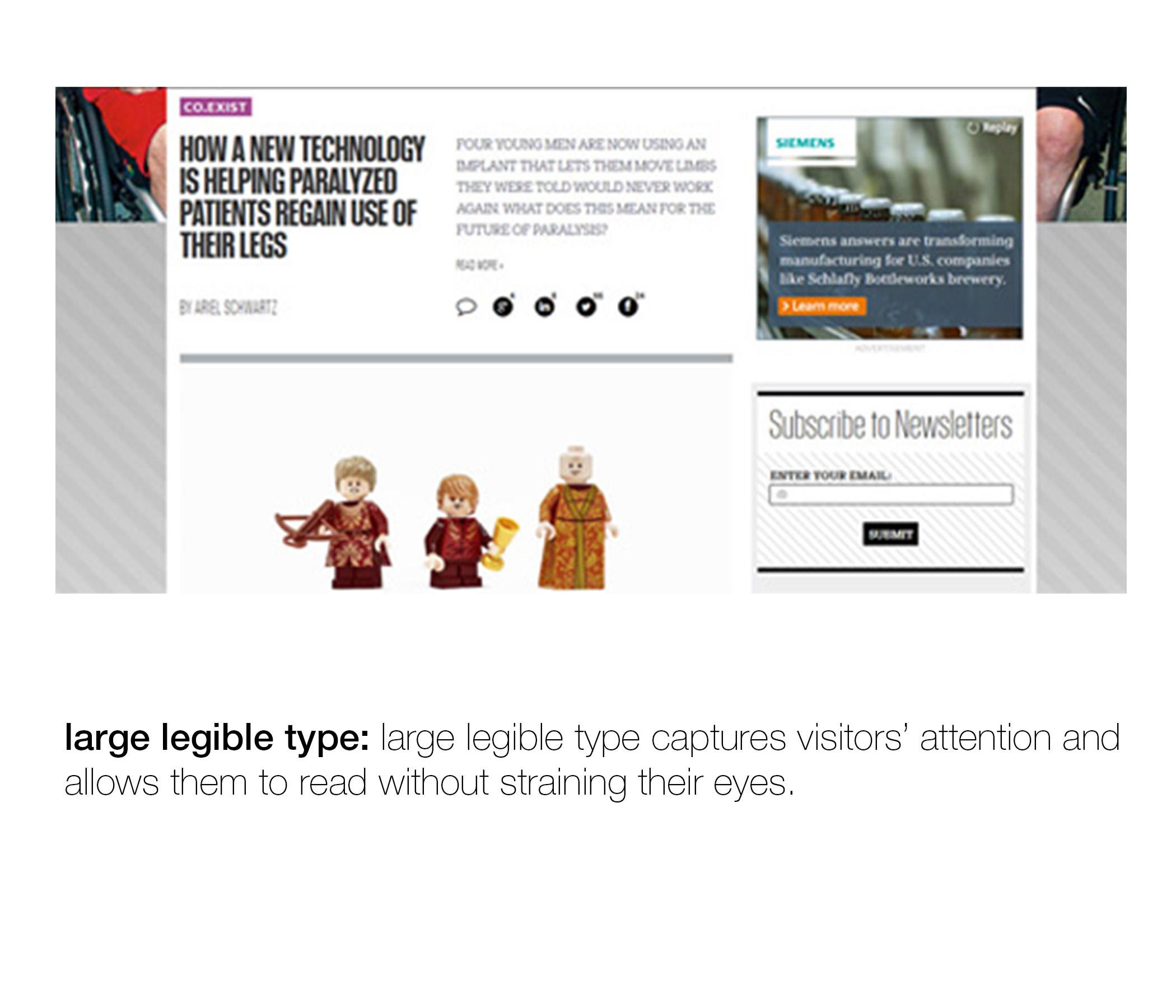
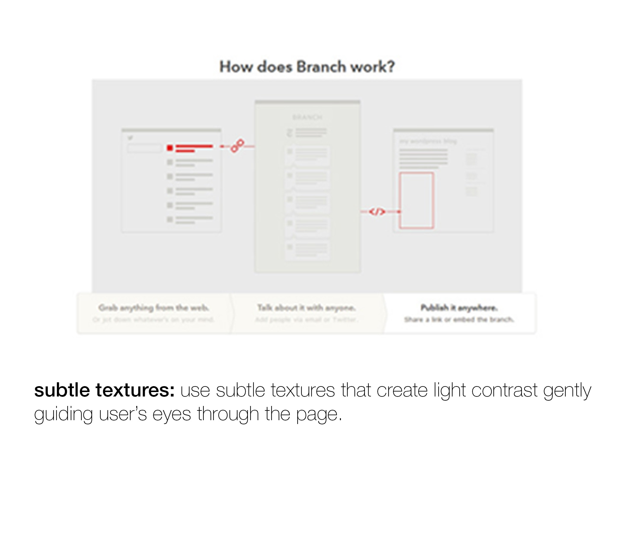
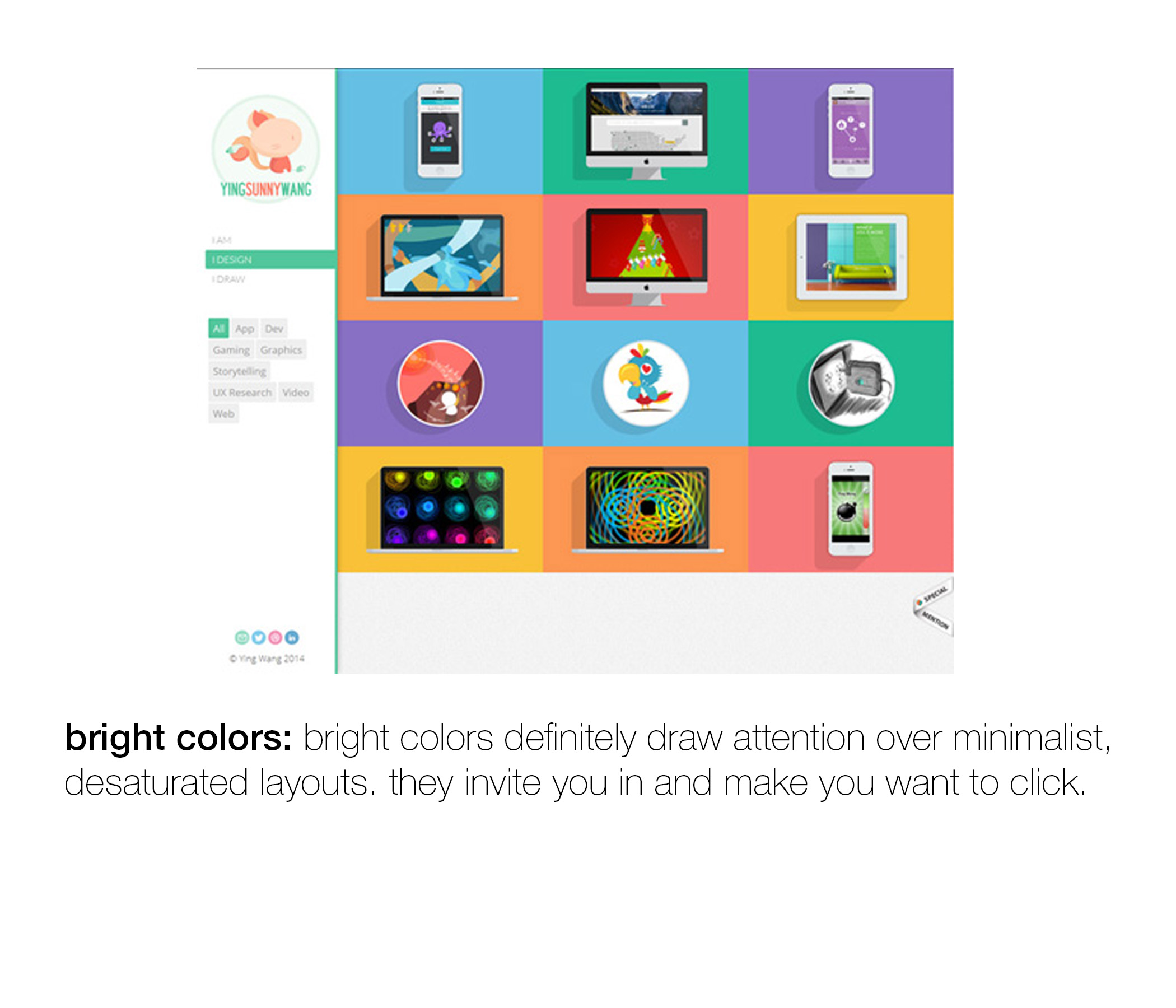
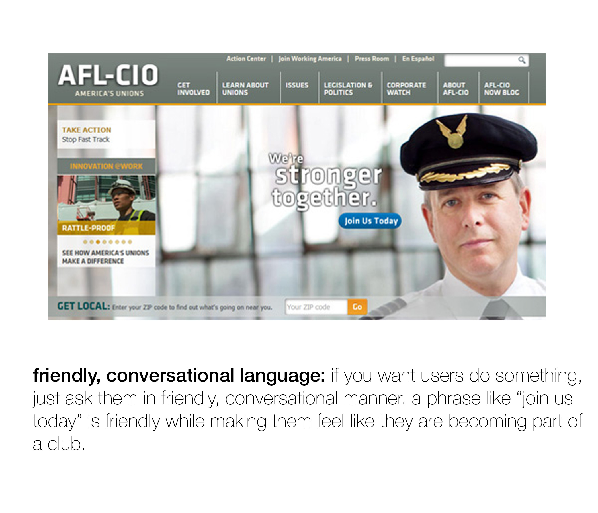
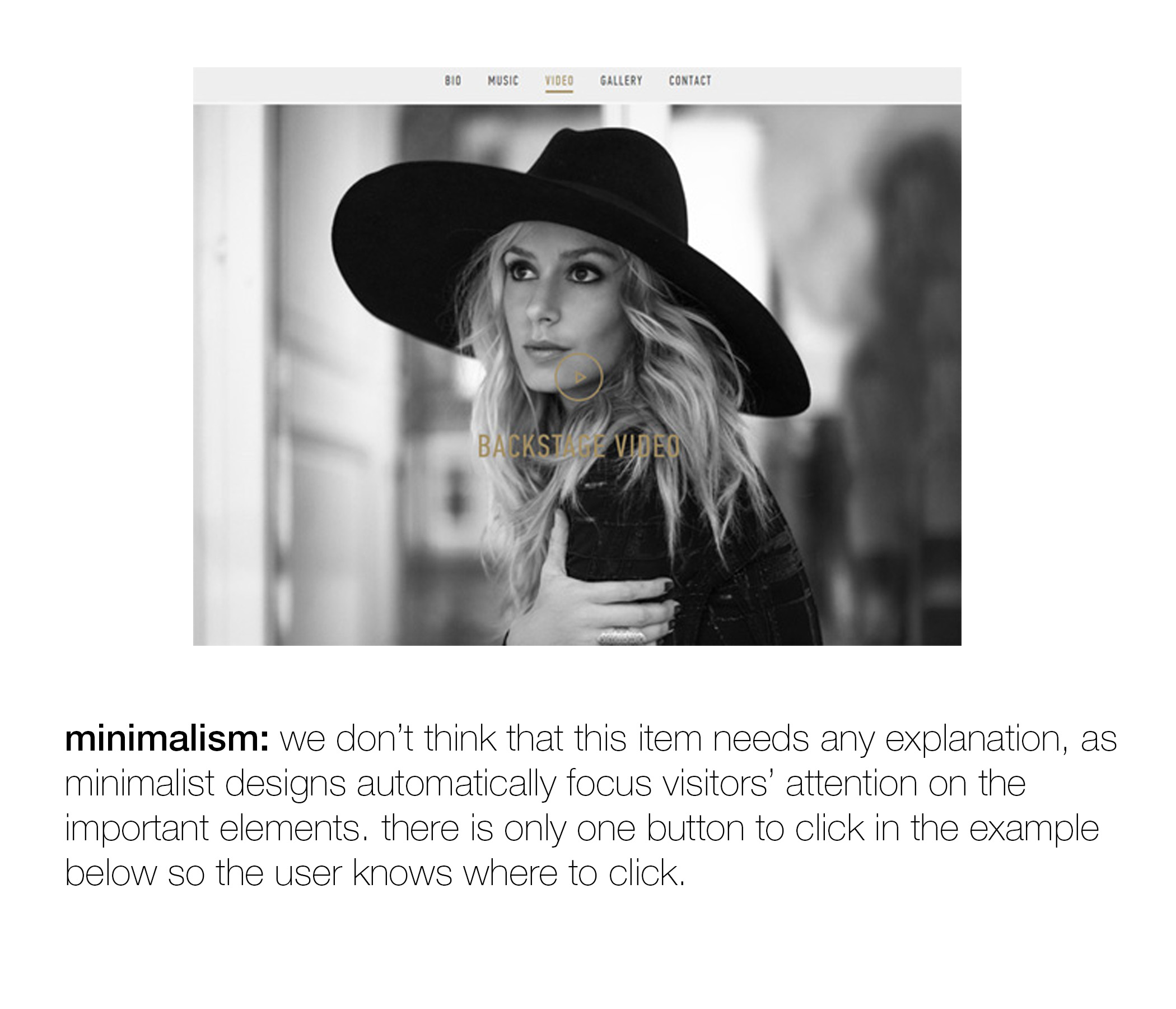
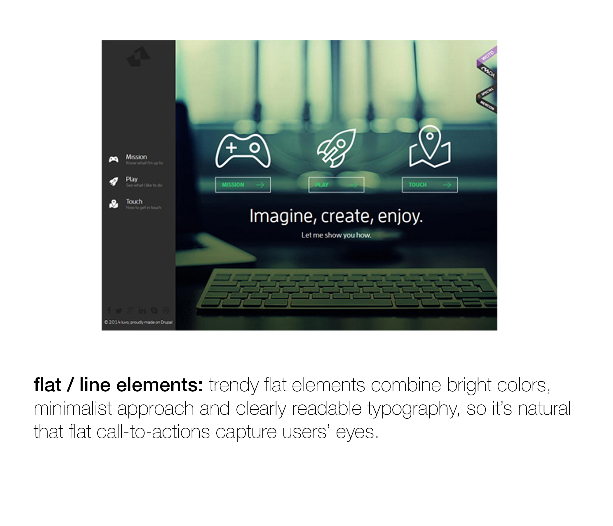
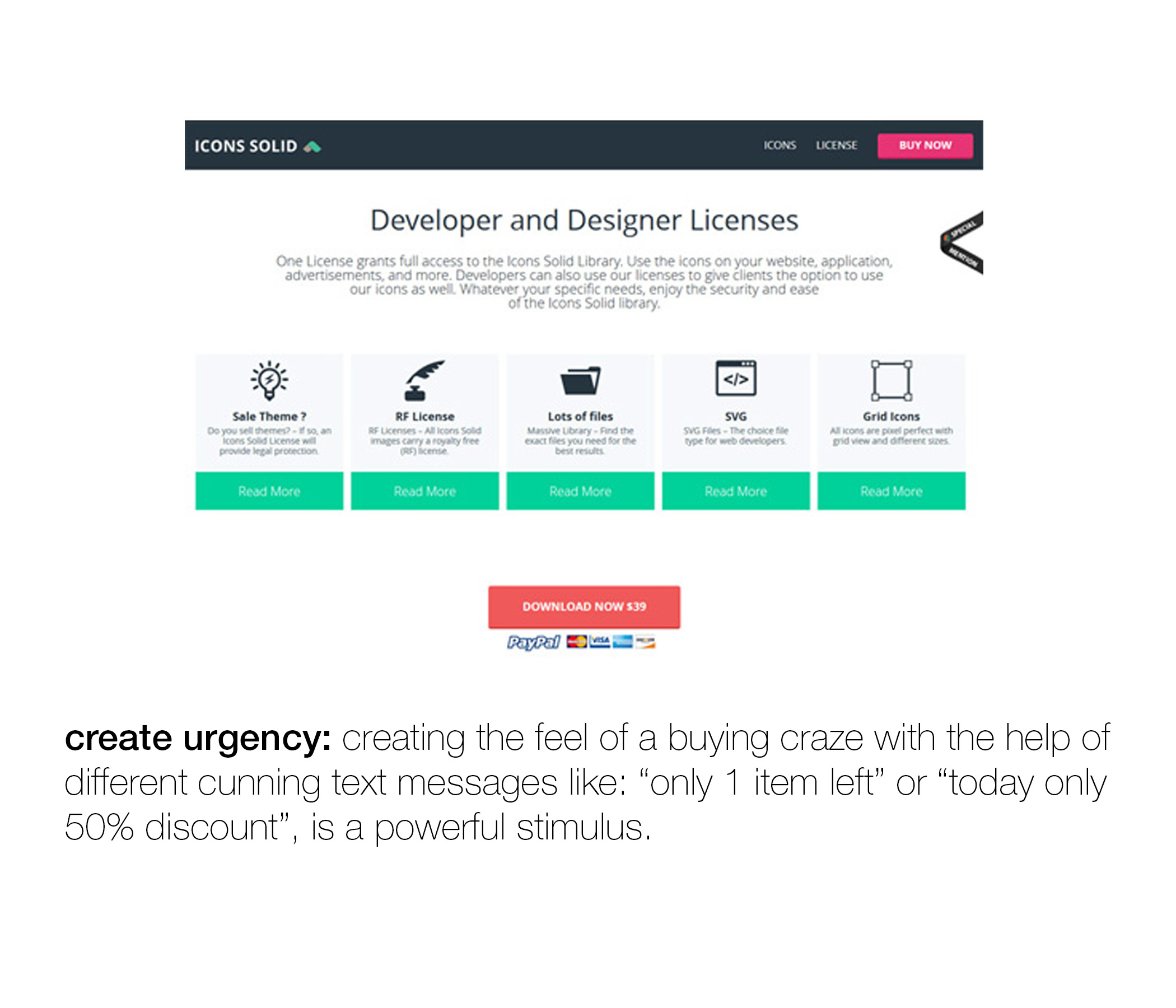
a little more on that post from wednesday. in this post i talked about the importance of having websites designed in a way that focuses the user's attention. this applies to organizations that want you to go to their site to "take action" (donate, sign up, etc.) but i think it applies to consumer sites as well. ultimately, every site should be designed with the goal of having it be as clear as possible to the user what they should do first, second and third.
below are my favorite pieces from an article on this topic by helga moreno over on justcreative.com. a lot of these suggestions are for web design but apply to effective email marketing, facebook ads, print marketing, and so on. click through below and hopefully this allows you to go back to the post from wednesday and compare the two sites with a little more context.
(everything below is directly from the post on just creative!)