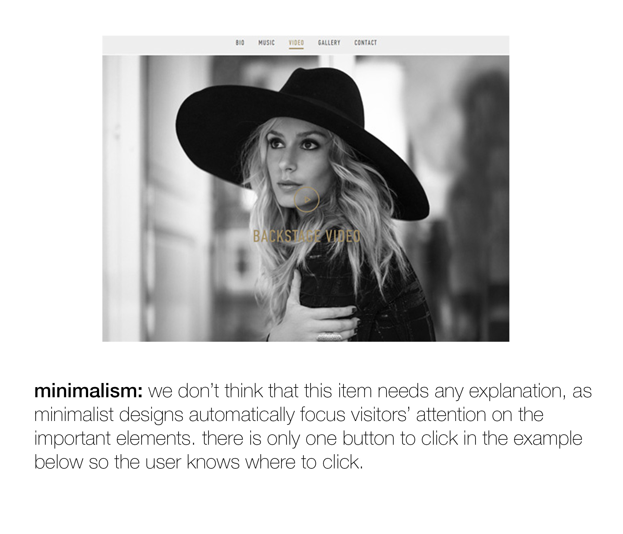
a little more on that post from wednesday. in this post i talked about the importance of having websites designed in a way that focuses the user's attention. this applies to organizations that want you to go to their site to "take action" (donate, sign up, etc.) but i think it applies to consumer sites as well. ultimately, every site should be designed with the goal of having it be as clear as possible to the user what they should do first, second and third.
below are my favorite pieces from an article on this topic by helga moreno over on justcreative.com. a lot of these suggestions are for web design but apply to effective email marketing, facebook ads, print marketing, and so on. click through below and hopefully this allows you to go back to the post from wednesday and compare the two sites with a little more context.
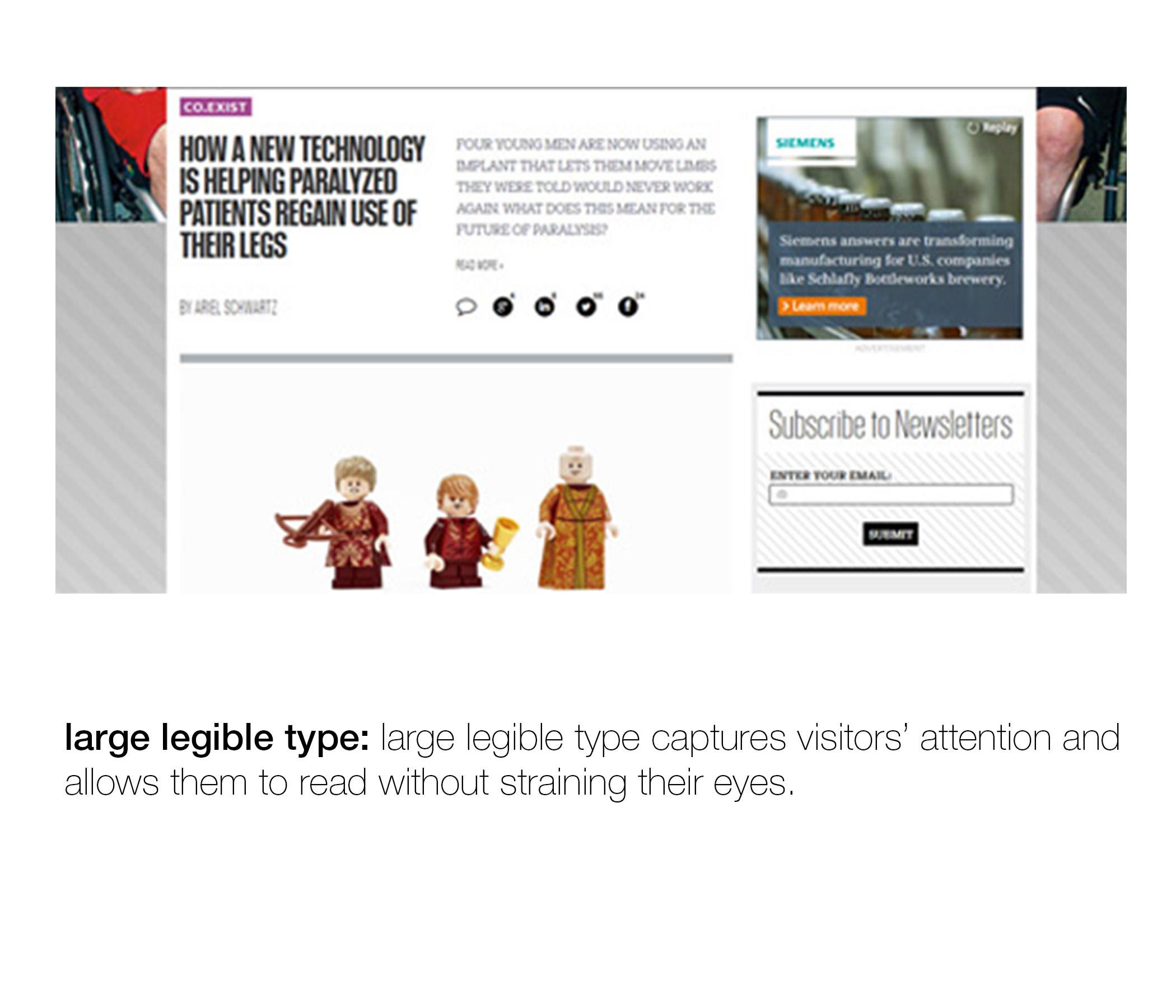
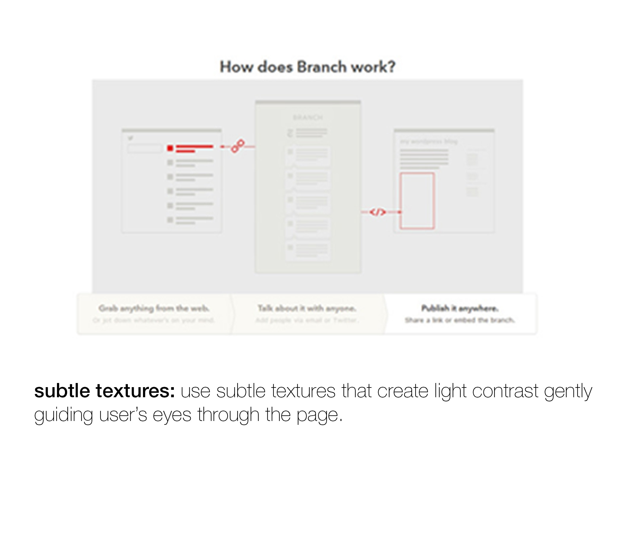
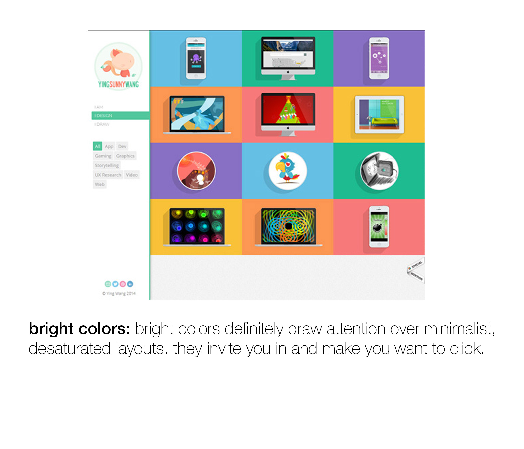
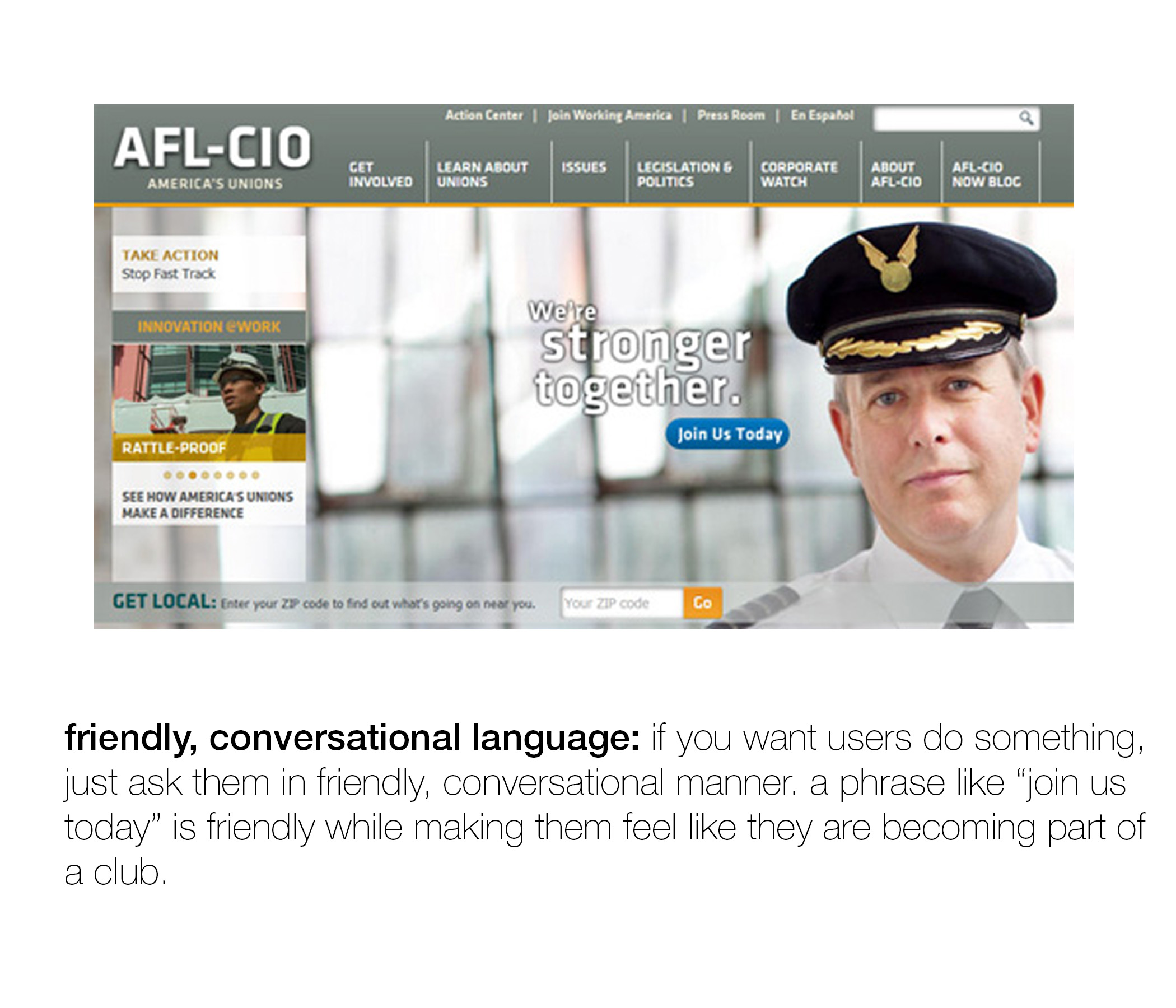
(everything below is directly from the post on just creative!)