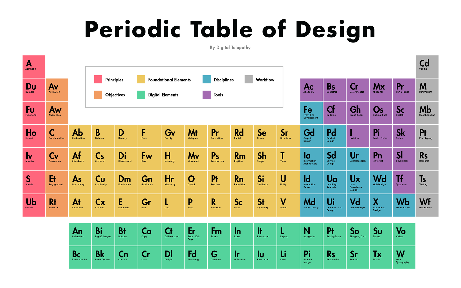
back to the basics! i love this beautifully organized (and color coded) piece from brent summers of digital telepathy. they give us the various tools, elements, and disciplines of design, all neatly conveyed in one place.
via design taxi
back to the basics! i love this beautifully organized (and color coded) piece from brent summers of digital telepathy. they give us the various tools, elements, and disciplines of design, all neatly conveyed in one place.
via design taxi
a nice little infographic for you today! this overview of the basic elements of design is a good one to bookmark. and if you don't have a design background at all, try looking at some of the things i've posted through the lens of one of these elements.
via design taxi
here's a great infographic on the brands that got digital marketing right in 2014.
via unmetric
i could talk about these brilliant data visualizations ALL DAY. david mccandless is a london-based data journalist and information designer and i’ve been following his work over on information is beautiful for years. like most people, i love a beautiful infographic, but he takes it to another level. and i love his mission: “distilling the world’s data, information and knowledge into beautiful, interesting and, above all, useful visualizations, infographics and diagrams.” we have so much data these days that is so incredibly powerful; but it’s not really worth much if we can't understand it. and smart design helps us do just that. information is beautiful, indeed.
more here, and a two of my favorites - on colors and complementary flavors - below:


