THE 3 P'S OF MOBILE

google has been collecting some great content over on think with google. i especially liked this piece by rei inamoto, from AKGA, about how marketers need to think about mobile.

he says that while the specific devices and behaviors around mobile will continue to evolve, there are three essential principles or questions to consider when building mobile products: is it portable? is it personal? is it perpetual?

"1. portable: your idea must be able to go where the user goes. if it can’t follow the user through his or her day, it's not mobile.

2. personal: the promise of digital was always and will always be its potential for personalization. your idea must cater to the individual needs and desires of every user—and the experience must be unique to her.

3. perpetual: your idea has to stand the test of time—24 hours a day, 365 days a year—because mobile is always on. the first thing you reach for in the morning is probably a mobile device. at the office. on your lunch break. curled up on your couch at home. even when you're sleeping, your mobile device is with you and on."

we often talk about the 4 P's of marketing: product, price, place and promotion; these 3 P's of mobile seem like a timely addition to that framework.

inamoto also shares five great examples of companies bringing his “3 P’s” to life in everything from textbooks to makeup and backseat driving. my favorite is the one below, txtbks. this is a company that wants to make textbooks more accessible to children in the philippines by making school books accessible via text (!) on old analog mobile phones.

txtbks

WHATCHATALKINABOUT: MOBILE EDITION

you know when people talk about mobile being *superduperimportant* and then go on and on about responsive design? yeah, usually they don't either. so here you go! a couple of quick and informative gifs that explain the basics of responsive design.

take a look and then play around with some of your favorite sites on your mobile device. you'll start noticing how these differences affect the functionality and design of the sites and brands you engage with via mobile. and hopefully feel like a smarter user and consumer of design.

more here.

via fastcompany and froont

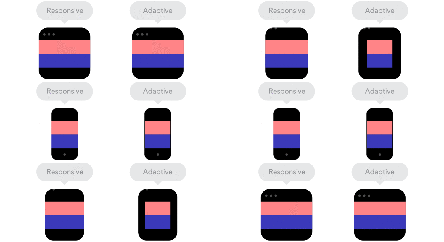
 "Responsive designs fluidly expand, whereas adaptive designs hitch as you expand a browser or viewport."


"Responsive designs fluidly expand, whereas adaptive designs hitch as you expand a browser or viewport."

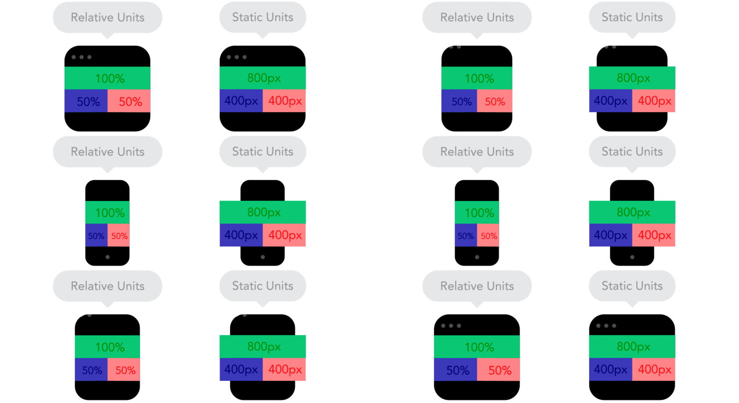
 "Positioning your designs elements using pixels as X,Y coordinates can cause a site designed for one screen to look weird on another. Use relative units, like percent of the screen, instead of static units like pixels."


"Positioning your designs elements using pixels as X,Y coordinates can cause a site designed for one screen to look weird on another. Use relative units, like percent of the screen, instead of static units like pixels."

 "Breakpoints allow the layout to change at predefined points, i.e. having three columns on a desktop, but only one column on a mobile device."


"Breakpoints allow the layout to change at predefined points, i.e. having three columns on a desktop, but only one column on a mobile device."

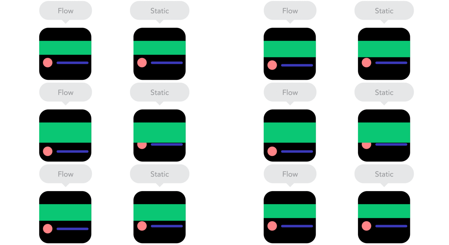
 "As screen sizes become smaller, content starts to take up more vertical space and anything below will be pushed down. It's called the flow."


"As screen sizes become smaller, content starts to take up more vertical space and anything below will be pushed down. It's called the flow."

 "By using nesting elements, you can make it so collections of onscreen elements adapt to a shrinking or expanding screen as one, instead of individually."


"By using nesting elements, you can make it so collections of onscreen elements adapt to a shrinking or expanding screen as one, instead of individually."

 "Sometimes it's great that content takes up the whole width of a screen, like on a mobile device, but having the same content stretching to the whole width of your TV screen often makes less sense."


"Sometimes it's great that content takes up the whole width of a screen, like on a mobile device, but having the same content stretching to the whole width of your TV screen often makes less sense."

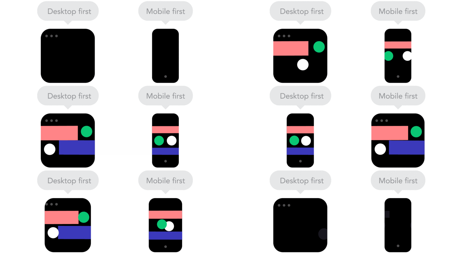
 "Technically there isn't much of a difference if a project is started from a smaller screen to a bigger screen (mobile first) or vice versa (desktop first). Yet it adds extra limitations and helps you make decisions if you start with mobile first."


"Technically there isn't much of a difference if a project is started from a smaller screen to a bigger screen (mobile first) or vice versa (desktop first). Yet it adds extra limitations and helps you make decisions if you start with mobile first."

 "Does your icon have lot of details and some fancy effects applied? If yes, use a bitmap. If not, consider using a vector image." A vector image can more properly adapt to different resolutions.


"Does your icon have lot of details and some fancy effects applied? If yes, use a bitmap. If not, consider using a vector image." A vector image can more properly adapt to different resolutions.

LOGO-ONTHE-GOGO

this is so cool. designer joe harrison was thinking about how the nature of logos will change as our screens get smaller and we get more and more mobile, so he created "responsive logos." this project made me pause and think about how branding needs to evolve for the multi-screen, interactive, ADD, always abbreviated world. if you click through and reduce your screen (it’s actually even cooler on your phone) you’ll see the logo evolve into it’s simplest form. the idea is that logos must be "responsive" to the device they're being displayed on.

i am obsessed with the simplicity-driven nature of this project. simplicity forces so much thought and intelligence into design and when it’s done right - and captures a lot with a little - it’s perfection. brands are going to have to do more with less as our interactions with them evolve so click through and see how harrison sees that happening. he plays with coca-cola, chanel, nike, bang & olufsen (shown below), disney and levi's.

1.jpg