you know when people talk about mobile being *superduperimportant* and then go on and on about responsive design? yeah, usually they don't either. so here you go! a couple of quick and informative gifs that explain the basics of responsive design.
take a look and then play around with some of your favorite sites on your mobile device. you'll start noticing how these differences affect the functionality and design of the sites and brands you engage with via mobile. and hopefully feel like a smarter user and consumer of design.
via fastcompany and froont
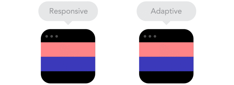
"Responsive designs fluidly expand, whereas adaptive designs hitch as you expand a browser or viewport."
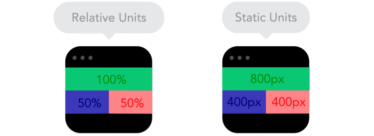
"Positioning your designs elements using pixels as X,Y coordinates can cause a site designed for one screen to look weird on another. Use relative units, like percent of the screen, instead of static units like pixels."

"Breakpoints allow the layout to change at predefined points, i.e. having three columns on a desktop, but only one column on a mobile device."
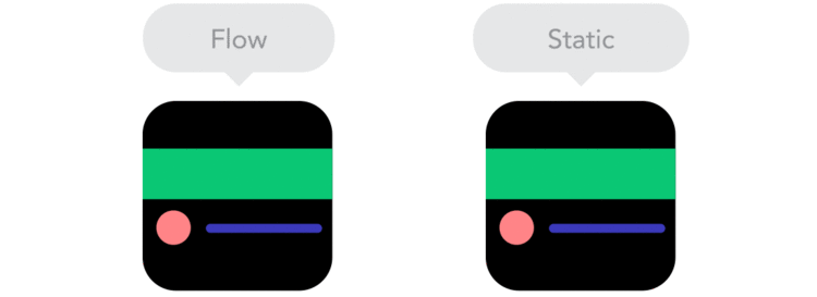
"As screen sizes become smaller, content starts to take up more vertical space and anything below will be pushed down. It's called the flow."

"By using nesting elements, you can make it so collections of onscreen elements adapt to a shrinking or expanding screen as one, instead of individually."

"Sometimes it's great that content takes up the whole width of a screen, like on a mobile device, but having the same content stretching to the whole width of your TV screen often makes less sense."
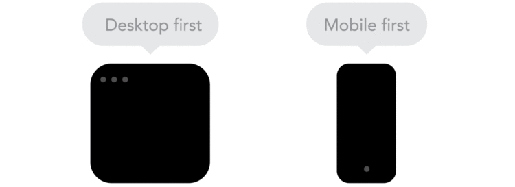
"Technically there isn't much of a difference if a project is started from a smaller screen to a bigger screen (mobile first) or vice versa (desktop first). Yet it adds extra limitations and helps you make decisions if you start with mobile first."

"Does your icon have lot of details and some fancy effects applied? If yes, use a bitmap. If not, consider using a vector image." A vector image can more properly adapt to different resolutions.