MAKE IT POP

gotta love a good creative collaboration. jonathan quintin and matt wilson got together to create a combination of graphic and motion design work, and the combo of their two strengths led to some pretty great branding. the font is playful but still so clean and beautiful. i also love the play on proportion and the way the use of the logo varies throughout the different pieces. cool and clean.

design in motion

more here.

via creative boom

COFFEE CUP COOL

i wanted to share the lovely branding for yardstick, a coffee company in the philippines. part of their mission is to increase the knowledge of specialty coffee in the philippines, so they used the national flag (flipped on it's side and broken down to its basic elements) as the inspiration for the branding. i also kind of love that they don't have a brand color but rather a palette of colors that they mix and match. clean and lovely.

Yardstick Coffee
Yardstick Coffee
Yardstick Coffee
Yardstick Coffee
Yardstick Coffee
Yardstick Coffee
Yardstick Coffee
Yardstick Coffee

ON YOUR MARKS

great branding often comes from unexpected places. in fact, the best branding i've seen this year was at a wedding! more on that soon.

today i wanted to share a beautiful branding project from an unexpected source: a cyclist.

this spring mark beaumont will be riding from cairo to capetown in the hopes of setting a cycling world record - a 100,000 kilometer-long ride. the proceeds from this ride, which he is calling africa solo, will go to orkidstudio, an organization that works to benefit kids and communities through innovative design and construction.

beaumont asked design studio o street to design a logo that could capture the spirit of this amazing undertaking. take a look at the process and sketches below and the inspired idea to combine mark's profile and the continent of africa into the branding of this amazing adventure.

africa-solo-route-poster.jpg
africa solo
africa solo
africa solo
africa solo

CHIC ON WHEELS

who said food trucks can't be chic?

take a look at the beautiful branding of swiss design student alexandre pietra. she created a full brand identity for a food truck called "the nordic." and no detail went un-noticed.

pietra has a beautifully minimalistic (and classically scandinavian) design influence here to reflect the scandinavian food truck's simple menu.

she also uses the logo in an interesting way, blowing it up and using it at scale throughout the materials. definitely makes everything feel cohesive while still having certain elements feel unique.

The Nordic Food Truck Branding

more here.

via designtaxi
 

SO, WHAT'S A LOGO ANYWAYS?

i was talking to a friend who is thinking of starting a business the other day. we were brainstorming about what she should think about as she builds her brand, logo, identity design, website design, instagram profile, brand tone, etc. i found it helpful to go back to the basics of what all of these things mean so i thought i’d share those with you. this piece from just creative is a great summary of this stuff so i've condensed it, (tweeked it a little) and copied for you the pieces i think are most important when building or re-building a brand.

ok! let's talk brand, identity and logo.

branding explained

A BRAND IS the perceived emotional corporate image as a whole. it is an organization, service or product with a ‘personality’ that is shaped by the perceptions of the audience.

many people believe a brand only consists of a few elements – colors, fonts, a logo, a slogan and maybe music. in reality, it is much more complicated than that. you might say that a brand is a ‘corporate image’.

the fundamental idea and core concept behind having a ‘corporate image’ is that everything a company does, everything it owns and everything it produces should reflect the values and aims of the business as a whole.

it is the consistency of this core idea that makes up the company, driving it, showing what it stands for, what it believes in and why they exist. it is not purely some colors, some typefaces, a logo and a slogan.

THE IDENTITY IS MADE UP OF the visual aspects that form part of the overall brand.

in most cases, identity design is based around the visual devices used within a company, usually assembled within a set of guidelines. these guidelines that make up an identity usually administer how the identity is applied throughout a variety of mediums, using approved color palettes, fonts, layouts, measurements and so forth. these guidelines ensure that the identity of the company is kept coherent, which in turn, allows the brand as a whole, to be recognizable.

the identity can be made up of many visual devices:

  • a logo (the symbol of the entire identity & brand)
  • stationery (letterhead + business card + envelopes, etc.)
  • marketing collateral (flyers, brochures, books, websites, etc.)
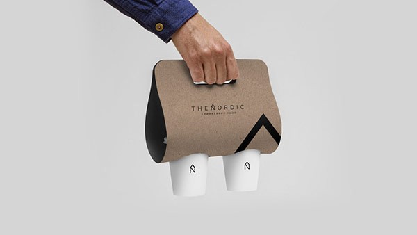
  • products & packaging (products sold and the packaging in which they come in)
  • apparel design (tangible clothing items that are worn by employees)
  • signage (interior & exterior design)
  • messages & actions (messages conveyed via indirect or direct modes of communication)
  • other communication (audio, smell, touch, etc.)
  • anything visual that represents the business

all of these things make up an identity and should support the brand as a whole.

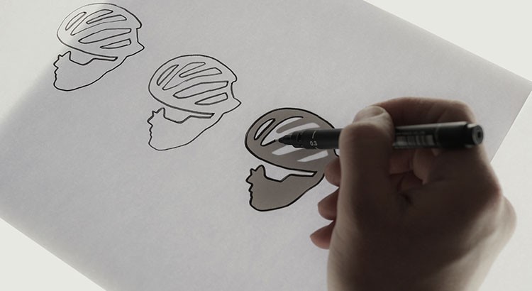
THE LOGO identifies a business in its simplest form via the use of a mark or icon. it is the corporate identity and brand all wrapped up into one identifiable mark. this mark is the symbol of the business as a whole.

a logo identifies a company or product via the use of a mark, flag, symbol or signature. a logo does not sell the company directly nor rarely does it describe a business. logo’s derive their meaning from the quality of the thing it symbolizes, not the other way around – logos are there to identity, not to explain. in a nutshell, what a logo means is more important than what it looks like.

so, in summary:

brand: the perceived emotional corporate image as a whole.
identity: the visual aspects that form part of the overall brand.
logo: identifies a business in its simplest form via the use of a mark or icon.

and, as always, if you want to chat branding, identity design, or logos, feel free to shoot me an email!

more on branding from just creative here.

7UP STRIPS DOWN AND CLEANS UP

new 7up logo

a nice re-design for 7up.

their branding has always been focused on the green "7up" and the red circle, so it's nice to see them do away with the extra (and unnecessary) elements in the logo. makes for a cleaner, more modern, more efficient identity design. take a look at the evolution of the logo below. kinda fun to see how identity and logo design reflects the times, particularly with such a big consumer product.

7up old logo can design evolution
7up old logo 2
7up can logo design evolution
old recent 7up logo design
new 7up logo design
new 7up logo bottle design

fun fact: 7up was created in 1929 and originally called “bib-label lithiated lemon-lime soda” because it contained the mood stabilizer lithium citrate (which it continued to have until 1950). it was almost immediately re-branded as “7 up lithiated lemon-lime,” and then finally ended up as “7up.”

via logodesignlove

LOGO-ONTHE-GOGO

this is so cool. designer joe harrison was thinking about how the nature of logos will change as our screens get smaller and we get more and more mobile, so he created "responsive logos." this project made me pause and think about how branding needs to evolve for the multi-screen, interactive, ADD, always abbreviated world. if you click through and reduce your screen (it’s actually even cooler on your phone) you’ll see the logo evolve into it’s simplest form. the idea is that logos must be "responsive" to the device they're being displayed on.

i am obsessed with the simplicity-driven nature of this project. simplicity forces so much thought and intelligence into design and when it’s done right - and captures a lot with a little - it’s perfection. brands are going to have to do more with less as our interactions with them evolve so click through and see how harrison sees that happening. he plays with coca-cola, chanel, nike, bang & olufsen (shown below), disney and levi's.

1.jpg

FOURSQUARE: A LESSON IN (BAD) LOGO DESIGN

i wanted to share some of graham smith's excellent analysis of foursquare's new logo. i was going to write my own take on this but felt his analysis was such a smart lesson in how to think about branding and logo design i decided to just share it as is. the point at the end about incorporating references into a logo (or not) is especially interesting. i cut some of his language for brevity but everything below is directly from him! you can read the full post here.

from graham:

"Foursquare's New Logo Redesign Goes Superhero

Direct from the folks at Foursquare: “…if you build a totally new app, you need a totally new logo. Our logo is changing from the check-in checkmark to something representing the new Foursquare. We designed it to be a mix of map pin and superhero emblem. We’ve always thought of Foursquare as giving you superpowers to explore your city, and our new logo reflects that vision. It’s coming soon to a homescreen near you.”

The good.

The logotype/wordmark/brand name yada yada, is pretty nice: it has presence, it’s pretty damn solid, has a nice rich almost Ultra Violet style to the colouring.

I also like the two colours, but they also remind me a little too much of the Flickr colour palette.

The bad

What is meant to be super is really really bad.

That ‘F’, that is a map-pin, and a superhero emblem just looks awful. The pinky outer keyline is far too kludgy, the outer corner radius look far too large compared to the inner radius. Which then leads to the corner radius of the ‘F’ which looks like an afterthought, BUT don’t come close to matching the far softer corner radius on the Foursquare wording.

Why oh why could they not have at least kept some consistency with the corner radius from the superhero ‘F’ emblem to that in the main wording? That would have at least made up for one of the most awkward looking logomark and logotype miss-matches I have seen in a long time.

There is nothing in this combination logo that looks like it should be one of a nice and cohesive whole. It’s super disjointed at best.

Conclusion:

The typography for the main Foursquare brand name is really good, has a strong presence to it, and has style. What I simply cannot get my head around is how completely unsymbiotic the relationship between this and that God awful superhero ‘F’ emblem really is.

I’m not even sure a map-pin, as a visual reference, was ever needed, especially how long Foursquare has been around. It’s not like Foursquare is a new brand having something to prove about it’s mission and purpose, and almost feels ever so slightly patronising.

The map-pin reference is way too over dramatic, and unnecessary. Almost sure a classy icon could have been crafted from that really strong logotype without force serving up well used, and tired visual cliches.

The new Foursquare logotype is all grown-up, yet the icon feels it’s taken a huge backwards step in this established brand’s maturity. "