PSYCHOLOGY OF DESIGN

i wanted to share two interesting design and user experience applications that caught my eye recently. both small but impactful.

first, vogue.com is doing a very smart thing. when you highlight any text it automatically asks if you want to tweet that phrase. it's kind of too much if you're not looking to tweet anything but it's also super smart.

psychology  of design: i'd bet they see significantly more engagement on twitter because of it.

VOGUE

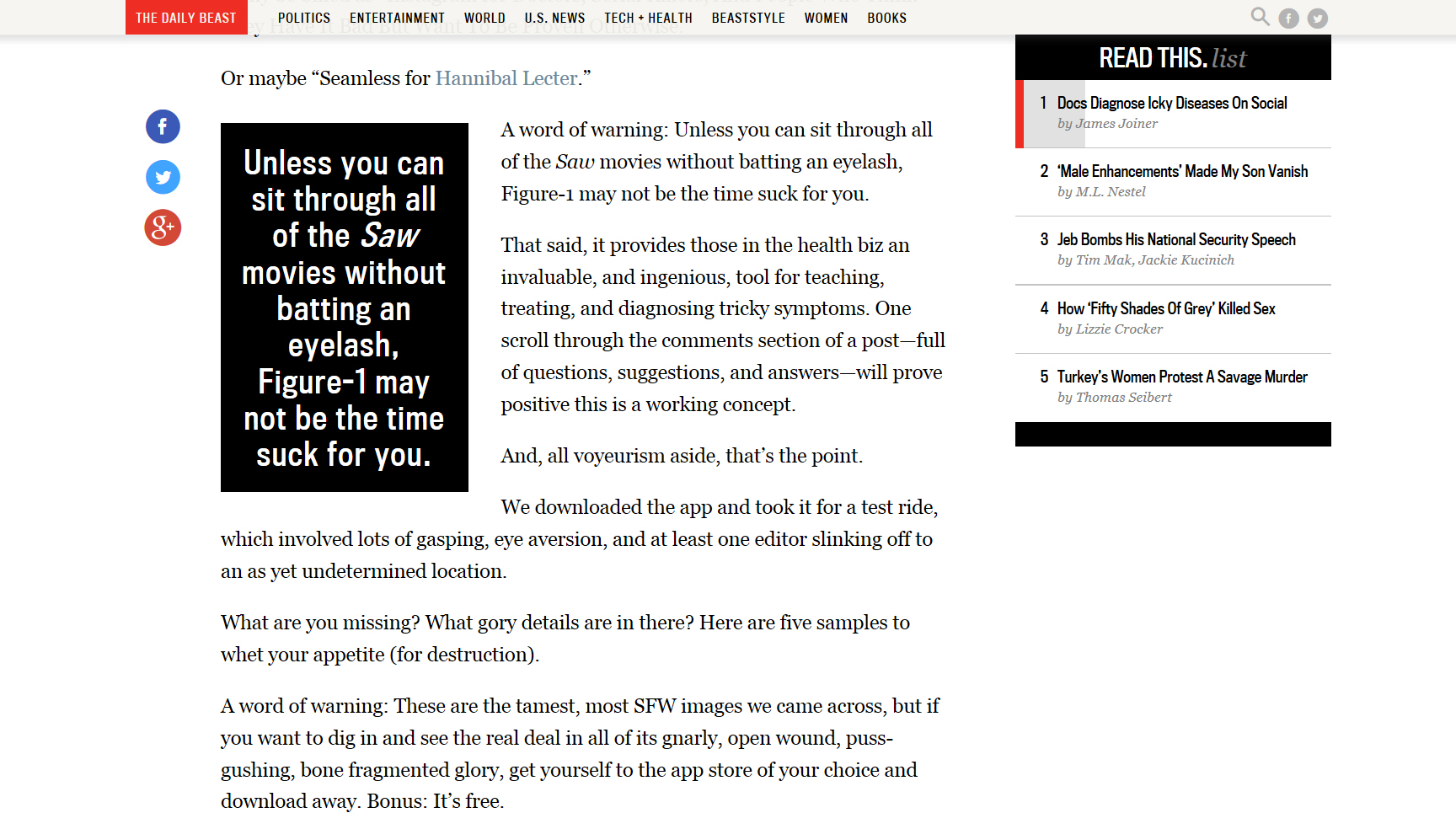
also. i like what the daily beast is doing with their sidebar. they highlight the article you're reading and you can see how far along you are and the progress you make as you scroll down. in this case, i was about 20% done with "docs diagnose icky diseases on social."

psychology of design: people have such short attention spans for longform pieces nowadays that i think this is an interesting design meets psychology decision. might distract people from how long the article is if they see the progress they make as they make it. seeing your progress as you go kind of adds an instant gratification element to the experience. i'd suspect this has increased the percentage of people that finish their longer pieces.

Daily Beast

as you interact with content on your computer, your tablet, and through apps i'd encourage you to look at how they're designed. it's amazing how far a little bird popping up or a scrolling grey bar will go towards changing your digital behavior.

SITE SO SLICK

i wanted to give you some website design inspiration today. given that websites are now the face and living logo of brands, people and organizations, making your website informative, engaging, and generally effective is critical. line25 is a blog about web design by chris spooner and he shares tons of great website examples. definitely one to bookmark. he features and organizes them based on style, focus, or element so if you’re thinking about how to make your personal website or your company’s website work a little harder for you this is a great resource.

beyond thinking about website design from a marketing perspective, as consumers of content i think it’s always interesting to think about how the sites you engage with are missing opportunities or failing to engage with you. just makes you a smarter digital consumer!

see below for some great examples of focused, effective site design.

i think the key with website design is that you have to tailor the design and style and content and tone of your site to the goal of the site. you have to think about what the singular focus or goal is and ensure the design is working in helping you work towards that end.

so... if your goal is email sign ups:

this collection - featuring beautiful use of typography - is great if your goal is a clean site that conveys creativity.

and finally, my favorite: websites with a single focus. these examples feature what's called the "hero image" - the large full screen background image. i’ve said it before here and i’ll probably say it a million more times: SIMPLICITY IS THE KEY TO EFFECTIVE, SMART DESIGN.

HISTORY OF WEB DESIGN

remember this post, from front, that explained responsive web design? love that one.

front created another series of gifs I wanted to share, this one about the history of web design.

it's amazing to see how quickly web design has evolved and kinda fun to learn a little bit more about what all these terms we always hear (java, flash, css) really mean. click through to read the full explanations!

the dark ages of web design (1989)

the dark ages of web design (1989)

tables – the beginning (1995)

tables – the beginning (1995)

javascript comes to the rescue (1995)

javascript comes to the rescue (1995)

the golden era of freedom – flash (1996)

the golden era of freedom – flash (1996)

CSS (1998)

CSS (1998)

mobile uprising – grids and frameworks (2007)

mobile uprising – grids and frameworks (2007)

responsive web design (2010)

responsive web design (2010)

the times of the flat (2010)

the times of the flat (2010)

the bright future (2014)

the bright future (2014)

read the full history and learn more over here.

NATURE IS SPEAKING. AND SO IS HARRISON FORD.


i wanted to share nature is speaking, a beautifully designed campaign by conservation international. they feature videos like the one shown above, narrated by a celebrity and about an element of nature. the focus of the campaign is that #natureisspeaking and we should be listening. the narration and music are *alittlemuch* for my taste but the design of this whole operation is beautiful.

take a look, and look out for:

  • the beautiful filming of the videos and the great use of video throughout the site (in the background of this section and this section, for example).
  • the design of the site: i love that having the images/videos take up the whole screen forces focus and simplicity. and the use of the images of the other videos at the bottom as a navigation is beautifully done.
  • nice use of social media throughout the site.

but... in addition to not loving the melodramatic tone i mentioned above, i think they could do a better job of making it clear what they want us to do about all of this. they have a nicely designed action page, but at the end of the video they miss an opportunity to drive us all towards something specific. also, they ask you to share/hashtag/the usual but the main push is to sign up for their email newsletter. that’s fine, harrison ford, but what happens when i sign up? what are you gonna send me? i think that context is important for people to feel like they’re taking action. the closest they get to this is on the pledge page - but it’s still pretty vague.

definitely one to check out though! the videos are truly stunning. more here.

A LITTLE MORE ON THAT


a little more on that post from wednesday. in this post i talked about the importance of having websites designed in a way that focuses the user's attention. this applies to organizations that want you to go to their site to "take action" (donate, sign up, etc.) but i think it applies to consumer sites as well. ultimately, every site should be designed with the goal of having it be as clear as possible to the user what they should do first, second and third.

below are my favorite pieces from an article on this topic by helga moreno over on justcreative.com. a lot of these suggestions are for web design but apply to effective email marketing, facebook ads, print marketing, and so on. click through below and hopefully this allows you to go back to the post from wednesday and compare the two sites with a little more context.

(everything below is directly from the post on just creative!)

FEELING (blah) ABOUT (this site re-design)


old site:

new site:

peopleforbikes2-1.jpg

i am not a biker, i do not particularly love riding bikes. i do, however LOVE people for bikes. i came across this website when working at an agency where i participated in a bunch of site designs and was looking for website design inspiration. i was obsessed with their old site design and logo - still obsessed with the logo, not so much with the site. 

why: the feel of the logo and the website used to be consistent: warm, simple, friendly. the new site has incorporated high resolution photography, a dark background, big diagonal lines. in my opinion, the old site was so much more original: playful, smoother edges, focused color palette, and had a beautiful interactive sign up thing.

also: the old site clearly showed what the user should do - as easy as 1, 2, 3. the new site does not do as good of a job of focusing your eye on the content that matters. too many boxes! the “take action” tab for example, is a list. guys, you gotta tell me where to go! same with the “get local” section - the map is nice but click on a state and… textontextontext.

long story short: sometimes organizations feel that if they’re updating the functionality of their site (which they should do on a regular basis) they might as well update the look of the site. but It’s important to separate the wish for a new shiny site from what actually makes sense for the brand and the organization. in this case, what makes sense is a clean and focused site, with a clean and focused action path for the user.