TAROT TO REALITY

i have a confession. when i was about 12 i started reading tarot cards. i was at barnes and noble with my mom on a sunday, saw the cards, and that was kind of it. little did i know i would get really into them, start reading cards for different family members (with what i am told was eerie insight) and make at least three grown ups cry. so, i quickly retired my cards and moved on to other creative endeavors. but! i was pretty excited to see this uber-cool and uber-creative recreation of tarot cards by haitian artist group atis rezistans and photographer alice smeets. they called this "the ghetto tarot" project. and it features recreations of famous cards using props and tools off the street in a beautifully unique and creative way.

from smeets: “our intention is not a glorification of the life in the ghetto, but to feature the haitian ghetto and poverty in general in another light. i have observed over and over again that those, who the world calls ‘the poor’, are full of strength, full of life, joy and creativity. i believe we need more people in this world to start looking at them that way and stop seeing them as victims of a deserted and hopeless situation”.

Haitian tarot by Atis Rezistans

more here.

via creative boom
SUGAR SKULLS AND MEXICAN ROSES

ready for my favorite branding of 2015? good! so...

it's a wedding.

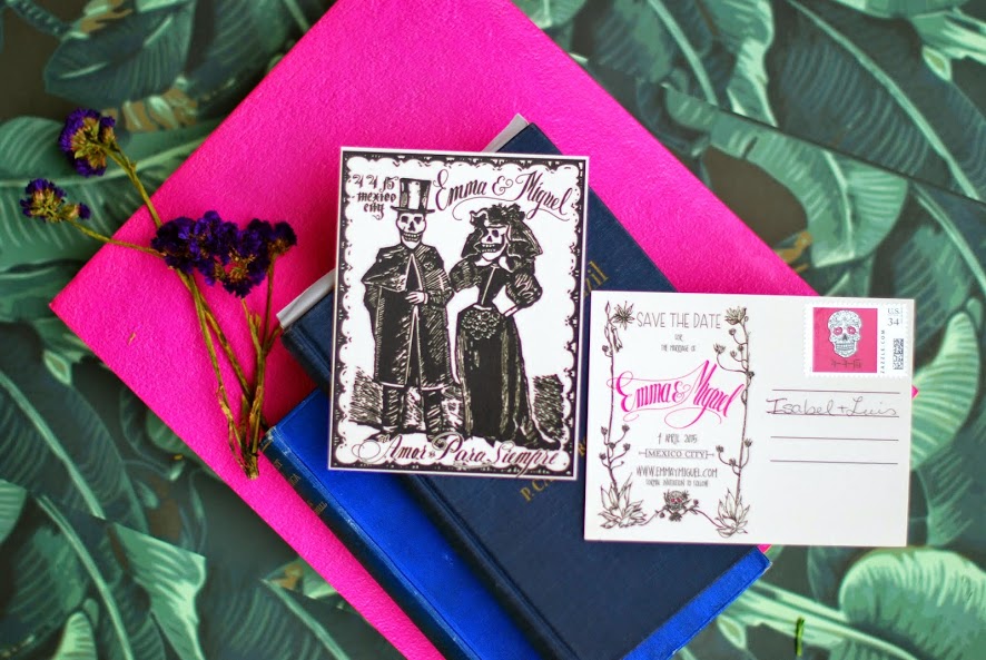
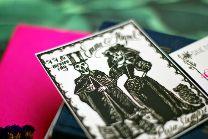
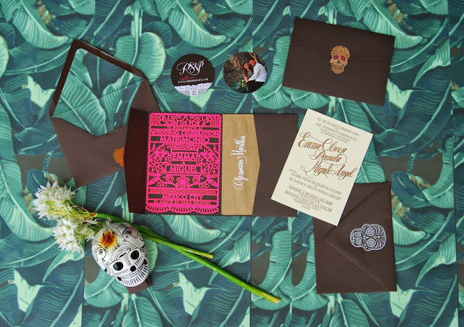
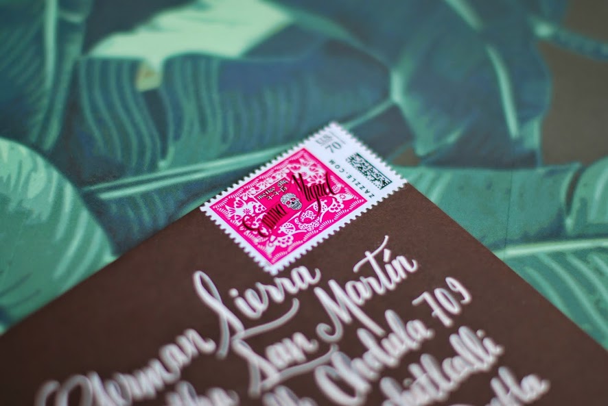
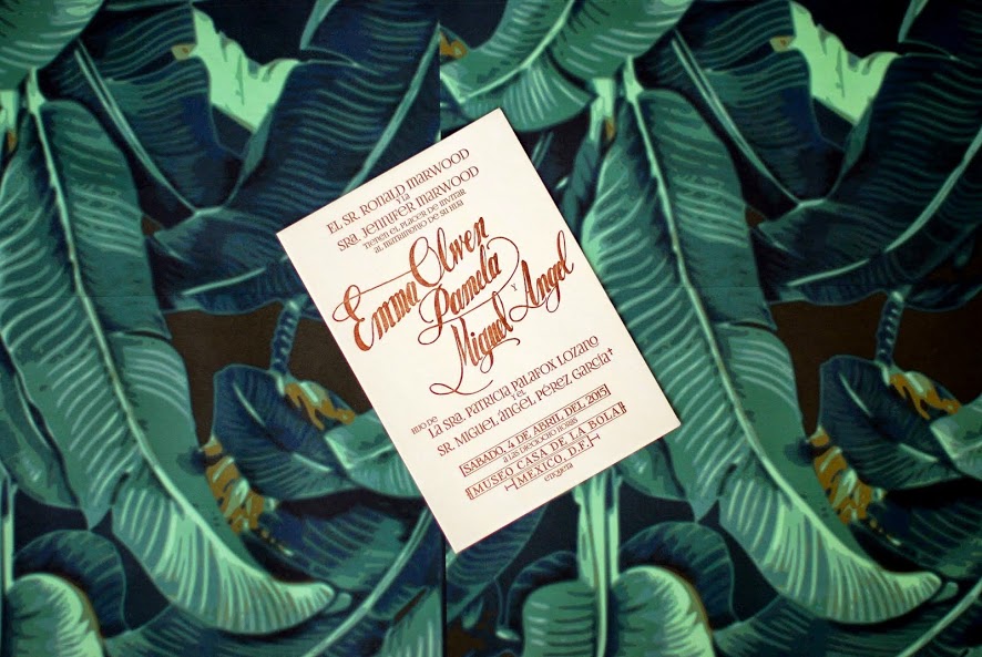
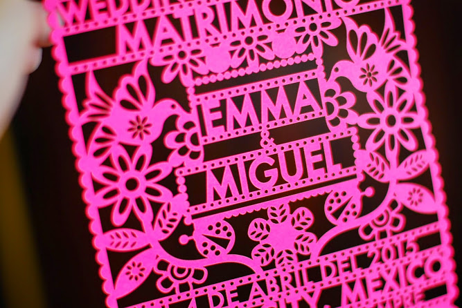
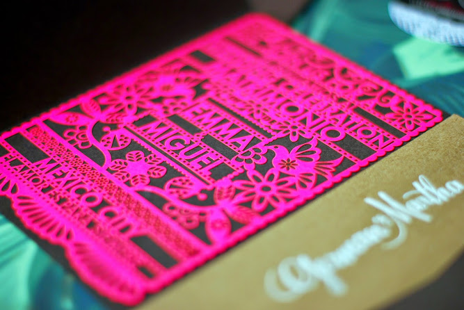
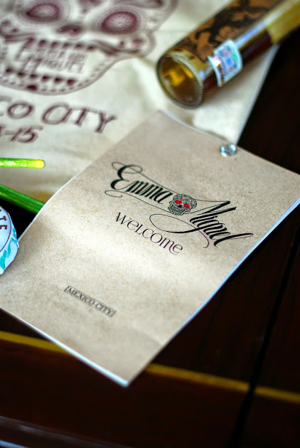
a couple of months ago my friends emma and miguel got married in mexico city, and with the help of the insanely talented isabel from tinta y calamar they created a wedding suite that made this design-lover's heart skip a beat.

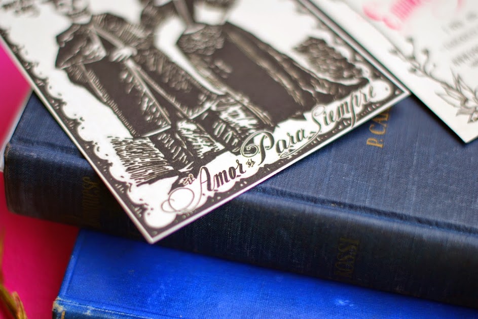
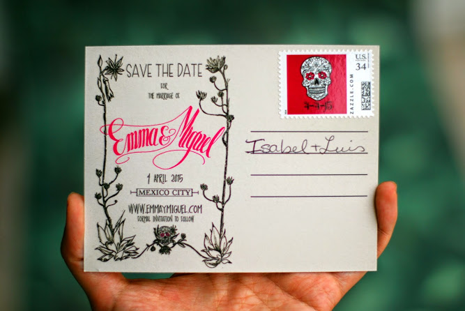
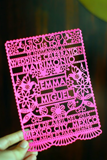
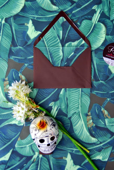
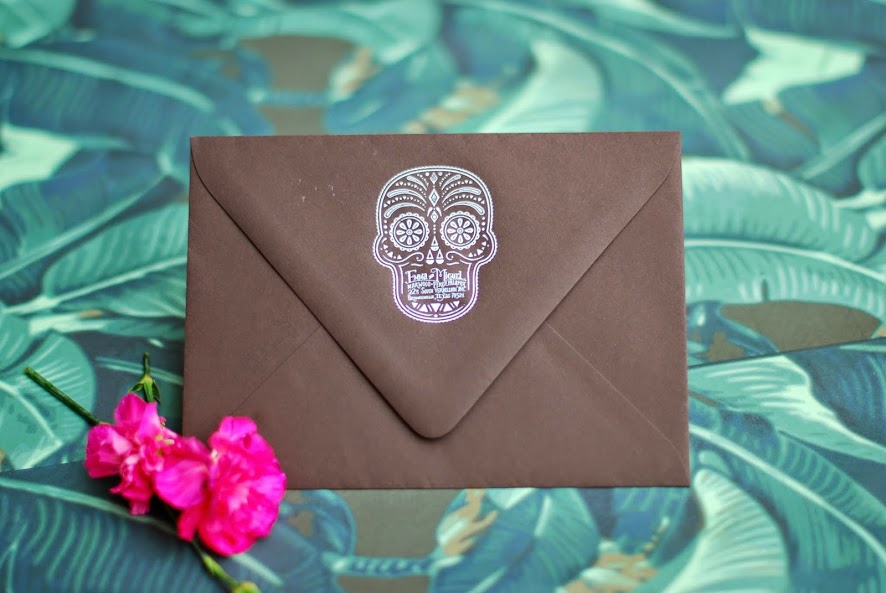
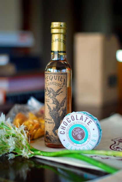
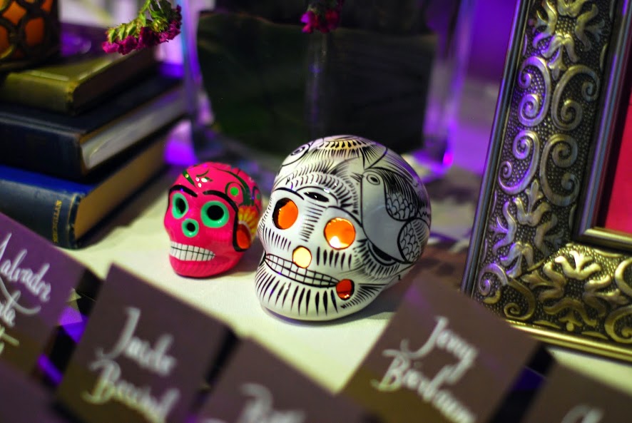
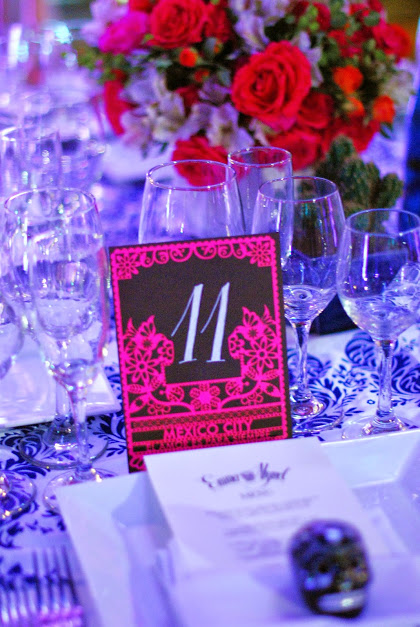
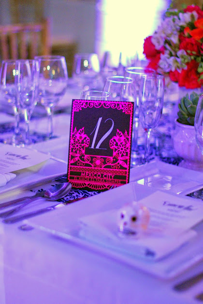
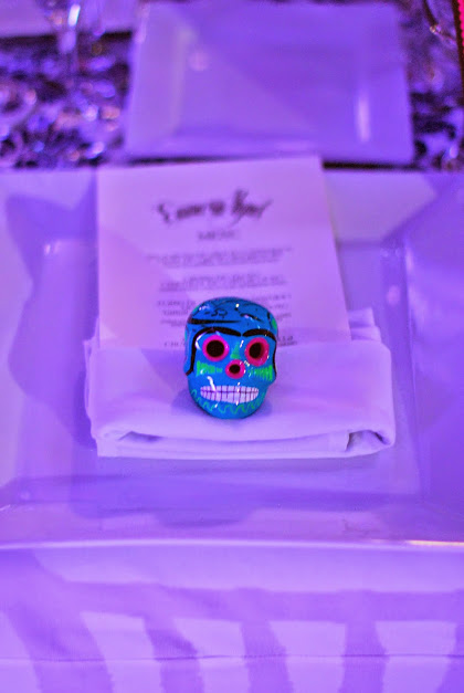
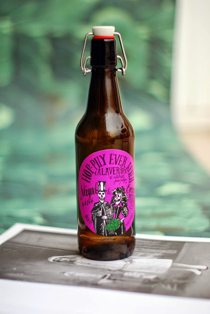
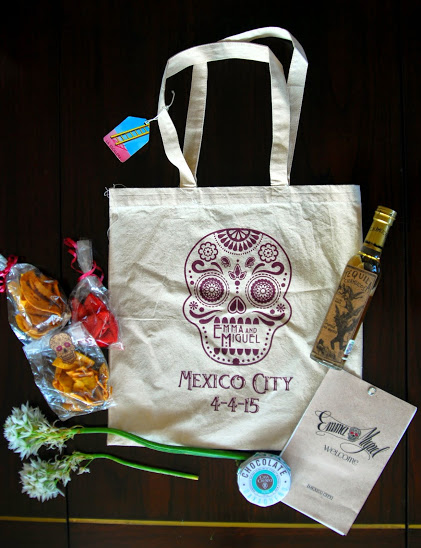
from the save the date to the table numbers and the skulls on the place settings, the design was consistent and unique. it was very mexican but the theme never translated as cheesy, just as a consistent thread. and THE DETAILS. to have this level of detail and this amount of color in anything and still make it feel clean is incredibly difficult. isabel incorporated laser cutting, hand painting, skulls, the couple's names, tons of color, the list goes on. but the overall look was consistent and so cool. as you'll see, the main elements of the wedding (and the paper suite) were a mexican sugar skull, papel picado (the laser cut paper) and rosa mexicano, a specific shade of hot pink.

i am so excited to share isabel's work - as well as emma and miguel's vision - with you. it's a beautiful example of how much love and work goes into weddings. it's a lesson in design. and it's branding at it's best, from an unexpected source. the fact that it was for emma, who i've been friends with since we were 15, is just the (mexican) cherry on top.

ok! let's start at the top. 

first / the save the date postcards:

next / the full invitation suite:

and / the welcome bag!

finally / at the wedding:

beautiful, right? thank you, isabel, for your beautiful work. y que vivan los novios!

more from isabel here.

UN POQUITO DE LEARNING WITH YOUR GUAC?

very cool initiative from chipotle i wanted to share. the fast food mega-chain is partnering was writers and illustrators to do more with their packaging through a new series called “cultivating thought.” authors provide mini essays and illustrators provide accompanying illustrations. and voila! your burrito stimulates your belly and your mind.

cups.jpg

the idea actually came from jonathan safran foer, the new york times best-selling author  of extremely loud and incredibly close and everything is illuminated. apparently, he was eating chipotle one day, found himself with nothing to read and had an aha moment. he approached chipotle with his idea to expose customers to creative people and kudos to chipotle for taking an idea from an outsider and running with it.

the contributers are pretty amazing: toni morrison wrote a piece called “two-minute seduction." sarah silverman has a funny piece called “two-minute index.” steven pinker presents “a two-minute case for optimism.”

i love the idea of stretching your product to do more. i appreciate the creativity and thought behind it. i think the biggest win of this initiative is that it comes from a customer. it comes from putting yourself in your customer’s shoes and saying, when our customers are engaging with our product what are they missing? how can we enrich the process of engaging with our product?

i do think that not featuring mexican or hispanic authors right off the bat was a missed opportunity. not just because there are so many great hispanic authors, but because it’s an opportunity to connect the campaign back to the brand - which is what branded content is all about. but chipotle got that feedback after it launched this initiative and (again) kudos to them for correcting the mistake quickly!

all in all, a great example of smart, thoughtful branded content.