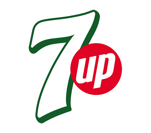
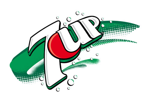
a nice re-design for 7up.
their branding has always been focused on the green "7up" and the red circle, so it's nice to see them do away with the extra (and unnecessary) elements in the logo. makes for a cleaner, more modern, more efficient identity design. take a look at the evolution of the logo below. kinda fun to see how identity and logo design reflects the times, particularly with such a big consumer product.


fun fact: 7up was created in 1929 and originally called “bib-label lithiated lemon-lime soda” because it contained the mood stabilizer lithium citrate (which it continued to have until 1950). it was almost immediately re-branded as “7 up lithiated lemon-lime,” and then finally ended up as “7up.”
via logodesignlove