old site:
new site:

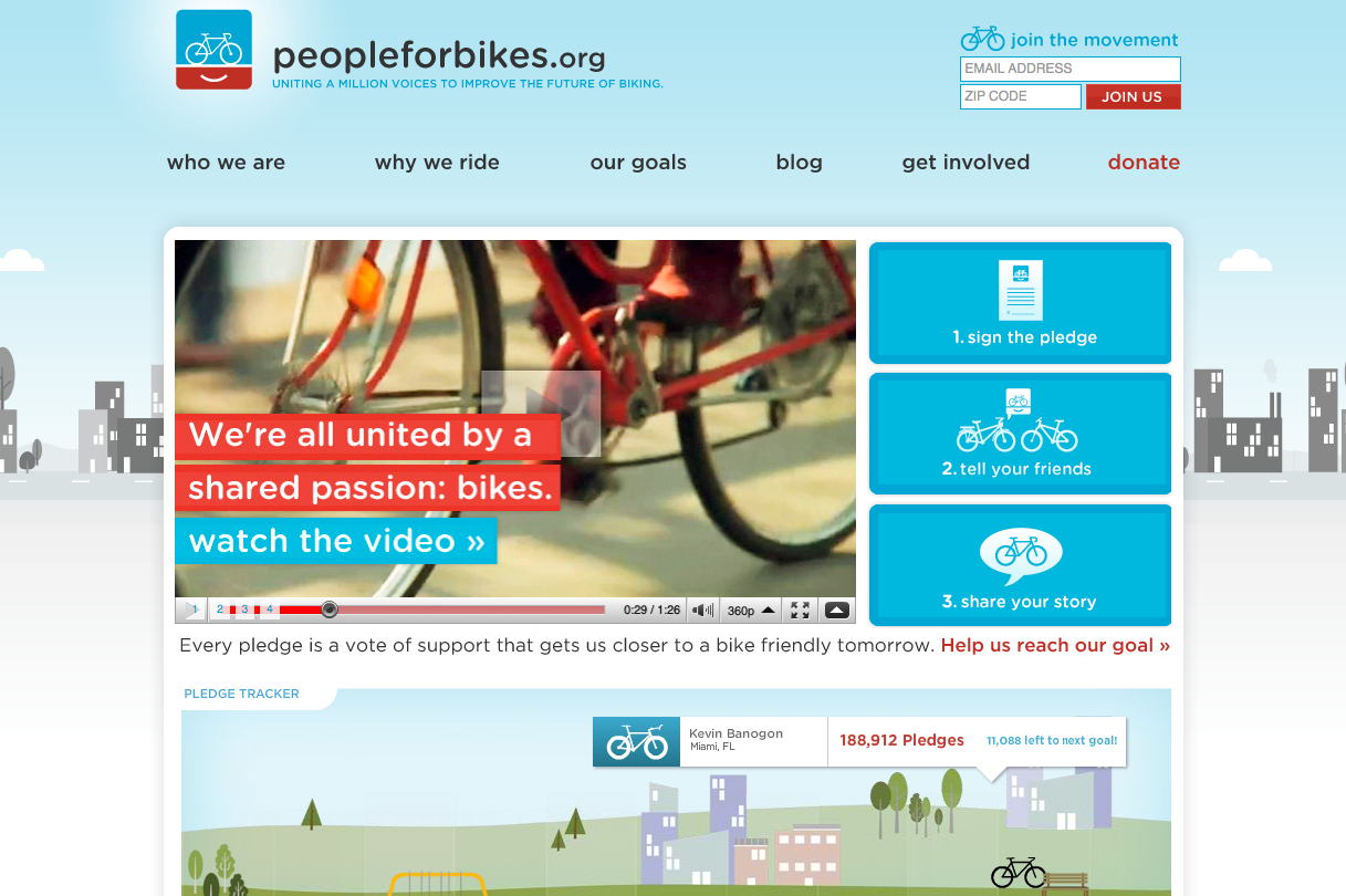
i am not a biker, i do not particularly love riding bikes. i do, however LOVE people for bikes. i came across this website when working at an agency where i participated in a bunch of site designs and was looking for website design inspiration. i was obsessed with their old site design and logo - still obsessed with the logo, not so much with the site.
why: the feel of the logo and the website used to be consistent: warm, simple, friendly. the new site has incorporated high resolution photography, a dark background, big diagonal lines. in my opinion, the old site was so much more original: playful, smoother edges, focused color palette, and had a beautiful interactive sign up thing.
also: the old site clearly showed what the user should do - as easy as 1, 2, 3. the new site does not do as good of a job of focusing your eye on the content that matters. too many boxes! the “take action” tab for example, is a list. guys, you gotta tell me where to go! same with the “get local” section - the map is nice but click on a state and… textontextontext.
long story short: sometimes organizations feel that if they’re updating the functionality of their site (which they should do on a regular basis) they might as well update the look of the site. but It’s important to separate the wish for a new shiny site from what actually makes sense for the brand and the organization. in this case, what makes sense is a clean and focused site, with a clean and focused action path for the user.