FEELING (forward-looking) WITH (story)

story is a retail store based in new york city that “takes the point of view of a magazine, changes like a gallery and sells things like a store.” started by rachel shechtman, every one to two months story chooses a different concept and then redesigns the store and restocks the merchandise around that concept, trend or theme. the idea is to tell a story through merchandise and constantly connect with consumers in a new way. past themes have included “home for the holidays,” “new york” and “made in america.”

why: i think story is an amazing example of disrupting traditional models (in this case retail) and making every day experiences more interactive. story is curating content through merchandise, constantly re-thinking design and inventing new ways to connect with their customers. given that brands have a hard time getting customer to watch videos longer than 15 seconds, why shouldn't retail adjust to shorter attention spans as well?

also: they find interesting corporate partners that are relevant to the concept at hand to sponsor areas of the store during that time (and get branding in return, #winwin). the most recent example is partnering with intel for their current story about style and technology. this is a *super* smart way to help large organizations experiment with new ways to engage their customers.

but: their email and website design is pretty flat. and i think that for how innovative and interactive they are in store, they could be better leveraging social media to expand their in-store community online.

long story short: we know people are expecting more from their online interactions with stores and retailers, but they’re expecting more offline as well. very few physical stores have changed the way they sell their products and story isn’t just doing that, they’re doing it really well.

ps: i saw the founder, rachel, speak last year and she was awesome. here's her ted talk.

more on story here. and here.

FEELING (blah) ABOUT (this site re-design)


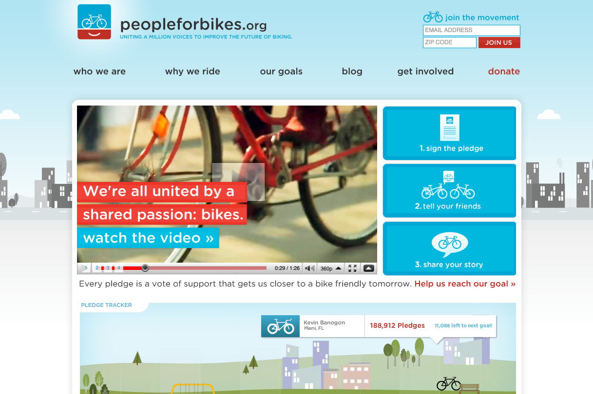
old site:

new site:

peopleforbikes2-1.jpg

i am not a biker, i do not particularly love riding bikes. i do, however LOVE people for bikes. i came across this website when working at an agency where i participated in a bunch of site designs and was looking for website design inspiration. i was obsessed with their old site design and logo - still obsessed with the logo, not so much with the site. 

why: the feel of the logo and the website used to be consistent: warm, simple, friendly. the new site has incorporated high resolution photography, a dark background, big diagonal lines. in my opinion, the old site was so much more original: playful, smoother edges, focused color palette, and had a beautiful interactive sign up thing.

also: the old site clearly showed what the user should do - as easy as 1, 2, 3. the new site does not do as good of a job of focusing your eye on the content that matters. too many boxes! the “take action” tab for example, is a list. guys, you gotta tell me where to go! same with the “get local” section - the map is nice but click on a state and… textontextontext.

long story short: sometimes organizations feel that if they’re updating the functionality of their site (which they should do on a regular basis) they might as well update the look of the site. but It’s important to separate the wish for a new shiny site from what actually makes sense for the brand and the organization. in this case, what makes sense is a clean and focused site, with a clean and focused action path for the user.

FEELING ( inspired ) BY ( blogshop )


i have been following bri emery’s blog, designlovefest, for years. she is one of two or three blogs i visit every day. i love her aesthetic, i love her sources of inspiration and i think her blog has maintained an incredibly consistent voice throughout her huge growth. bri co-founded blogshop, and i am so inspired by this idea. blogshop is a photoshop course that teaches bloggers how best to leverage photoshop for their blog, their business and as a tool in making their vision a reality.

why: blogshop is a great idea but what inspires me the most is the full experience bri and her co-founder angela kohler have created around it. blogshop is a full day workshop but it’s also an opportunity to meet fellow creatives in your area, be inspired by an impeccably designed event space, and walk away with cute gifts. bri and angela have created a workshop meets dinner party meets design space complete with décor, catering, florals and goodie bags.

also: i am obsessed with this one pager they created for prospective students to take to their bosses: focused design, deliberate content, and so freaking practical. it’s something that makes the lives of their students easier before they’re students! talk about customer centric.

long story short: i love bri and think this idea is what it's all about: create great digital content, with a consistent and authentic voice and aesthetic, and then connect that to offline experiences that can make your digital content/voice/brand tangible.

Floral background image: Paris in Four Months