beautiful, minimalist pieces from german artist imi knoebel. so simple and restrained. i love the proportion and structure he works in. also, i want the orange one for mi casa.

DESIGNCRUSH


COLOR BLOCK LOVE FROM DOWN UNDER
ladies and gents. take a look at the beautiful work of one of my favorite artists, melbourne based esther stewart. i love her use of line and color. so cool and collected but also so bold. the colors are a little retro but there is something about these shapes that feels clean and special to me. dreaming of what these would look like in a series above my living room. sigh.


images via the jealous curator
THE NEW CLASSICS
loving the work of american artist chad wys. wys digitally alters classic works of art with strokes of color and texture. interesting how one stroke that feels so out of place can also make something feel immediately modern. this first one is my favorite.

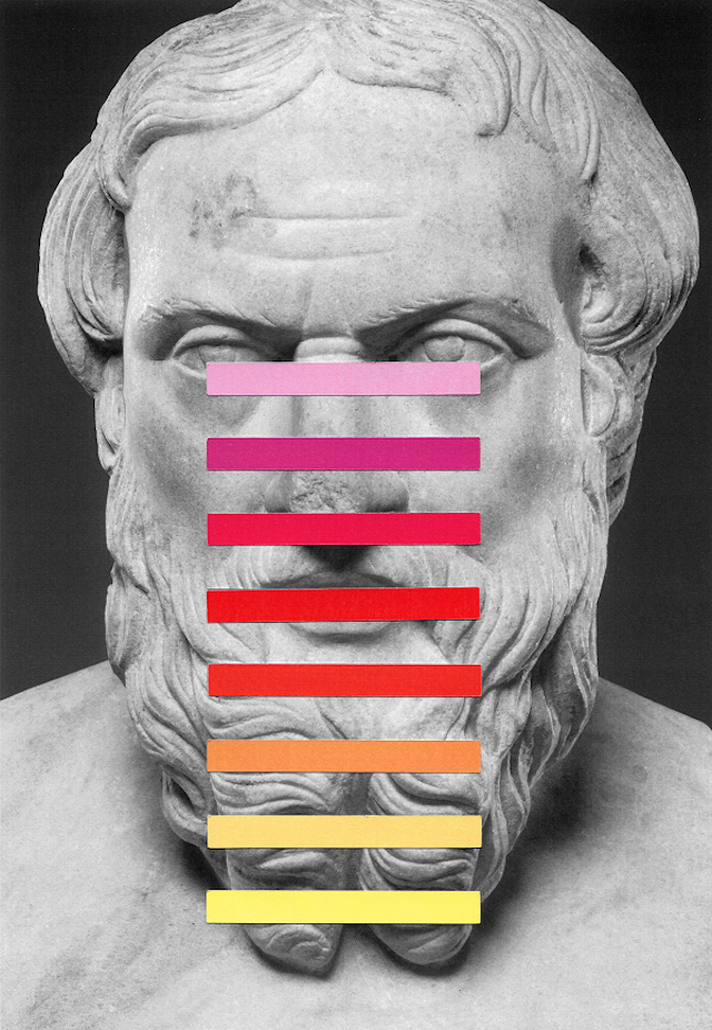


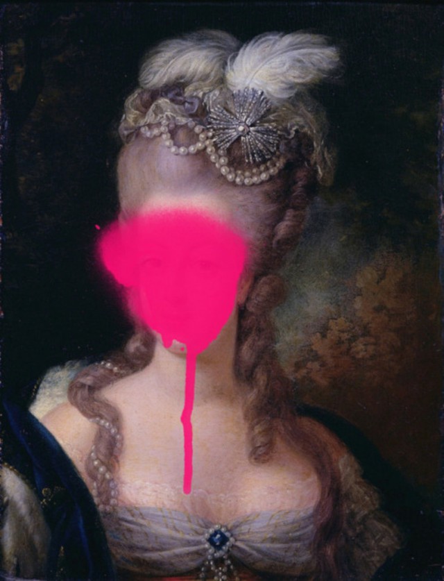

DESIGNCRUSH


JUST A LINE
i stumbled across these the other day and went into a glorious rabbit hole discovering the work of italian illustrator jonathan calugi. as much as i love color, there is just something so rich about black and white design that features a single black line. this series is called "into the line" and it's just perfect.


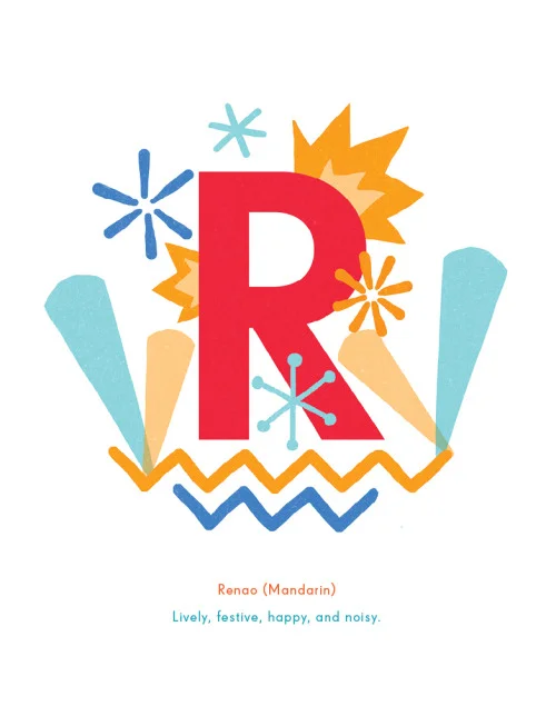
ALPHABET OF UNTRANSLATABLE WORDS


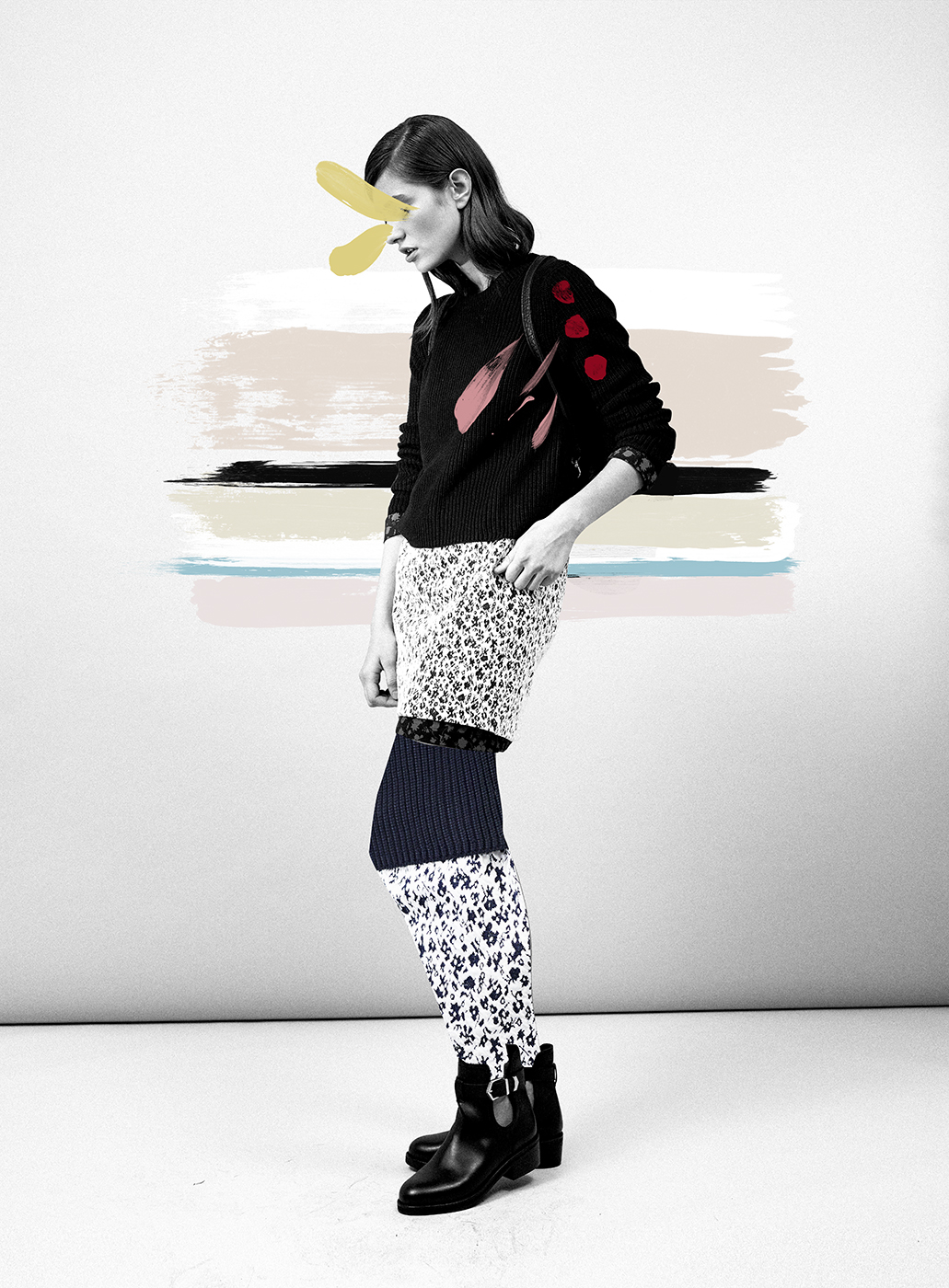
LAY IT ON ME
feeling very inspired by the layered, multi-media, editorial-inspired work of ernesto artillo. i've shared this first piece before here but wanted to share it again with this full series. so good.