BELLA BRILLI

a beautiful series from american artist jessica brilli. she took a collection of images found at yard sales and in family basements, and created colorful, textured, painted interpretations.

i love that these feel vintage in subject, but very contemporary in style. 

jessica brilli
jessica brilli
jessica brilli
jessica brilli

more here.

via creative boom

DOORS OF NEW YORK

i have a serious design crush on this series of illustrated doors from jose guizar, who says this project is "part an ode to architecture and part a self-challenge to never stop looking up."

such a beautiful, inspired project. click through (below) for the full experience. scrolling through these kinda makes me feel like i'm going on a long walk through new york.

159 PRINCE ST., SOHO

159 PRINCE ST., SOHO

1 WASHINGTON SQ. NORTH, GREENWICH VILLAGE

1 WASHINGTON SQ. NORTH, GREENWICH VILLAGE

349 GRAND ST., LOWER EAST SIDE

349 GRAND ST., LOWER EAST SIDE

164 WEST 136TH ST., HARLEM

164 WEST 136TH ST., HARLEM

more here.

via: my brother!

PINK AND BLUE

in case you missed it, pantone (the color masters) announced their colors of the year...

soft pink + pale blue.

specifically, rose quartz and serenity. expect to see a lot more of these in products, fashion, and merchandising in the coming months.

pantone colors of the year

ON SCULPTURE, AND LONLINESS

i love this series i shared a few months back called like knows like. the latest video - about beth cavener - is out and it's a beauty.

"Cavener wants to pry at those uncomfortable, awkward edges between animal and human. Entangled in their own internal and external struggles, the figures express frustration for the human tendency towards cruelty and lack of understanding."

TEXTURE-IZE

loving the beautiful, graphic brush strokes in this series from claire sherman. also, her use of color is perfection.

Claire Sherman
Claire Sherman
Claire Sherman
Claire Sherman

more here.

via miss moss

INSTA INSPO

a big part of my job at framebridge is to reach out to content creators and design influencers, share what we do, and make collaborations happen. one of the first people i reached out to when i first got to framebridge was monling lee. she is one of my all time instagram crushes.

and since she's based in dc, we got drinks and ended up talking for nearly three hours about design, the power of instagram and the importance of having a creative point of view. we also talked about the fact that she had been creating beautiful content online for years but had never seen her work in print. 

so, naturally, we fixed that. and this week we shared an interview with her on the framebridge blog so others could find inspiration in her work too.

Monling Lee

FLAT FASHION

you know i love a creative twist. these, my friends, are PHOTOS not vector art prints. they are shot by erik madigan heck for junta watanabe's fall 2015 collection, and designed to create a flat, graphic feel. super stunning.

Junya Watanabe
Junya Watanabe
Junya Watanabe
Junya Watanabe
Junya Watanabe
Erik Madigan Heck

more here.

via design milk

CAMACHO COOL

say hello to cristina camacho. originally from bogota, colombia, camacho's work is a play on color and shape and canvas. and i am very into it.

artsy on camacho: 

When she arrived at Columbia to pursue an MFA, she embarked on a process that she describes as “letting go.” First Camacho stopped working from sketches that might normally predetermine her direction or the final composition. Then she added layers of canvas and more incisions; played with the canvases’ tensions and how they interacted with her cuts; and let gravity interact with the fabric strips. “If the canvas is a little bit loose when I stretch it, it reacts differently than if it was taut. If you have gesso or acrylic on both sides of the canvas, it sags in a very different way than when it’s just on one side” said Camacho. “I finally understood that the material was free, and I needed to let the material be what it is.”

In the show at Praxis, Camacho’s surfaces twist, protrude, and droop, resembling gaping Venus fly traps, elaborate fractals, or the guts of magical creatures. “They’re still very abstract, but there’s also something very figurative in the pieces,” said Camacho. “They became alive—like people that I know, stories that I have, animals, and plants. They became dissections more than constructions.”

Cristina Camacho
cristina camacho
Cristina Camacho
cristina camacho
Cristina Camacho
cristina camacho

more here.

via artsy

GIVES YOU WINGS

very, very cool brand video from red bull.

from red bull: "our world is full of opposites, but as we have learned from chinese philosophy with the yin and yang, opposing forces relate to each other. the result is this fine masterpiece that required a high degree of planning and direction to coordinate the complex. we hope you enjoy the little insight into the black and white world of visual possibilities."

red bull

watch the video here.

via huh magazine

LET IT GO

i wanted to share what is definitely one of the best articles i have read on start ups. it's from first round and it's called "give away your legos, and other commandments for scaling startups."

if you work at a start up, love someone who works at a startup, or are just interested in how companies grow, i highly recommend reading the whole thing.

here's an excerpt:

“The best metaphor I have for scaling is building one of those huge, complex towers out of Legos,” she says. “At first, everyone’s excited. Scaling a team is a privilege. Being inside a company that’s a rocket ship is really cool. There are so many Legos! You could build anything. At the beginning, as you start to scale, everyone has so many Legos to choose from — they’re doing 10 jobs — and they’re all part of building something important.”

You have so many choices and things to build during this early phase that it’s easy to get overwhelmed. There’s too much work — too many Legos. You’re not sure you can do it all yourself. Soon, you decide you need help. So you start to add people. That’s when something funny happens on a personal level and to teams: People get nervous.

“As you add people, you go through this roller coaster of, ‘Wait, is that new person taking my job? What if they don’t do it the right way? What if they’re better than me at it? What do I do now?’” says Graham. “These are some strong emotions, and even if they're predictable, they can be unnerving.” In order to get to a really high-functioning, larger team, you have to help everyone get through this roller coaster. If you don’t, you can end up with a real mess.

more here.

COLOR AND GLASS

this might be my favorite thing i have seen in a while. it's a series called "botanical" from swiss photographer and designer samuel zeller, and it's a new take on the classic botanical illustrations from the 18th and 19th centuries. i can't believe these are photos. 

Samuel Zeller

from zeller: "reality is refracted by the greenhouse’s ground glass and reminds me of the paper used in watercolour paintings. the colours are subtle and sophisticated, they mirror the tones found in this kind of illustration... the greenhouse in which resides the subject of this photographic’s series is a controlled environment that aims to protect exotic plants by creating better climate conditions than the local weather; it’s also a beautiful creation of metal and glass, dedicated, refined, elegant (just like the plants inside). the structure itself becomes a frame in some images."

Samuel Zeller
Samuel Zeller
Samuel Zeller

and i love this quote from him: "i almost always create images when going through strong emotional states. photography is a way i found to talk about myself, rather than with language were I always had difficulties."

Samuel Zeller

more here.

via creative boom

PAPEL POR FAVOR

paper art is really becoming a thing over here. and here is yet another truly amazing study in paper art.

say hello to canadian paper master, myriam dion.

these are newspapers. made into lace. holy moly.

Myriam Dion

more here.

via the jealous curator

AN ECONOMIST WALKS INTO A BAR

thought this was fun. a lesson on economics from the financial times and a reminder that every small detail is an opportunity to be playful and thoughtful with how your brand interacts with its users. 

FT

see the full page here.

FLOWER POWER

so, this is how the netherlands celebrates van gogh. 

it's called corso zundert, and it's a legendary parade with massive floats designed and decorated with millions of dahlias. every year there is a new theme and this year, the theme is the celebration of vincent van gogh, who was born in zundert.

the town launched the parade in 1936 as a way to celebrate their role as a global supplier of dahlias.

so cool.

Vincent van Gogh Parade

via creative boom

BOLDNESS HAS GENIUS

"until one is committed, there is hesitancy, the chance to draw back — concerning all acts of initiative (and creation), there is one elementary truth that ignorance of which kills countless ideas and splendid plans: that the moment one definitely commits oneself, then providence moves too. all sorts of things occur to help one that would never otherwise have occurred. a whole stream of events issues from the decision, raising in one’s favor all manner of unforeseen incidents and meetings and material assistance, which no man could have dreamed would have come his way. whatever you can do, or dream you can do, begin it. Boldness has genius, power, and magic in it. begin it now.“ - goethe

more here.

via swiss miss

PAPER CUT COOL

holy moly. take a piece of white paper, an x-acto knife, tweezers and a WHOLE lot of talents and here you go. korean artist too hyun has created a truly unbelievable series of hyperrealistic portraits of famous icons. take a look at a few of her amazing pieces below.

Korean artist Yoo Hyun

more here.

via creative boom

ONE YEAR LATER

and just like that, it's been a year of the boss aesthetic! here are five (and a half) things i've learned:

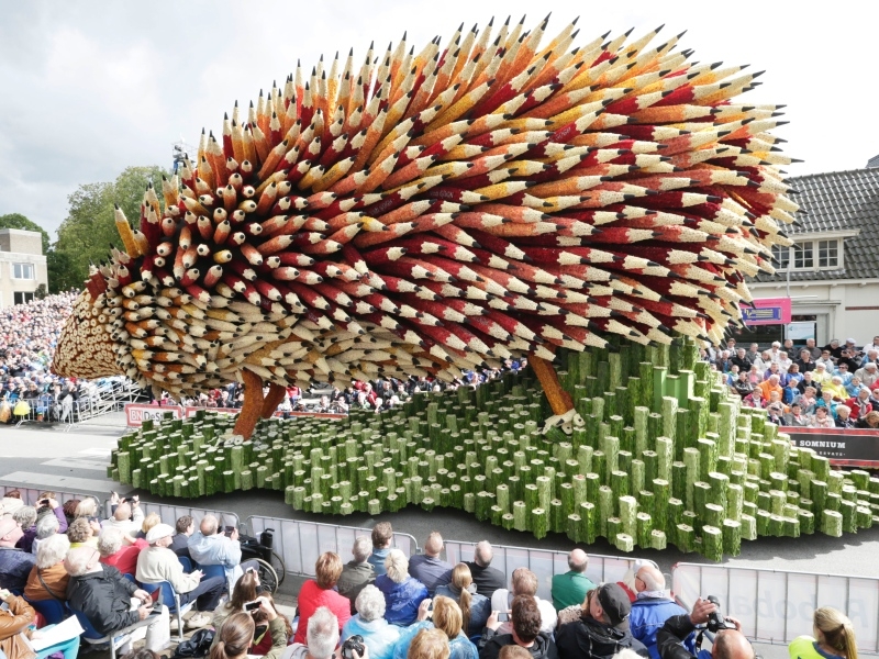
1. a love letter to instagram. this might be the biggest surprise of all! before starting the blog i was very active on instagram but had a private account, so while i liked photos and commented on images of my friends that was about it. since starting my @thebossaesthetic profile my mind has been blown by the power of instagram. it is a creative community unlike any other. i have made friends through instagram, i have gotten clients through instagram, discovered artists, and really found the DC creative community. i have also found that because i am always looking for beautiful images to share on instagram, i am looking for beauty and interest all the time! i am seeking out beautiful street art i see people share, i'm styling my home with a little more care, looking up more often, and generally taking more moments to pause and appreciate beautiful things i find.

2. the power of just starting. since starting this project i have been amazed by how many people have shared that they have an idea, a blog they want to start, a project on their mind. here's my advice: just do it. just start. it's the hardest part, i promise.

3. karma is a beauty. if you put energy out there, it will come back to you. putting yourself out there - your ideas, what you think, things you love - is a powerful thing. so many friends and acquaintances in my life knew i loved design, but after starting the blog things kind of shifted. i started getting texts and emails and tags on instagram: "saw the coolest art exhibit, take a look" "have a really creative friend you should meet" "isn't this store design beautiful?" it's amazing how much you get back when you start putting a little something out there.

4. the importance of focus. the hardest part post-launch has been consistency. i find that one of two things is often happening: 1) there are weeks where i'm feeling way to busy or tired or just uninspired and 2) there are weeks where i see a million beautiful and interesting things and want to share everything! for the first, i have tried to make sure i have *a lot* of posts stockpiled for rainy days. and being able to pull from those has been important, especially recently. for number two, i have found it helpful to go back to a mission statement i wrote when i was brainstorming the blog. if it relates, post it! if not, just enjoy it, maybe add it to pinterest and keep on moving. 

4.5. focus, again. i decided from the beginning that the goal of this blog, this project, was to catalogue and share my perspective - on design, on beauty, on business. i decided to focus on that - not partnerships or monetizing or making it a full time thing. and that's been helpful to remember! i think deciding what your project is and, importantly, what it isn't, is one of the easiest ways to to stay focused and keep it going.

5. things they are a' changin. when i started the blog i was at a job that was not the right fit for me. it was very 9 to 5 and really, very not creative. my business mind needed more of a challenge and my creative soul needed more inspiration. and for a time the blog served as a way to feed that. i got projects and met new people and started to build my own brand. and then framebridge happened. and it is so much of a good thing and all consuming and a huge challenge for my business mind and a hugely filling experience for my creative soul. and so, i find myself coming to the blog with a lot more to say but no time to say it. so, here we are a year later and i am really thinking about what the next stage of the boss aesthetic will be. it will likely have to do with sharing more about all of the cool creative stuff i'm working on at framebridge but what form that will take is still tbd. if you have suggestions let me know. if not, stay tuned! i think it's going to be a fun year ahead over here. 

xx

claudia