WES JUNG IL

so, architecture critic oliver wainwright was allowed to tour north korea. how? i do not know. but he found pastel colors, quirky architecture, and kind of amazing design. wes anderson, can ya hear me? 

he wrote a piece on it for the guardian:

“In every refurbished building we visit, there is a peculiarly consistent style of preschool colour schemes and shiny synthetic surfaces, the pastel palettes and axial symmetry giving an eerie feeling of walking into a Wes Anderson film set, or a life-size Polly Pocket toy… kindergarten kitsch is the logical next step for a regime intent on projecting an image of carefree prosperity. It is architecture as anaesthetic, a powerful tool for the state to infantilise its people.”

more here.

via, my friend emma!

IF THESE WALLS COULD TALK

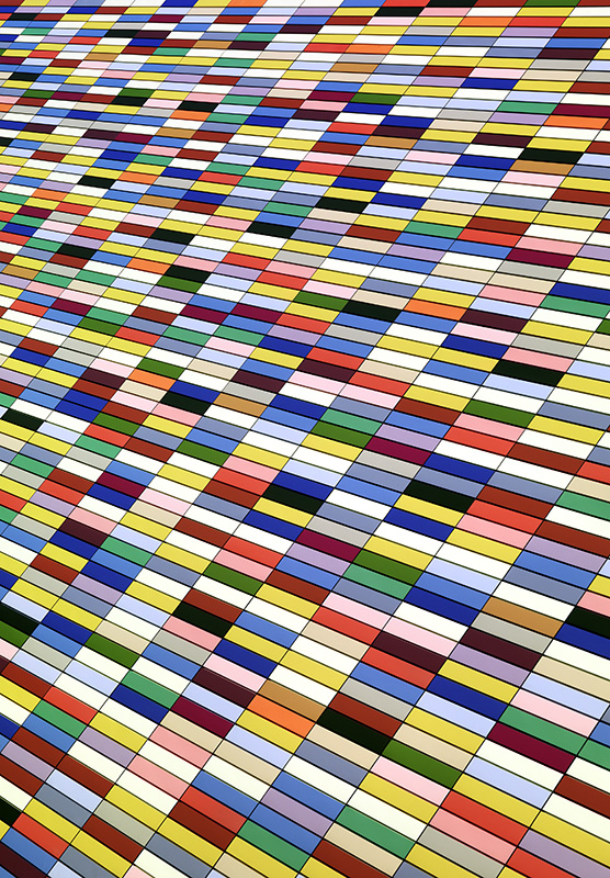
thought you guys would like this series - called facades - from roland fischer. at first you might think these colorful patterns are from tiles or fabrics or sculptures. but actually these are walls of architectural structures from around the world.

and a great reminder to look for art in architecture!

these images also highlight some of the trends that are shaping architecture around the world. from fischer: “i noticed all these new buildings mushrooming everywhere, giving the impression that they could as well be from any other major town in the world... i thought that this was a new urban visual experience, a consequence naturally of the then still new process of globalization.”

looks like architectural abstractions are becoming a thing over here.

Museum, Munich, 2010

Museum, Munich, 2010

Kitamagome, Tokyo, 2014

Kitamagome, Tokyo, 2014

Eldorado, Brasilia, 2006

Eldorado, Brasilia, 2006

Oio, Melbourne, 2012

Oio, Melbourne, 2012

Highschool, Utrecht, 2013

Highschool, Utrecht, 2013

Docklands, Melbourne, 2014

Docklands, Melbourne, 2014

Black Forest #2, 2010

Black Forest #2, 2010

more here.

via swissmiss

MAKING AIRPORT DESIGN FLY

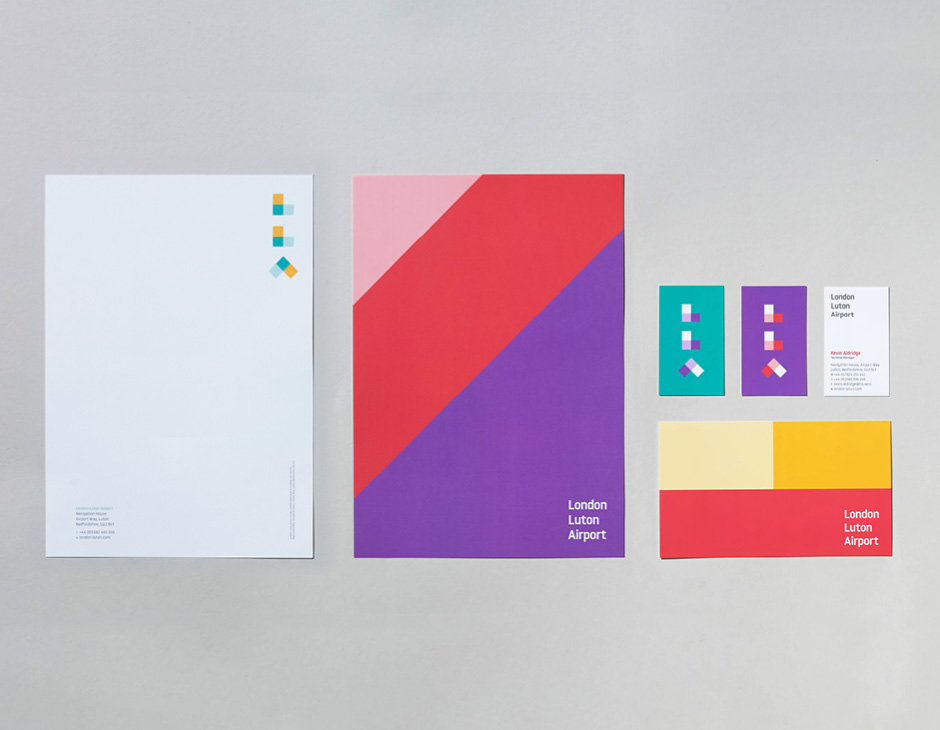
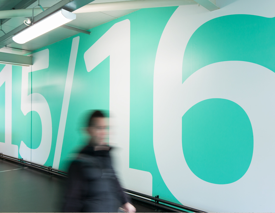
take a look at this very cool rebrand of london luton airport (LLA) from atipo (who i actually wrote about in this post!) and ICO design. as i said in this post, i love when people bring color and thoughtful design into spaces that are typically just focused on utility (read: grey and beige). here's what the design house said about the project:

"rebranding an airport is no easy task. following the approval of a major development at LLA, we were approached to create a brand that would redefine the airport in the london market and inform its future direction as a passenger-focused airport. working closely with the key stakeholders led to four core values that will inform all aspects of the brand. these are expressed in the simplicity and dynamism of the new visual identity which is a clear statement of intent of the airport’s bold ambition for the future. the identity includes a specially commissioned typeface and icon set designed by atipo." 

LLA Airport Rebrand by Atipo

ART-CHITECTURE

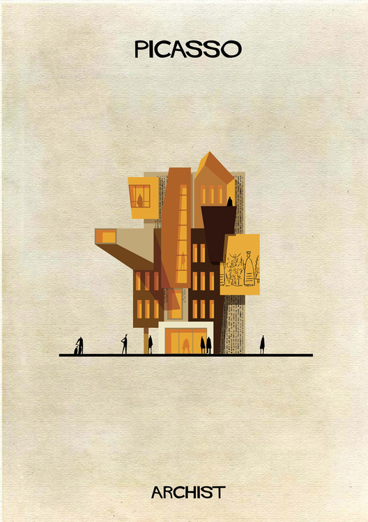
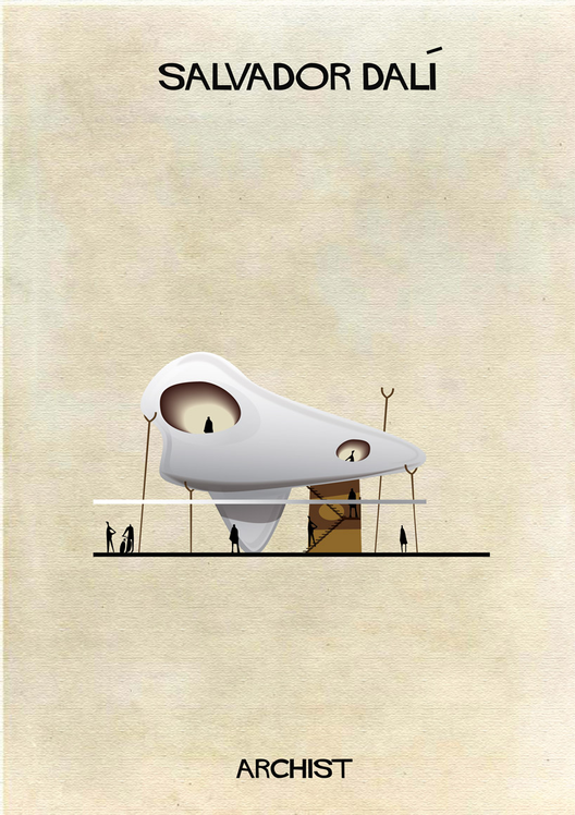
a very cool series by federico babina. he's created a beautiful and playful project called archist, where he imagines artists as architects and reinterprets art as construction.

from babina: "art and architecture are disciplines that talk... the definition and the function of architecture is constantly changing with the evolution of contemporary art... i took pleasure in imagining architecture full of art, designed and built through the interpretation of the language of an artist."

Mondrian Art as Architecture
Halley Art as Architecture
Rothko Art as Architecture
Picasso Art as Architecture
Dali Art as Architecture
Malevich Art as Architecture
Duchamp Art as Architecture