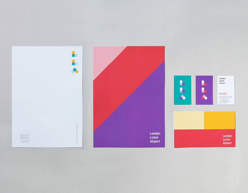
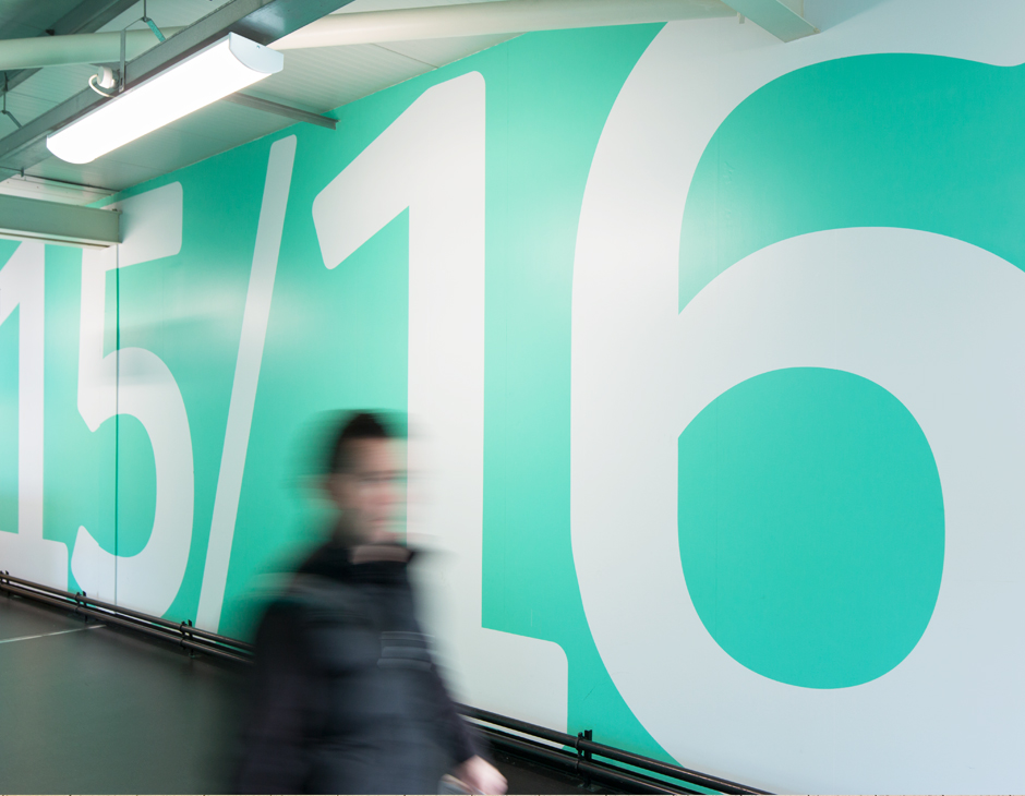
take a look at this very cool rebrand of london luton airport (LLA) from atipo (who i actually wrote about in this post!) and ICO design. as i said in this post, i love when people bring color and thoughtful design into spaces that are typically just focused on utility (read: grey and beige). here's what the design house said about the project:
"rebranding an airport is no easy task. following the approval of a major development at LLA, we were approached to create a brand that would redefine the airport in the london market and inform its future direction as a passenger-focused airport. working closely with the key stakeholders led to four core values that will inform all aspects of the brand. these are expressed in the simplicity and dynamism of the new visual identity which is a clear statement of intent of the airport’s bold ambition for the future. the identity includes a specially commissioned typeface and icon set designed by atipo."